QML学习:使用QML实现抽屉式侧边栏菜单
文章目录
- 前言
- 一、环境配置
- 二、实现步骤
- 三、示例完整代码
- 四、注意事项
- 总结
前言
最近在进行QML的学习,发现一个比较有意思的交互设计:抽屉式侧边栏菜单,出于开发实战需求,最终实现了一个支持手势拖拽、弹性动画、蒙层效果和智能悬停检测的抽屉菜单,下面将我的示例内容进行展示,以便大家学习,如有错误之处,欢迎大家批评指正。
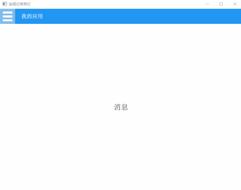
项目效果
提示:以下是本篇文章正文内容,下面案例可供参考
一、环境配置
我的示例使用的是Qt5.14版本,需要确保包含 Qt Quick Controls 2 模块(安装时勾选Qt Quick Controls 2组件),需要在项目的.pro文件中添加:
QT += qml quick quickcontrols2
这里有详细的Qt安装和QML项目的创建步骤:Qt Creator的安装和Qml项目的创建
这里有QML的基础教程:QML快速入门(Quick Starter)
二、实现步骤
1、基础框架搭建
//通过ApplicationWindow创建主窗口
ApplicationWindow {id: mainWindowvisible: truewidth: 800height: 600title: "抽屉式菜单栏"......
}
2、顶部工具栏设计
//顶部工具栏
header: ToolBar {height: 50background: Rectangle {color: "#2196F3" //蓝色背景}......//这里实现了汉堡菜单按钮,通过MouseArea检测悬停状态,并配合Timer实现智能延时关闭功能(详细代码见下文)......
}
3、抽屉菜单核心实现
//主内容区域
Item {id: mainContentanchors.fill: parent......//使用x坐标控制菜单位置,通过状态机(States)切换展开/收起状态,添加平滑动画过渡效果(详细代码见下文)......
}
4、高级交互功能
//边缘滑动手势检测,鼠标点击左侧区域后向右移动可以拉出菜单,双击也能展开菜单
MouseArea {id: drawerDragAreaanchors.left: parent.leftwidth: 20   //手势检测区域宽度height: parent.heightpropagateComposedEvents: true//拖拽起始位置的全局X坐标property real globalStartX: 0//鼠标按下事件处理onPressed: {globalStartX = mapToGlobal(mouseX, 0).xif(isDrawerOpen){mouse.accepted = false}}//位置变化事件处理onPositionChanged: {if (pressed) {//滑动距离超过25px时切换状态let currentGlobalX = mapToGlobal(mouseX, 0).xlet delta = currentGlobalX - globalStartXif (Math.abs(delta) > 10) {mainWindow.isDrawerOpen = delta > 0}}}//添加双击切换onDoubleClicked: isDrawerOpen = !isDrawerOpen
}
三、示例完整代码
1.main.qml
import QtQuick 2.14
import QtQuick.Controls 2.14ApplicationWindow {id: mainWindowvisible: truewidth: 800height: 600title: "抽屉式菜单栏"//当前选中的菜单项文本property string selectedMenuItem: "请选择菜单项"//是否正在与菜单栏交互property bool isMenuActive: false//菜单栏是否展开property bool isDrawerOpen: false//菜单栏宽度property int drawerWidth: 200//根据窗口宽度自动调整菜单栏宽度Component.onCompleted: {drawerWidth = Qt.binding(() => Math.min(200, mainWindow.width * 0.8))}//顶部工具栏header: ToolBar {height: 50background: Rectangle {color: "#2196F3" //蓝色背景}Row {spacing: 20anchors.fill: parent//菜单入口按钮ToolButton {id: menuButtonhoverEnabled: true //启用悬停检测//是否悬停在按钮上property bool buttonHovered: false//按钮内容contentItem: Text {text: "☰"color: "white"font.pixelSize: 38}//鼠标交互MouseArea {anchors.fill: parenthoverEnabled: true//鼠标进入时展开菜单栏并修改悬停状态onEntered: {isDrawerOpen = truemenuButton.buttonHovered = true}//鼠标离开时重置状态并启动关闭计时器onExited: {menuButton.buttonHovered = falseif (!mainWindow.isMenuActive) {timer.restart()}}}//点击切换菜单栏状态//onClicked: isDrawerOpen = !isDrawerOpen//自动关闭菜单栏定时器Timer {id: timerinterval: 300 //延时300ms关闭onTriggered: {//双重验证是否满足关闭条件(未悬停在此按钮及菜单栏中)if (!mainWindow.isMenuActive && !menuButton.buttonHovered) {isDrawerOpen = false}}}}//应用标题Label {text: "我的应用"color: "white"font.bold: truefont.pixelSize: 18anchors.verticalCenter: parent.verticalCenter}}}//主内容区域Item {id: mainContentanchors.fill: parent//中央文本显示Text {id: contentTextanchors.centerIn: parenttext: mainWindow.selectedMenuItemfont.pixelSize: 24color: "#333333"}//遮罩层(展开菜单栏后出现)Rectangle {id: overlayanchors.fill: parentcolor: "#80000000" //半透明黑色遮罩opacity: isDrawerOpen ? 1 : 0visible: opacity > 0enabled: visible//鼠标点击关闭菜单栏MouseArea {anchors.fill: parentonClicked: isDrawerOpen = false}//创建平滑的透明度渐变效果Behavior on opacity {NumberAnimation {duration: 200easing.type: Easing.OutQuad}}}//抽屉菜单栏容器Rectangle {id: drawerwidth: drawerWidthheight: parent.heightx: -drawerWidth // 初始隐藏位置color: "#ffffff"//菜单栏悬停检测(注意这个需要放在ListView之前,否则动画效果异常)MouseArea {anchors.fill: parenthoverEnabled: truepropagateComposedEvents: true //允许事件继续传递onEntered: mainWindow.isMenuActive = true//鼠标离开时重置状态并启动关闭计时器onExited: {mainWindow.isMenuActive = falsetimer.restart()}}//抽屉菜单列表ListView {anchors.fill: parentmodel: menuItems//菜单项模板delegate: ItemDelegate {id: menuItemwidth: drawerWidthheight: 50hoverEnabled: true//鼠标交互,处理悬停状态MouseArea {anchors.fill: parenthoverEnabled: truepropagateComposedEvents: true//设置为false,允许事件传递给ItemDelegate,不拦截点击事件onPressed: mouse.accepted = falseonEntered: mainWindow.isMenuActive = true//鼠标离开时重置状态并启动关闭计时器onExited: {//确保鼠标完全离开才更新状态if(!containsMouse) {mainWindow.isMenuActive = falsetimer.restart()}}}//背景样式background: Rectangle {color: menuItem.hovered ? "#2196F3" : "transparent"opacity: menuItem.hovered ? 0.6 : 0.3Behavior on color {ColorAnimation {duration: 150easing.type: Easing.OutCubic}}}//菜单项内容布局contentItem: Row {spacing: 10leftPadding: 10//图标Image {source: model.iconwidth: 24height: 24anchors.verticalCenter: parent.verticalCenter}//文本Text {text: model.titlecolor: "#444444"font.pixelSize: 16anchors.verticalCenter: parent.verticalCenter}}//点击事件处理onClicked: {console.log("切换到:", model.title)mainWindow.selectedMenuItem = model.title //更新显示文本isDrawerOpen = false //点击后自动关闭抽屉}}}//抽屉动画状态states: State {name: "opened"when: isDrawerOpenPropertyChanges {target: drawerx: 0}}//创建平滑缓动效果transitions: Transition {NumberAnimation {property: "x"duration: 300easing.type: Easing.InOutQuad}}}}//菜单项数据模型ListModel {id: menuItemsListElement { title: "首页"; icon: "qrc:/icons/home.png" }ListElement { title: "消息"; icon: "qrc:/icons/message.png" }ListElement { title: "设置"; icon: "qrc:/icons/settings.png" }ListElement { title: "个人中心"; icon: "qrc:/icons/profile.png" }}//边缘滑动手势检测MouseArea {id: drawerDragAreaanchors.left: parent.leftwidth: 20 //手势检测区域宽度height: parent.heightpropagateComposedEvents: true//拖拽起始位置的全局X坐标property real globalStartX: 0//鼠标按下事件处理onPressed: {globalStartX = mapToGlobal(mouseX, 0).xif(isDrawerOpen){mouse.accepted = false}}//位置变化事件处理onPositionChanged: {if (pressed) {//滑动距离超过25px时切换状态let currentGlobalX = mapToGlobal(mouseX, 0).xlet delta = currentGlobalX - globalStartXif (Math.abs(delta) > 10) {mainWindow.isDrawerOpen = delta > 0}}}//添加双击切换onDoubleClicked: isDrawerOpen = !isDrawerOpen}
}
四、注意事项
1、资源路径问题
其中菜单项数据模型中可以看到有图标资源,需要确保图标资源正确添加到.qrc文件,否则会显示为空白,在项目的源文件目录下添加了一个icons文件夹,其中有使用到的图片资源:
2、事件冲突处理
在代码中可以看到设置mouse.accepted = false,允许事件传递,避免阻断按钮点击事件
总结
这个示例中不仅实现了基础的抽屉菜单,还加入了手势交互、智能悬停检测等功能。可以看到QML的声明式语法让我们可以用少量代码实现复杂的动态效果,本文中实现这个示例也是比较简单的,要实现更复杂的功能还是需要不断的学习哦~
hello:
共同学习,共同进步,如果还有相关问题,可在评论区留言进行讨论。
参考文章:
Qt Creator的安装和Qml项目的创建
QML快速入门(Quick Starter)