React-native之组件
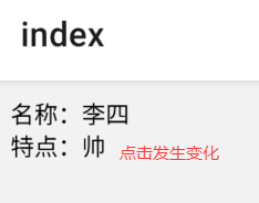
状态组件
import { Text, View, StyleSheet } from 'react-native';
import React from 'react';
export default class Index extends React.Component {
state = {
name: '李四',
type: '牛逼',
};
updateState = () => {
const type = this.state.type === '牛逼' ? '帅' : '牛逼';
this.setState({ type });
};
render() {
const { name, type } = this.state;
return (
<View style={styles.container}>
<Text onPress={this.updateState}>名称:{name}</Text>
<Text>特点:{type}</Text>
</View>
);
}
}
const styles = StyleSheet.create({
container: {
margin: 10,
},
});
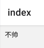
组件属性Props
父子组件之间数据传递
import { Text, View, StyleSheet } from 'react-native';
import React from 'react';
class SiteNameComponent extends React.Component{
constructor(props){
super(props)
this.state={name:props.name}
}
//触摸事件
updateState=()=>{
const name=this.state.name=='帅'?'不帅':'帅'
this.setState({name:name})
}
render(){
const {name}=this.state
return (
<View>
<Text onPress={this.updateState}>{name}</Text>
</View>
)
}
}
export default class Index extends React.Component {
render() {
return (
<View style={styles.container}>
<SiteNameComponent name={'帅'}></SiteNameComponent>
</View>
);
}
}
const styles=StyleSheet.create({
container:{
margin:10
}
})
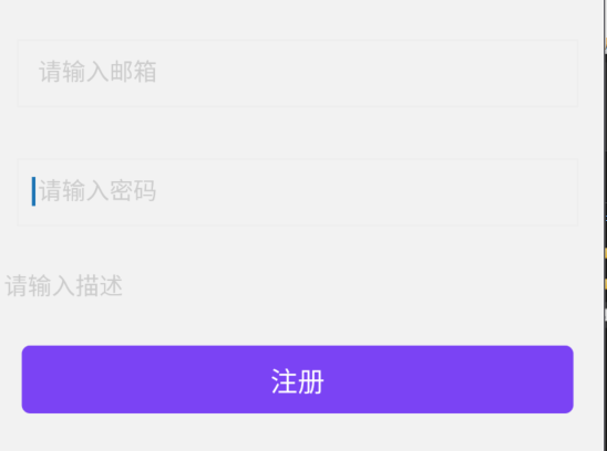
输入组件TextInput
import { Text, View, StyleSheet, TouchableOpacity, TextInput } from 'react-native';
import React, { Component } from 'react';
export default class Index extends Component {
state = {
email: '',
password: '',
intro: ''
};
handleEmail = (text) => {
this.setState({ email: text });
};
handlePassword = (text) => {
this.setState({ password: text });
};
handleIntro = (text) => {
this.setState({ intro: text });
};
register = () => {
const { email, password, intro } = this.state;
alert(`email: ${email}\npassword: ${password}\nintro: ${intro}`);
};
render() {
return (
<View style={styles.container}>
{/* ===== 邮箱输入框 ===== */}
<TextInput
style={styles.input} // 自定义样式
underlineColorAndroid="transparent" // Android 下划线颜色透明
placeholder=" 请输入邮箱 " // 占位提示文字
placeholderTextColor="#ccc" // 占位文字颜色
autoCapitalize="none" // 关闭首字母自动大写
keyboardType="email-address" // 键盘类型:邮箱专用
onChangeText={this.handleEmail} // 文字变化回调
value={this.state.email} // 受控组件:值由 state 驱动
/>
{/* ===== 密码输入框 ===== */}
<TextInput
style={styles.input} // 自定义样式
underlineColorAndroid="transparent" // Android 下划线颜色透明
placeholder=" 请输入密码 " // 占位提示文字
placeholderTextColor="#ccc" // 占位文字颜色
autoCapitalize="none" // 关闭首字母自动大写
keyboardType="default" // 键盘类型:默认键盘
returnKeyType="next" // 软键盘回车键显示为“下一项”
secureTextEntry={true} // 密文输入(密码不可见)
onChangeText={this.handlePassword} // 文字变化回调
value={this.state.password} // 受控组件:值由 state 驱动
/>
{/* ===== 描述输入框(多行) ===== */}
<TextInput
underlineColorAndroid="transparent" // Android 下划线颜色透明
placeholder=" 请输入描述 " // 占位提示文字
placeholderTextColor="#ccc" // 占位文字颜色
autoCapitalize="none" // 关闭首字母自动大写
multiline={true} // 允许多行输入
numberOfLines={4} // 默认显示 4 行高度
textAlignVertical="top" // 文字垂直对齐到顶部(Android)
returnKeyType="next" // 软键盘回车键显示为“下一项”
onChangeText={this.handleIntro} // 文字变化回调
value={this.state.intro} // 受控组件:值由 state 驱动
/>
{/* ===== 注册按钮 ===== */}
<TouchableOpacity
style={styles.submitButton} // 自定义样式
onPress={this.register} // 点击回调:触发注册方法
>
<Text
style={styles.submitButtonText} // 按钮文字样式
>
注册
</Text>
</TouchableOpacity>
</View>
);
}
}
const styles = StyleSheet.create({
container: {
paddingTop: 23
},
input: {
margin: 15,
paddingLeft: 8,
height: 40,
borderColor: '#EEEEEE',
borderWidth: 1
},
submitButton: {
backgroundColor: '#7a42f4',
padding: 10,
alignItems: 'center', // 子元素水平居中
margin: 15,
height: 40,
borderRadius: 5, // 圆角
width: '90%', // 宽度占父容器 90%
alignSelf: 'center' // 自身在父容器中水平居中
},
submitButtonText: {
color: 'white',
fontSize: 16 // 字体大小
}
});
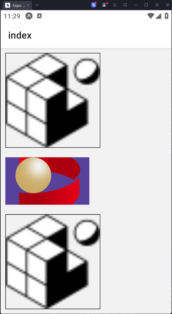
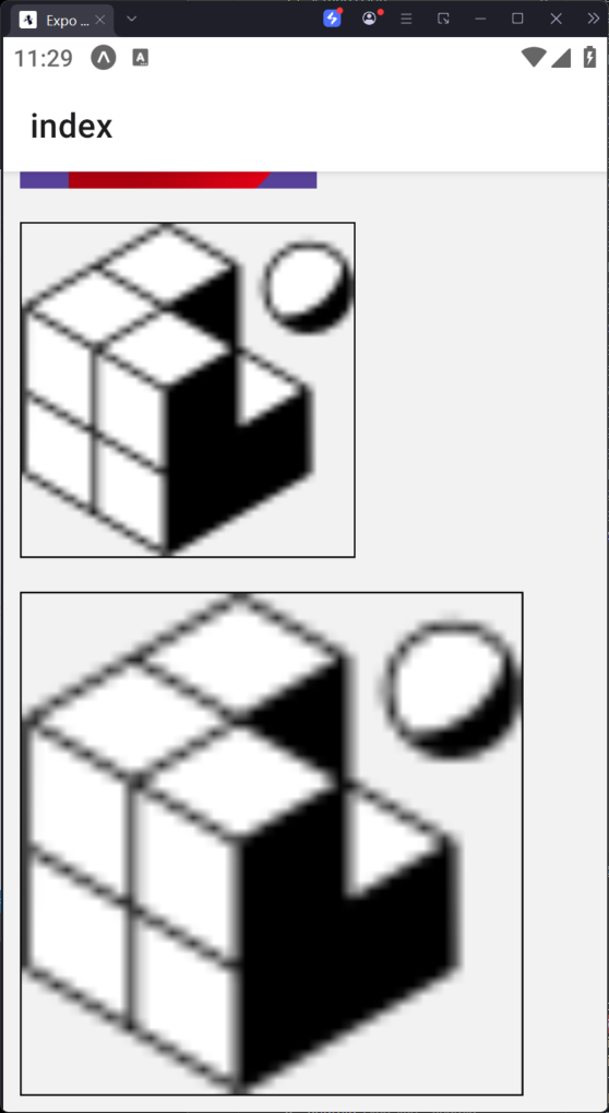
图片组件
import { Text, View, StyleSheet, Image, ScrollView } from 'react-native';
import React from 'react';
export default class Index extends React.Component {
render() {
return (
<ScrollView>
{/* 普通图片设置(修正路径和 require 语法) */}
<Image
style={{ margin: 10, width: 200, height: 200, resizeMode: 'contain', borderWidth: 1, borderColor: '#000' }}
source={require('../assets/images/favicon.png')}
/>
{/* 网络图片设置(修正组件名大小写) */}
<Image
style={{ margin: 10, width: 177, height: 100 }}
source={{ uri: 'https://qhglhh.oss-cn-beijing.aliyuncs.com/05521404-406b-433f-b871-54350f9dd611.png' }}
/>
{/* 图片显示模式:contain(正常等比例缩放) */}
<Image
style={{ margin: 10, width: 200, height: 200, resizeMode: 'contain', borderWidth: 1, borderColor: '#000' }}
source={require('../assets/images/favicon.png')}
/>
{/* 图片显示模式:stretch(覆盖填充,可能变形) */}
<Image
style={{ margin: 10, width: 300, height:300, resizeMode: 'stretch', borderWidth: 1, borderColor: '#000' }}
source={require('../assets/images/favicon.png')}
/>
</ScrollView>
);
}
}
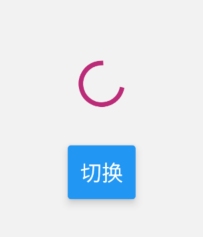
加载组件-活动指示器
import React from 'react';
import {
View,
StyleSheet,
ActivityIndicator,
Button
} from 'react-native';
export default class Index extends React.Component {
state = { animating: true };
closeActivityIndicator = () => {
this.setState(prevState => ({ animating: !prevState.animating }));
};
componentDidMount() {
this.closeActivityIndicator();
}
render() {
const { animating } = this.state;
return (
<View style={styles.container}>
<ActivityIndicator
animating={animating}
color="#bc2b78"
size="large"
style={styles.activityIndicator}
/>
<Button
title="切换"
onPress={this.closeActivityIndicator}
/>
</View>
);
}
}
const styles = StyleSheet.create({
container: {
flex: 1,
marginTop: 70,
alignItems: 'center',
justifyContent: 'center'
},
activityIndicator: {
height: 80
}
});
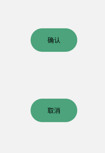
弹出框组件
import React from 'react';
import {
Text,
View,
StyleSheet,
Alert,
TouchableOpacity
} from 'react-native';
export default class Index extends React.Component {
showAlert1 = () => {
Alert.alert('弹出框1');
};
showTip = () => {
Alert.alert('删除数据成功');
};
showAlert2 = () => {
Alert.alert(
'警告',
'确定删除?',
[
{ text: '确认', onPress: this.showTip },
{ text: '取消', style: 'cancel' }
],
{ cancelable: false }
);
};
render() {
return (
<View style={{ alignItems: 'center' }}>
<TouchableOpacity onPress={this.showAlert1} style={styles.button}>
<Text>确认</Text>
</TouchableOpacity>
<TouchableOpacity onPress={this.showAlert2} style={styles.button}>
<Text>取消</Text>
</TouchableOpacity>
</View>
);
}
}
const styles = StyleSheet.create({
button: {
backgroundColor: '#4ba37b',
width: 100,
height: 50,
borderRadius: 50,
justifyContent: 'center',
alignItems: 'center',
marginTop: 100
}
});
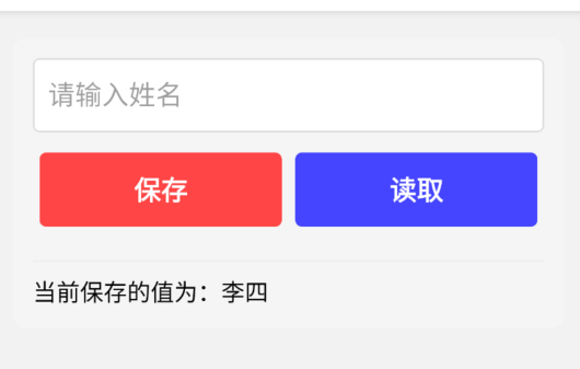
数据存储组件-AsyncStroage
需要提前安装组件
yarn add @react-native-async-storage/async-storage
类似于redux,实现跨组件数据共享
import React from 'react';
import {
Text,
View,
StyleSheet,
Alert,
TouchableOpacity,
TouchableHighlight,
TextInput
} from 'react-native';
import AsyncStorage from '@react-native-async-storage/async-storage';
export default class Index extends React.Component {
state = {
name: '李四', // 初始姓名
inputText: '' // 输入框内容(初始化为空更合理)
};
// 读取存储的姓名
async readName() {
try {
const value = await AsyncStorage.getItem('name');
if (value !== null) {
this.setState({ name: value });
Alert.alert('提示', '数据读取成功');
} else {
Alert.alert('提示', '没有找到保存的数据');
}
} catch (e) {
console.error('读取失败:', e);
Alert.alert('错误', '读取数据失败');
}
};
// 保存姓名到本地存储
setName = () => {
const { inputText } = this.state;
if (!inputText.trim()) { // 简单校验空输入
Alert.alert('提示', '请输入要保存的姓名');
return;
}
AsyncStorage.setItem('name', inputText) // 修复:使用正确的setItem方法
.then(() => {
this.setState({ name: inputText }); // 保存成功后更新显示
Alert.alert('提示', '保存成功');
})
.catch(e => {
console.error('保存失败:', e);
Alert.alert('错误', '保存数据失败');
});
};
render() {
const { name, inputText } = this.state;
return (
<View style={styles.container}>
{/* 输入框:修复value绑定,添加输入监听 */}
<TextInput
style={styles.textInput}
autoCapitalize="none" // 禁止自动首字母大写
placeholder="请输入姓名"
value={inputText} // 绑定输入内容
onChangeText={(text) => this.setState({ inputText: text })} // 实时更新输入状态
/>
{/* 操作按钮组 */}
<View style={styles.buttonGroup}>
<TouchableHighlight
style={[styles.button, styles.saveButton]}
onPress={this.setName}
underlayColor="#ff9999"
>
<Text style={styles.buttonText}>保存</Text>
</TouchableHighlight>
<TouchableHighlight
style={[styles.button, styles.readButton]}
onPress={this.readName.bind(this)}
underlayColor="#9999ff"
>
<Text style={styles.buttonText}>读取</Text>
</TouchableHighlight>
</View>
{/* 显示当前保存的值 */}
<View style={styles.tipContainer}>
<Text>当前保存的值为:{this.state.name}</Text>
</View>
</View>
);
}
}
const styles = StyleSheet.create({
container: {
margin: 16,
padding: 12,
backgroundColor: '#f5f5f5',
borderRadius: 8,
},
textInput: {
height: 44,
borderWidth: 1,
borderColor: '#ddd',
borderRadius: 4,
paddingHorizontal: 8,
marginBottom: 12,
fontSize: 16,
backgroundColor: 'white',
},
buttonGroup: {
flexDirection: 'row',
justifyContent: 'space-between',
marginBottom: 12,
},
button: {
flex: 1, // 平分宽度
height: 44,
borderRadius: 4,
justifyContent: 'center',
alignItems: 'center',
marginHorizontal: 4,
},
saveButton: {
backgroundColor: '#ff4444', // 更醒目的红色
},
readButton: {
backgroundColor: '#4444ff', // 更醒目的蓝色
},
buttonText: {
color: 'white',
fontSize: 16,
fontWeight: 'bold',
},
tipContainer: {
marginTop: 8,
paddingTop: 8,
borderTopWidth: 1,
borderTopColor: '#eee',
fontSize: 14,
color: '#666',
}
});
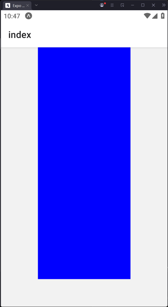
动画组件-Animated
import React from 'react';
import {
StyleSheet,
TouchableOpacity,
Animated
} from 'react-native';
export default class Index extends React.Component {
constructor(props){
super(props)
this.animatedWidth=new Animated.Value(50)
this.animatedHeight=new Animated.Value(100)
}
animatedBox=()=>{
//点击后,设置动画变化
Animated.timing(this.animatedWidth,{
toValue:200,
duration:1000,
useNativeDriver: false
}).start()
Animated.timing(this.animatedHeight,{
toValue:500,
duration:500,
useNativeDriver: false
}).start()
}
render() {
const animatedStyle={
width:this.animatedWidth,
height:this.animatedHeight
}
return (
<TouchableOpacity
style={styles.container}
onPress={this.animatedBox}
>
<Animated.View style={[styles.box,animatedStyle]}/>
</TouchableOpacity>
);
}
}
const styles=StyleSheet.create({
container:{
justifyContent:'center',
alignItems:'center'
},
box:{
backgroundColor:'blue',
}
})
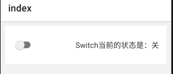
开关组件-Switch
import React from 'react';
import { Text, StyleSheet, View, Switch } from 'react-native'; // 补充必要组件导入
export default class Index extends React.Component {
constructor() {
super();
this.label = { false: '关', true: '开' };
this.state = {
switch1Value: true
};
}
toggleSwitch = (value) => {
this.setState({ switch1Value: value });
};
render() {
return (
<View style={styles.container}>
{/* 将开关和文本放在同一行容器中 */}
<View style={styles.switchWrapper}>
<Switch
onValueChange={this.toggleSwitch}
value={this.state.switch1Value}
trackColor={{ false: '#767577', true: '#81b0ff' }}
thumbColor="#f4f3f4"
/>
{/* 将状态文本移到Switch外部 */}
<Text style={styles.statusText}>
Switch当前的状态是:{this.label[this.state.switch1Value]}
</Text>
</View>
</View>
);
}
}
// 修复StyleSheet创建方法拼写错误
const styles = StyleSheet.create({
container: {
margin: 10,
padding: 16,
backgroundColor: '#fff',
},
switchWrapper: {
flexDirection: 'row', // 水平排列
alignItems: 'center', // 垂直居中
justifyContent: 'space-between', // 两端对齐
},
statusText: {
fontSize: 16,
color: '#333',
marginLeft: 12, // 与开关的间距
},
});
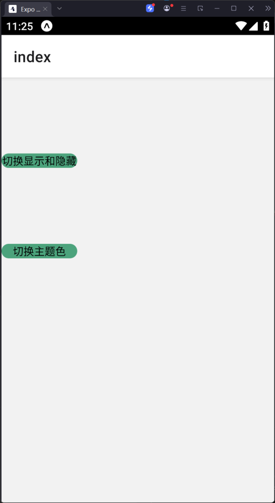
状态栏组件-StatuBar
import React from "react";
import {
Text,
StyleSheet,
View,
Switch,
StatusBar,
TouchableOpacity,
} from "react-native"; // 补充必要组件导入
export default class Index extends React.Component {
state = {
hidden: false,
barStyle: "default",
};
changeHidden = () => {
var hidden = this.state.hidden ? false : true;
this.setState({ hidden: hidden });
};
changeBarStyle = () => {
var barStyle =this.state.barStyle == "light-content" ? "dark-content" : "light-content";
this.setState({ barStyle: barStyle });
};
render() {
return (
<View>
<StatusBar barStyle={this.state.barStyle} hidden={this.state.hidden} />
<TouchableOpacity style={styles.button} onPress={this.changeHidden}>
<Text>切换显示和隐藏</Text>
</TouchableOpacity>
<TouchableOpacity style={styles.button} onPress={this.changeBarStyle}>
<Text>切换主题色</Text>
</TouchableOpacity>
</View>
);
}
}
const styles=StyleSheet.create({
button:{
backgroundColor:'#4ba37b',
width:100,
borderRadius:50,
alignItems:'center',
marginTop:100
}
})
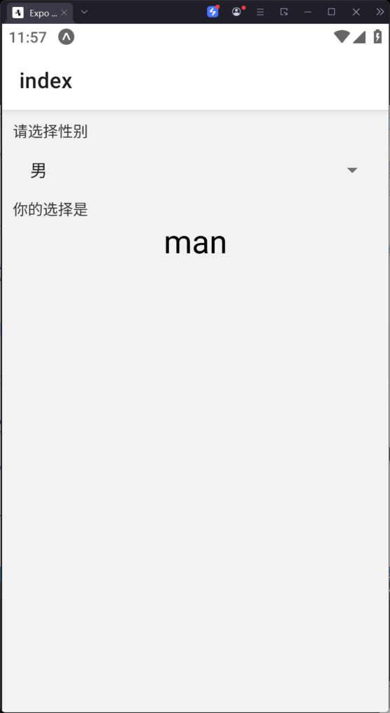
选择器组件-Picker
import React from "react";
import {
Text,
StyleSheet,
View,
} from "react-native";
import {Picker} from '@react-native-picker/picker';
export default class Index extends React.Component {
user = [
{ label: "请选择性别", value: "" },
{ label: "男", value: "man" },
{ label: "女", value: "woman" },
{ label: "其他", value: "other" },
];
state = { user: "" };
updateUser = (user) => {
this.setState({ user: user });
};
render() {
return (
<View style={styles.container}>
<Text style={styles.label}>请选择性别</Text>
<Picker selectedValue={this.state.user} onValueChange={this.updateUser}>
{
this.user.map((o,index)=>
<Picker.Item key={index} label={o.label} value={o.value}/>
)
}
</Picker>
<Text style={styles.label}>你的选择是</Text>
<Text style={styles.text}>{this.state.user}</Text>
</View>
);
}
}
const styles=StyleSheet.create({
container:{
margin:10
},
label:{
fontSize:14,
color:'#333333'
},
text:{
fontSize:30,
alignSelf:'center'
}
})
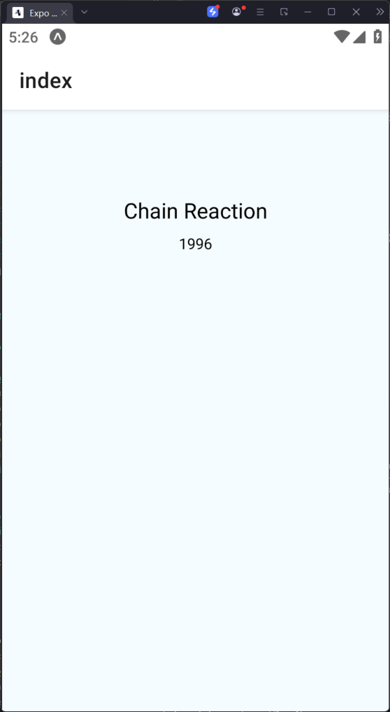
网络请求
import React from "react";
import {
Text,
StyleSheet,
View,
Image
} from "react-native";
const REQUEST_URL = "https://raw.githubusercontent.com/facebook/react-native/0.51-stable/docs/MoviesExample.json";
export default class Index extends React.Component {
constructor(props) {
super(props);
this.state = {
movies: null,
};
this.fetchData = this.fetchData.bind(this);
}
componentDidMount() {
this.fetchData();
}
fetchData() {
fetch(REQUEST_URL)
.then((response) => response.json())
.then((responseData) => {
this.setState({
movies: responseData.movies,
});
});
}
render() {
if (!this.state.movies) {
return this.renderLoadingView();
}
const movie = this.state.movies[0];
return this.renderMovie(movie);
}
renderLoadingView() {
return (
<View style={styles.container}>
<Text>loading...</Text>
</View>
);
}
renderMovie(movie) {
return (
<View style={styles.container}>
<Image
style={styles.thumbnail}
source={{ uri: movie.posters.thumbnail }}
/>
<View style={styles.rightContainer}>
<Text style={styles.title}>{movie.title}</Text>
<Text style={styles.year}>{movie.year}</Text>
</View>
</View>
);
}
}
const styles = StyleSheet.create({
container: {
flex: 1,
justifyContent: 'center',
alignItems: 'center',
backgroundColor: '#F5FCFF',
},
thumbnail: {
width: 100,
height: 80,
},
rightContainer: {
flex: 1,
},
title: {
fontSize: 20,
marginBottom: 8,
textAlign: 'center',
},
year: {
textAlign: 'center',
},
});