【Bootstrap V4系列】学习入门教程之 组件-表单(Forms)高级用法(二)
Bootstrap V4系列 学习入门教程之 组件-表单(Forms)高级用法(二)
- 表单(Forms)高级用法(二)
- 一、Help text 帮助文本
- 二、Disabled forms 禁用表单
- 三、Validation 验证
- 3.1 How it works
- 3.2 Custom styles 自定义样式
- 3.3 Browser defaults 浏览器默认值
- 3.4 Tooltips 工具提示
- 四、Custom forms 自定义表单
- 4.1 Checkboxes and radios 复选框和单选
- Checkboxes 复选框
- Radios 单选
- Inline 内联
- 4.2 Switches 开关
- 4.3 Select menu 选择菜单
表单(Forms)高级用法(二)
一、Help text 帮助文本
表单中的块级帮助文本可以使用.form-text 文本(以前在v3中称为.help-block块)创建。内联帮助文本可以使用任何内联HTML元素和实用程序类(如.text-muted)灵活实现。
将帮助文本与表单控件相关联
帮助文本应与使用
aria-descripted属性相关的表单控件显式关联。这将确保辅助技术(如屏幕阅读器)在用户聚焦或进入控件时宣布此帮助文本。
输入下方的帮助文本可以使用.form-text 文本设置样式。这个类包括display:block,并添加了一些上边距,以便与上面的输入间隔开。
这里是引用输入下方的帮助文本可以使用.form-text 文本设置样式。这个类包括display:block,并添加了一些上边距,以便与上面的输入间隔开。
<label for="inputPassword5">Password</label>
<input type="password" id="inputPassword5" class="form-control" aria-describedby="passwordHelpBlock">
<small id="passwordHelpBlock" class="form-text text-muted">Your password must be 8-20 characters long, contain letters and numbers.
</small>
页面展示效果:

内联文本可以使用任何典型的内联HTML元素(无论是<small>、<span>还是其他元素),只需要一个实用类。
<form class="form-inline"><div class="form-group"><label for="inputPassword6">Password</label><input type="password" id="inputPassword6" class="form-control mx-sm-3" aria-describedby="passwordHelpInline"><small id="passwordHelpInline" class="text-muted">Must be 8-20 characters long.</small></div>
</form>
页面展示效果:

二、Disabled forms 禁用表单
在输入上添加禁用的布尔属性,以防止用户交互并使其看起来更轻。
<input class="form-control" id="disabledInput" type="text" placeholder="Disabled input here..." disabled>
页面展示效果:

将disabled属性添加到<fieldset>中,以禁用其中的所有控件。
<form><fieldset disabled>...</fieldset>
</form>
三、Validation 验证
通过HTML5表单验证为您的用户提供有价值的、可操作的反馈——可在我们所有支持的浏览器中使用。从浏览器默认验证反馈中进行选择,或使用我们的内置类和启动器JavaScript实现自定义消息。
3.1 How it works
以下是表单验证与Bootstrap的工作原理:
- HTML表单验证是通过CSS的两个伪类应用的
:invalid和:valid。它适用于<input>、<select>和<textarea>元素。 - Bootstrap将
:invalid和:valid样式的作用域限定为父级.was-validated验证类,通常应用于<form>。否则,任何没有值的必填字段在页面加载时都会显示为无效。这样,您可以选择何时激活它们(通常在尝试提交表单后)。 - 要重置表单的外观(例如,在使用AJAX的动态表单提交的情况下),请在提交后再次从
<form>中删除.was-validated验证类。
3.2 Custom styles 自定义样式
对于自定义Bootstrap表单验证消息,您需要将novalidate布尔属性添加到<form>中。这将禁用浏览器默认反馈工具提示,但仍提供对JavaScript中表单验证API的访问。请尝试提交以下表格;我们的JavaScript将拦截提交按钮并将反馈传递给您。尝试提交时,您将看到:invalid和:valid样式应用于表单控件。
自定义反馈样式应用自定义颜色、边框、焦点样式和背景图标,以更好地传达反馈。<select>s的背景图标仅在.custom-select中可用,而在.form-control 控件中不可用。
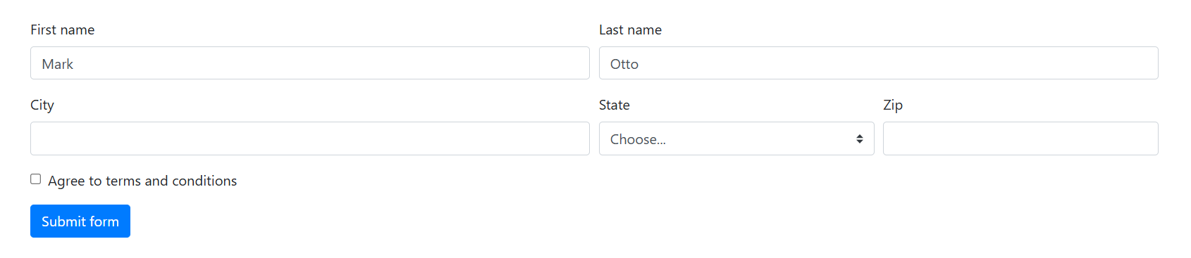
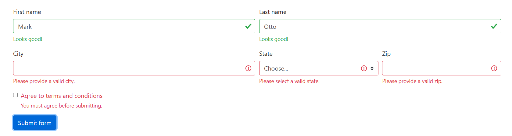
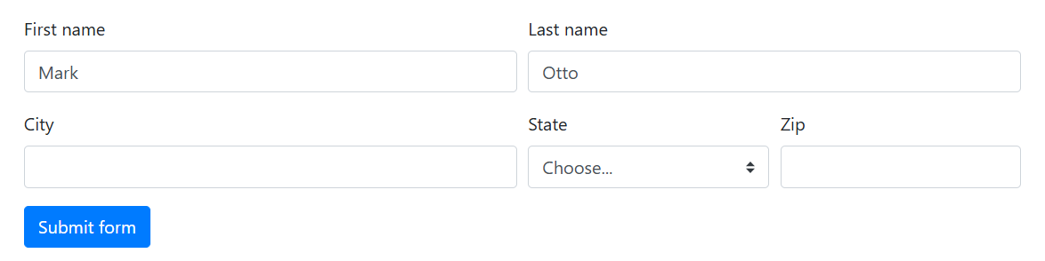
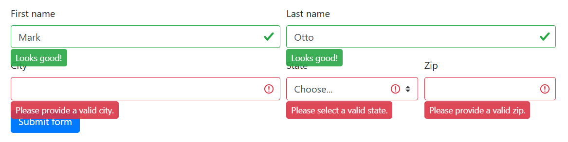
<form class="needs-validation" novalidate><div class="form-row"><div class="col-md-6 mb-3"><label for="validationCustom01">First name</label><input type="text" class="form-control" id="validationCustom01" value="Mark" required><div class="valid-feedback">Looks good!</div></div><div class="col-md-6 mb-3"><label for="validationCustom02">Last name</label><input type="text" class="form-control" id="validationCustom02" value="Otto" required><div class="valid-feedback">Looks good!</div></div></div><div class="form-row"><div class="col-md-6 mb-3"><label for="validationCustom03">City</label><input type="text" class="form-control" id="validationCustom03" required><div class="invalid-feedback">Please provide a valid city.</div></div><div class="col-md-3 mb-3"><label for="validationCustom04">State</label><select class="custom-select" id="validationCustom04" required><option selected disabled value="">Choose...</option><option>...</option></select><div class="invalid-feedback">Please select a valid state.</div></div><div class="col-md-3 mb-3"><label for="validationCustom05">Zip</label><input type="text" class="form-control" id="validationCustom05" required><div class="invalid-feedback">Please provide a valid zip.</div></div></div><div class="form-group"><div class="form-check"><input class="form-check-input" type="checkbox" value="" id="invalidCheck" required><label class="form-check-label" for="invalidCheck">Agree to terms and conditions</label><div class="invalid-feedback">You must agree before submitting.</div></div></div><button class="btn btn-primary" type="submit">Submit form</button>
</form><script>
// Example starter JavaScript for disabling form submissions if there are invalid fields
(function() {'use strict';window.addEventListener('load', function() {// Fetch all the forms we want to apply custom Bootstrap validation styles tovar forms = document.getElementsByClassName('needs-validation');// Loop over them and prevent submissionvar validation = Array.prototype.filter.call(forms, function(form) {form.addEventListener('submit', function(event) {if (form.checkValidity() === false) {event.preventDefault();event.stopPropagation();}form.classList.add('was-validated');}, false);});}, false);
})();
</script>
页面展示效果:
点击表单提交时触发表单验证,页面展示效果:
3.3 Browser defaults 浏览器默认值
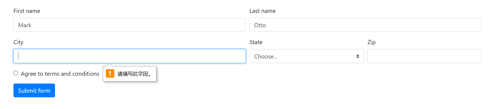
对自定义验证反馈消息或编写JavaScript来更改表单行为不感兴趣?很好,您可以使用浏览器默认设置。请尝试提交下面的表格。根据您的浏览器和操作系统,您将看到略有不同的反馈风格。
虽然这些反馈样式不能使用CSS设置样式,但您仍然可以通过JavaScript自定义反馈文本。
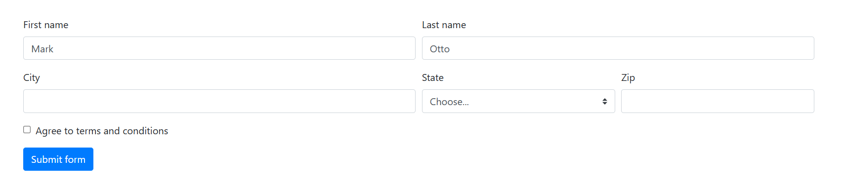
<form><div class="form-row"><div class="col-md-6 mb-3"><label for="validationDefault01">First name</label><input type="text" class="form-control" id="validationDefault01" value="Mark" required></div><div class="col-md-6 mb-3"><label for="validationDefault02">Last name</label><input type="text" class="form-control" id="validationDefault02" value="Otto" required></div></div><div class="form-row"><div class="col-md-6 mb-3"><label for="validationDefault03">City</label><input type="text" class="form-control" id="validationDefault03" required></div><div class="col-md-3 mb-3"><label for="validationDefault04">State</label><select class="custom-select" id="validationDefault04" required><option selected disabled value="">Choose...</option><option>...</option></select></div><div class="col-md-3 mb-3"><label for="validationDefault05">Zip</label><input type="text" class="form-control" id="validationDefault05" required></div></div><div class="form-group"><div class="form-check"><input class="form-check-input" type="checkbox" value="" id="invalidCheck2" required><label class="form-check-label" for="invalidCheck2">Agree to terms and conditions</label></div></div><button class="btn btn-primary" type="submit">Submit form</button>
</form>
页面展示效果:
点击表单提交时触发表单验证,页面展示效果:
3.4 Tooltips 工具提示
如果您的表单布局允许,您可以交换。{valid | invalid}-feedback 的反馈类。{valid|invalid}-tooltip 工具提示类,用于在样式化的工具提示中显示验证反馈。确保有一个带有position:relative的父级,以便工具提示定位。在下面的示例中,我们的列类已经有了这个,但您的项目可能需要另一种设置。
<form class="needs-validation" novalidate><div class="form-row"><div class="col-md-6 mb-3"><label for="validationTooltip01">First name</label><input type="text" class="form-control" id="validationTooltip01" value="Mark" required><div class="valid-tooltip">Looks good!</div></div><div class="col-md-6 mb-3"><label for="validationTooltip02">Last name</label><input type="text" class="form-control" id="validationTooltip02" value="Otto" required><div class="valid-tooltip">Looks good!</div></div></div><div class="form-row"><div class="col-md-6 mb-3"><label for="validationTooltip03">City</label><input type="text" class="form-control" id="validationTooltip03" required><div class="invalid-tooltip">Please provide a valid city.</div></div><div class="col-md-3 mb-3"><label for="validationTooltip04">State</label><select class="custom-select" id="validationTooltip04" required><option selected disabled value="">Choose...</option><option>...</option></select><div class="invalid-tooltip">Please select a valid state.</div></div><div class="col-md-3 mb-3"><label for="validationTooltip05">Zip</label><input type="text" class="form-control" id="validationTooltip05" required><div class="invalid-tooltip">Please provide a valid zip.</div></div></div><button class="btn btn-primary" type="submit">Submit form</button>
</form>
页面展示效果:
点击表单提交时触发表单验证,页面展示效果:
四、Custom forms 自定义表单
为了实现更多的自定义和跨浏览器一致性,请使用我们完全自定义的表单元素来替换浏览器默认值。它们建立在语义和可访问标记之上,因此它们是任何默认表单控件的可靠替代品。
4.1 Checkboxes and radios 复选框和单选
每个复选框和单选<input>和<label>配对都被包装在一个<div>中,以创建我们的自定义控件。从结构上讲,这与我们的默认.form-check检查方法相同。
Checkboxes 复选框
<div class="custom-control custom-checkbox"><input type="checkbox" class="custom-control-input" id="customCheck1"><label class="custom-control-label" for="customCheck1">Check this custom checkbox</label>
</div>
页面展示效果:

Radios 单选
<div class="custom-control custom-radio"><input type="radio" id="customRadio1" name="customRadio" class="custom-control-input"><label class="custom-control-label" for="customRadio1">Toggle this custom radio</label>
</div>
<div class="custom-control custom-radio"><input type="radio" id="customRadio2" name="customRadio" class="custom-control-input"><label class="custom-control-label" for="customRadio2">Or toggle this other custom radio</label>
</div>
页面展示效果:

Inline 内联
<div class="custom-control custom-radio custom-control-inline">...
</div>
页面展示效果:

4.2 Switches 开关
开关具有自定义复选框的标记,但使用.custom-switch 开关类来呈现切换开关。开关还支持disabled属性。
<div class="custom-control custom-switch"><input type="checkbox" class="custom-control-input" id="customSwitch1"><label class="custom-control-label" for="customSwitch1">Toggle this switch element</label>
</div>
<div class="custom-control custom-switch"><input type="checkbox" class="custom-control-input" disabled id="customSwitch2"><label class="custom-control-label" for="customSwitch2">Disabled switch element</label>
</div>
页面展示效果:

4.3 Select menu 选择菜单
自定义<select>菜单只需要一个自定义类,.custom-select即可触发自定义样式。自定义样式仅限于<select>的初始外观,由于浏览器的限制,无法修改<options>。
<select class="custom-select"><option selected>Open this select menu</option><option value="1">One</option><option value="2">Two</option><option value="3">Three</option>
</select>
页面展示效果:
