UI框架-通知组件
UI框架-通知组件
介绍
一个基于 Vue 3 的轻量级通知组件库,提供了丰富的消息通知功能。支持多种通知类型、自定义样式、进度条显示等特性。
特性
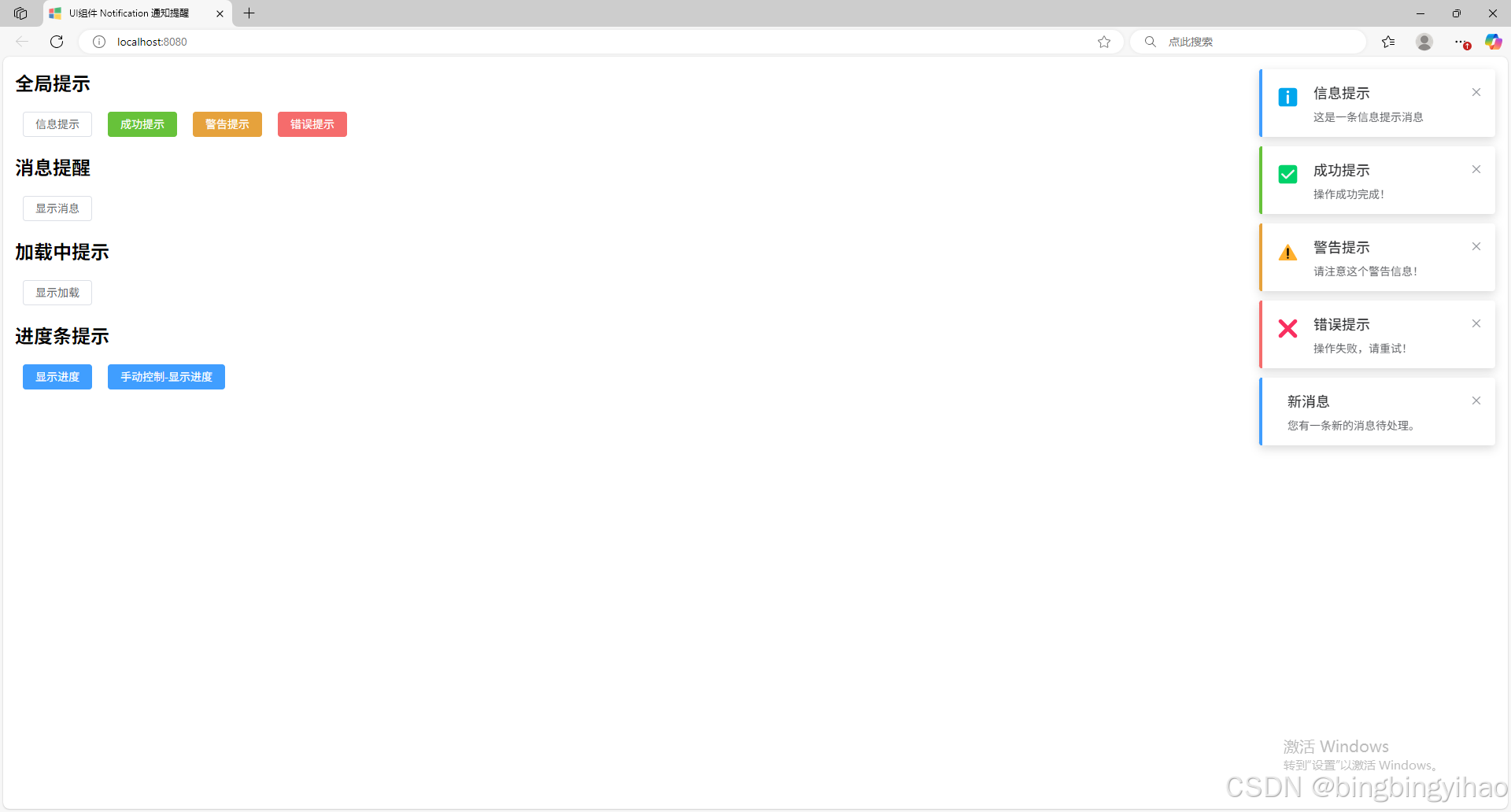
- 🎨 支持多种通知类型:信息、成功、警告、错误
- ⏳ 支持进度条显示
- 🔄 支持加载中状态
- ⚙️ 可自定义显示时长
- 🎯 支持手动关闭
- 💫 优雅的动画效果
- 📱 响应式设计
安装
npm install bbyh-ui-notifaction
使用方法
基础用法
import { showNotification } from 'bbyh-ui-notifaction'// 显示基础通知
showNotification({type: 'info',title: '提示',message: '这是一条消息通知'
})
不同类型
// 成功提示
showNotification({type: 'success',title: '成功',message: '操作成功完成!',icon: '✅'
})// 警告提示
showNotification({type: 'warning',title: '警告',message: '请注意这个警告信息!',icon: '⚠️'
})// 错误提示
showNotification({type: 'error',title: '错误',message: '操作失败,请重试!',icon: '❌'
})
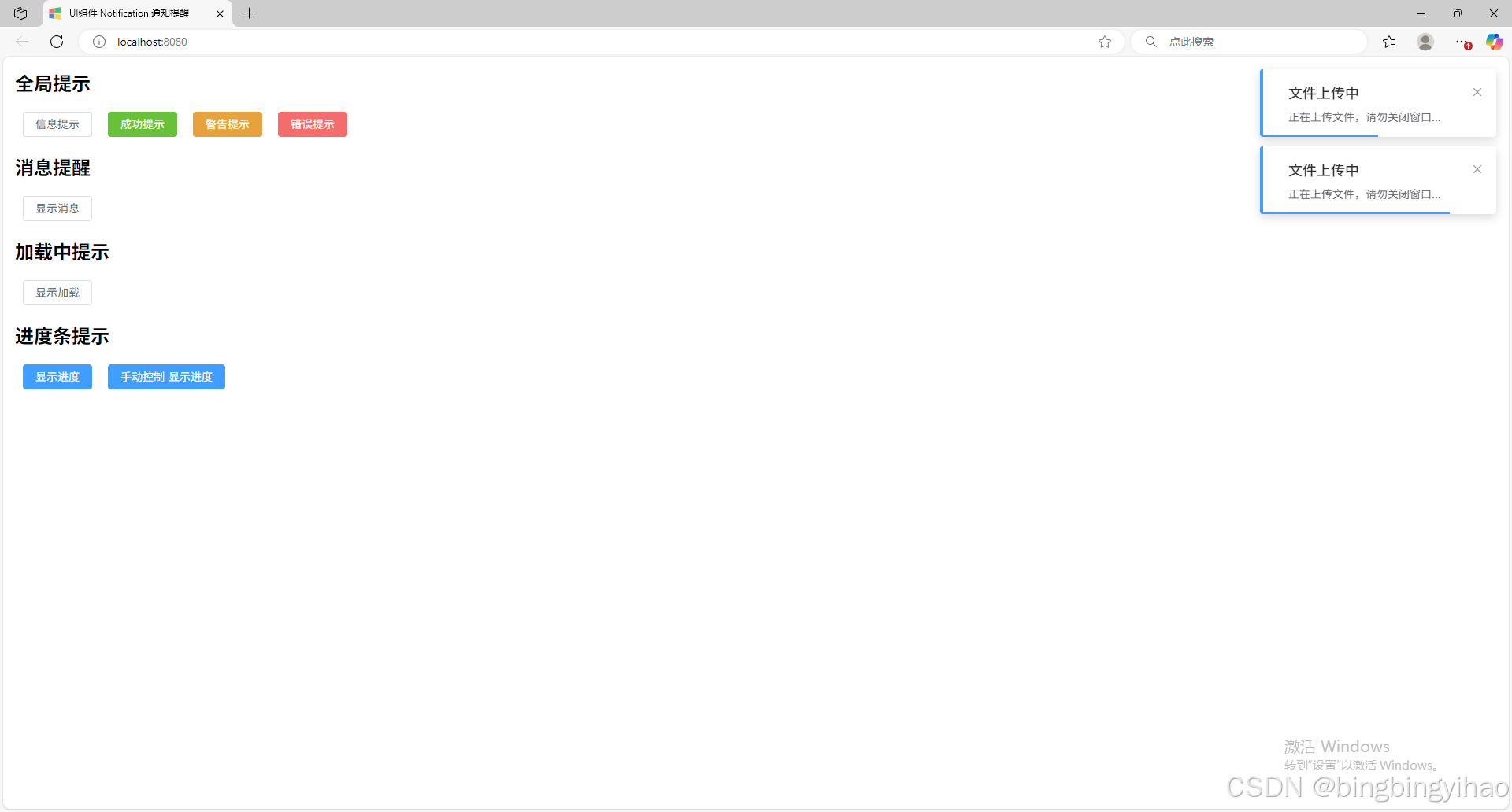
进度条
showNotification({type: 'info',title: '文件上传中',message: '正在上传文件,请勿关闭窗口...',progress: true,duration: 5000
})
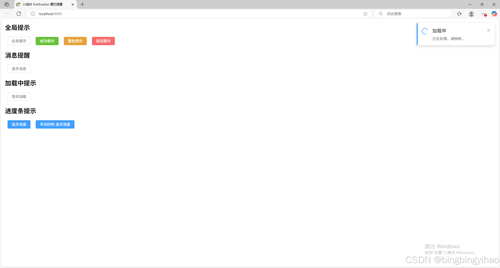
加载中状态
const notification = showNotification({type: 'info',title: '加载中',message: '正在处理,请稍候...',loading: true,duration: 0
})// 手动关闭
setTimeout(() => {notification.close()
}, 3000)
API
Options
| 参数 | 说明 | 类型 | 默认值 |
|---|---|---|---|
| type | 通知类型 | ‘info’ | ‘success’ | ‘warning’ | ‘error’ | ‘info’ |
| title | 标题 | string | - |
| message | 消息内容 | string | - |
| duration | 显示时间(毫秒),设为 0 则不会自动关闭 | number | 4500 |
| icon | 自定义图标 | string | null |
| progress | 是否显示进度条 | boolean | false |
| loading | 是否显示加载动画 | boolean | false |
| controlProgress | 是否手动控制进度 | boolean | false |
| progressValue | 进度条初始值 | number | 100 |
方法
| 方法名 | 说明 | 参数 |
|---|---|---|
| close | 关闭当前通知 | - |
| setProgress | 设置进度条值 | value: number |
源码下载
UI框架-通知组件
npm仓库
UI框架-通知组件
核心代码
code/src/components/Notification.vue
<template><div class="ui-notification" :class="['ui-notification--' + type, { 'is-closing': closing }]" ref="notification"><div class="ui-notification__icon"><span v-if="icon">{{ icon }}</span><span v-else-if="loading" class="ui-notification__loading"></span></div><div class="ui-notification__content"><h4 class="ui-notification__title">{{ title }}</h4><p class="ui-notification__message">{{ message }}</p></div><span class="ui-notification__close" @click="close">×</span><div v-if="progress" class="ui-notification__progress" :style="{ width: progressWidth + '%' }"></div></div>
</template><script setup>
import {defineExpose, defineProps, onMounted, ref} from "vue";const props = defineProps({type: {type: String,default: "info",},title: {type: String,required: true,},message: {type: String,required: true,},icon: {type: String,default: null,},duration: {type: Number,default: 4500,},progress: {type: Boolean,default: false,},controlProgress: {type: Boolean,default: false,},progressValue: {type: Number,default: 100,},loading: {type: Boolean,default: false,},
});const notification = ref();
const closing = ref(false);
const progressWidth = ref(props.progressValue);onMounted(() => {if (props.controlProgress) {if (props.progress) {if (props.duration > 0) {const interval = setInterval(() => {progressWidth.value -= 1;if (progressWidth.value <= 0) {clearInterval(interval);}}, props.duration / 100);}}} else {if (props.duration > 0) {setTimeout(() => close(), props.duration);}if (props.progress) {const interval = setInterval(() => {progressWidth.value -= 1;if (progressWidth.value <= 0) {clearInterval(interval);close();}}, props.duration / 100);}}
});function close() {closing.value = true;setTimeout(() => {notification.value.parentElement.remove();}, 300);
}function setProgress(value) {progressWidth.value = value;
}defineExpose({close,setProgress
});
</script><style>
/* 定义根变量 */
:root {/* 主题色 */--primary-color: #409eff;--success-color: #67c23a;--warning-color: #e6a23c;--danger-color: #f56c6c;--info-color: #909399;--error-color: #f56c6c;/* 文字颜色 */--text-primary: #303133;--text-regular: #606266;--text-secondary: #909399;--text-placeholder: #c0c4cc;/* 边框颜色 */--border-color: #dcdfe6;--border-light: #e4e7ed;--border-lighter: #ebeef5;/* 背景颜色 */--background-color: #ffffff;--background-hover: #f5f7fa;/* 字体大小 */--font-size-large: 18px;--font-size-medium: 16px;--font-size-base: 14px;--font-size-small: 13px;--font-size-mini: 12px;/* 边框圆角 */--border-radius-base: 4px;--border-radius-small: 2px;--border-radius-round: 20px;--border-radius-circle: 100%;
}/* 通知容器 */
.ui-notification-container {position: fixed;z-index: 9999;display: flex;flex-direction: column;gap: 12px;padding: 16px;
}.ui-notification-container--top-right {top: 0;right: 0;
}.ui-notification-container--top-left {top: 0;left: 0;
}.ui-notification-container--bottom-right {bottom: 0;right: 0;
}.ui-notification-container--bottom-left {bottom: 0;left: 0;
}/* 通知项 */
.ui-notification {min-width: 300px;max-width: 400px;padding: 16px;border-radius: var(--border-radius-base);background-color: var(--background-color);box-shadow: 0 4px 12px rgba(0, 0, 0, 0.15);display: flex;align-items: flex-start;position: relative;animation: notification-in 0.3s ease-out;
}.ui-notification.is-closing {animation: notification-out 0.3s ease-in forwards;
}/* 通知类型样式 */
.ui-notification--info {border-left: 4px solid var(--primary-color);
}.ui-notification--success {border-left: 4px solid var(--success-color);
}.ui-notification--warning {border-left: 4px solid var(--warning-color);
}.ui-notification--error {border-left: 4px solid var(--error-color);
}/* 通知图标 */
.ui-notification__icon {margin-right: 16px;font-size: 24px;
}.ui-notification--info .ui-notification__icon {color: var(--primary-color);
}.ui-notification--success .ui-notification__icon {color: var(--success-color);
}.ui-notification--warning .ui-notification__icon {color: var(--warning-color);
}.ui-notification--error .ui-notification__icon {color: var(--error-color);
}/* 通知内容 */
.ui-notification__content {flex: 1;
}.ui-notification__title {font-size: var(--font-size-large);font-weight: 500;margin: 0 0 8px;color: var(--text-primary);
}.ui-notification__message {font-size: var(--font-size-base);color: var(--text-regular);margin: 0;
}/* 关闭按钮 */
.ui-notification__close {position: absolute;top: 16px;right: 16px;font-size: 16px;color: var(--text-secondary);cursor: pointer;transition: color 0.3s;
}.ui-notification__close:hover {color: var(--text-regular);
}/* 进度条 */
.ui-notification__progress {position: absolute;bottom: 0;left: 0;height: 2px;background-color: var(--primary-color);transition: width 0.3s linear;
}/* 动画 */
@keyframes notification-in {from {transform: translateX(100%);opacity: 0;}to {transform: translateX(0);opacity: 1;}
}@keyframes notification-out {from {transform: translateX(0);opacity: 1;}to {transform: translateX(100%);opacity: 0;}
}/* 加载中动画 */
.ui-notification__loading {display: inline-block;width: 24px;height: 24px;border: 2px solid currentColor;border-top-color: transparent;border-radius: 50%;animation: notification-loading 0.8s infinite linear;
}@keyframes notification-loading {to {transform: rotate(360deg);}
}
</style>
code/src/components/NotificationManager.js
import {createApp} from "vue";
import Notification from "./Notification.vue";let container;function getContainer() {if (!container) {container = document.createElement("div");container.className = "ui-notification-container ui-notification-container--top-right";document.body.appendChild(container);}return container;
}export function showNotification(options) {const app = createApp(Notification, options);const wrapper = document.createElement("div");app.mount(wrapper);getContainer().appendChild(wrapper);return app._instance.exposed;
}
效果展示
示例页面
普通消息提示
加载消息提示
进度消息提示