在React 中安装和配置 shadcn/ui
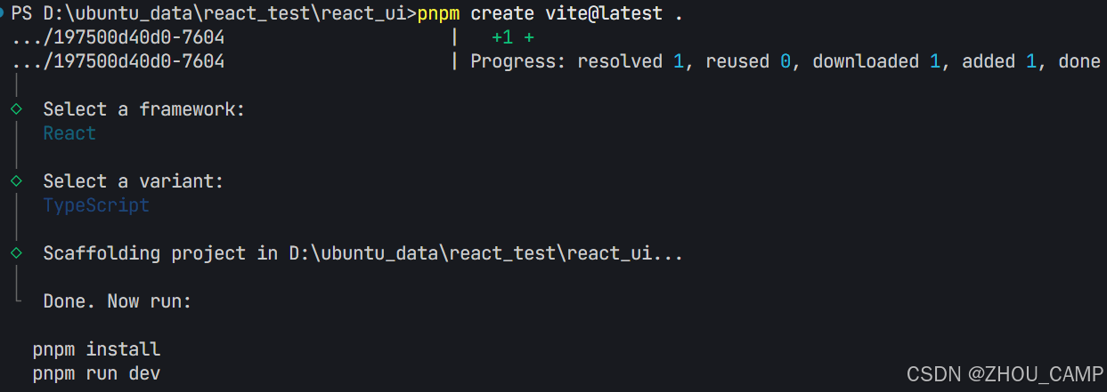
1. 创建 React 项目
pnpm create vite@latest .
- 选择模板:
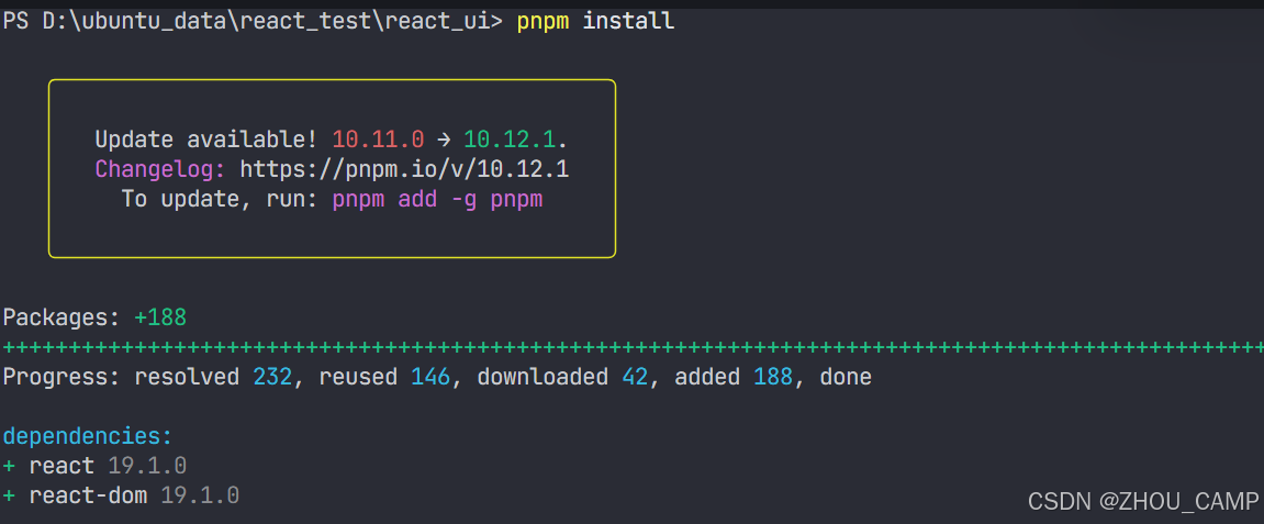
React + TypeScript - 安装依赖:
pnpm install
2. 添加 Tailwind CSS
pnpm add -D tailwindcss postcss autoprefixer
- 修改
src/index.css内容:
@import "tailwindcss";
3. 配置 TypeScript 路径别名
修改 tsconfig.json:
{"compilerOptions": {"baseUrl": ".","paths": {"@/*": ["./src/*"]}},"files": [],"references": [{ "path": "./tsconfig.app.json" },{ "path": "./tsconfig.node.json" }]
}
修改 tsconfig.app.json:
{"compilerOptions": {"baseUrl": ".","paths": {"@/*": ["./src/*"]}},// ...其他配置
}
4. 配置 Vite 路径别名
- 安装依赖:
pnpm add -D @types/node - 修改
vite.config.ts:import path from "path"import tailwindcss from "@tailwindcss/vite"import react from "@vitejs/plugin-react"import { defineConfig } from "vite"// https://vite.dev/config/export default defineConfig({plugins: [react(), tailwindcss()],resolve: {alias: {"@": path.resolve(__dirname, "./src"),},},})
5. 初始化 shadcn/ui
pnpm dlx shadcn@latest init
- 按提示配置:

6. 添加并使用组件
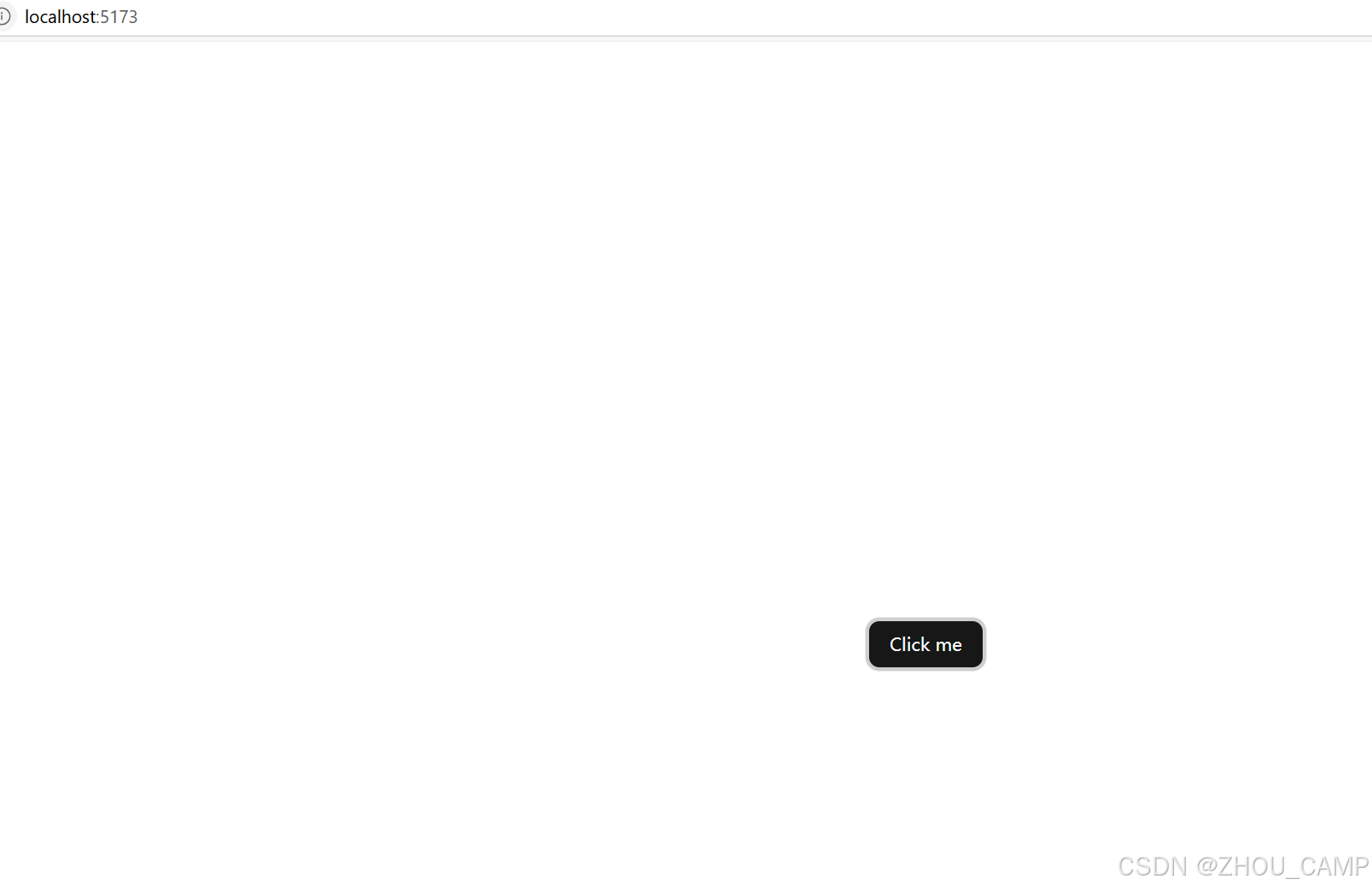
- 添加 Button 组件:
pnpm dlx shadcn@latest add button - 在
src/App.tsx中使用:import { Button } from "@/components/ui/button";function App() {return (<div className="flex min-h-screen items-center justify-center"><Button>click me </Button></div>); } export default App;
7. 启动开发服务器
pnpm run dev
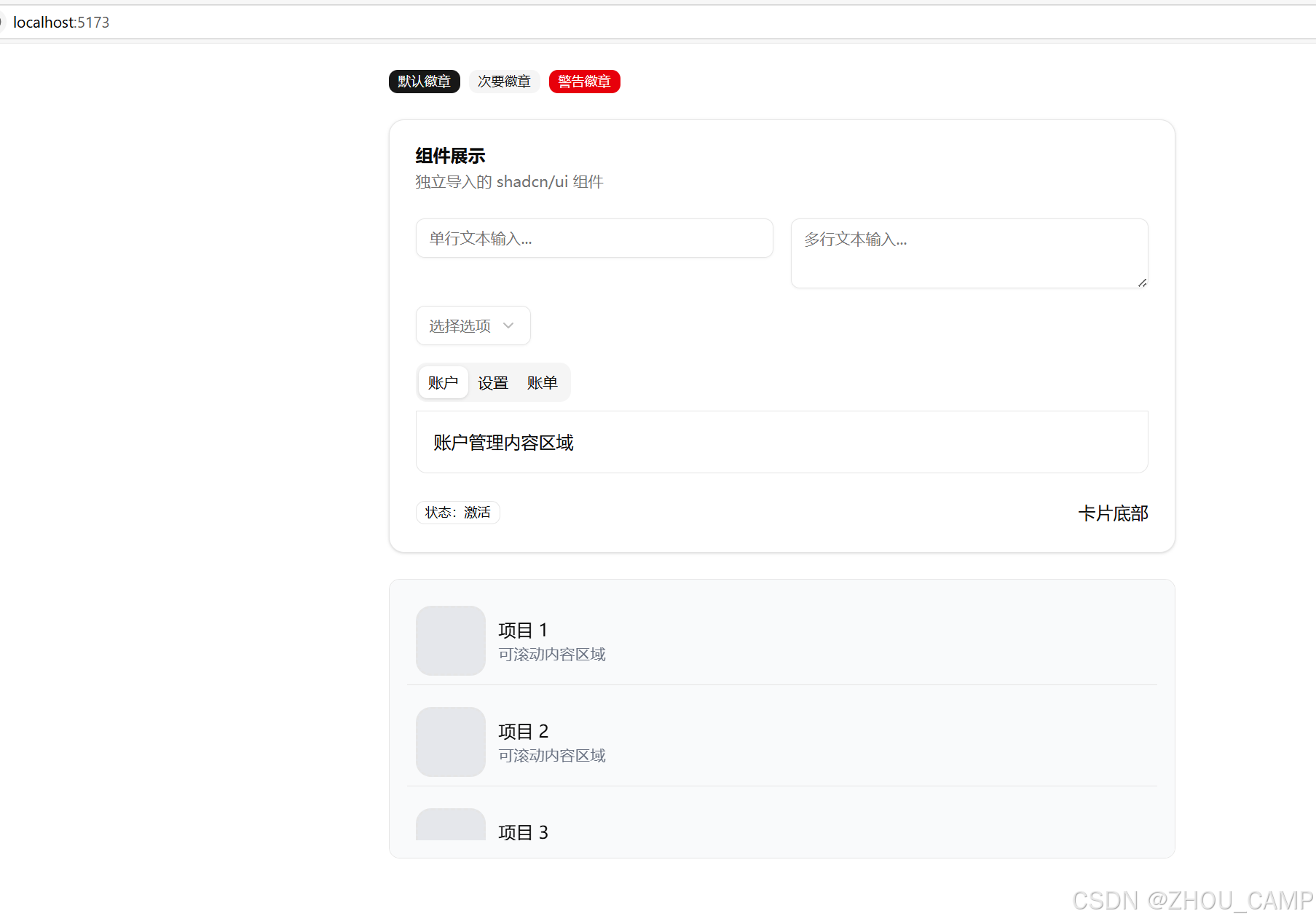
更多组件
安装命令(除 button 外)
pnpm dlx shadcn@latest add badge card input scroll-area select tabs textarea
完整使用示例
// 导入所有组件
import { Badge } from "@/components/ui/badge"
import { Card, CardHeader, CardTitle, CardDescription, CardContent, CardFooter
} from "@/components/ui/card"
import { Input } from "@/components/ui/input"
import { ScrollArea } from "@/components/ui/scroll-area"
import { Select, SelectTrigger, SelectValue, SelectContent, SelectItem
} from "@/components/ui/select"
import { Tabs, TabsList, TabsTrigger, TabsContent
} from "@/components/ui/tabs"
import { Textarea } from "@/components/ui/textarea"function App() {return (<div className="max-w-3xl mx-auto p-6">{/* Badge */}<div className="mb-6 flex gap-2"><Badge>默认徽章</Badge><Badge variant="secondary">次要徽章</Badge><Badge variant="destructive">警告徽章</Badge></div>{/* Card */}<Card className="mb-6"><CardHeader><CardTitle>组件展示</CardTitle><CardDescription>独立导入的 shadcn/ui 组件</CardDescription></CardHeader><CardContent>{/* Input & Textarea */}<div className="grid md:grid-cols-2 gap-4 mb-4"><div><Input placeholder="单行文本输入..." /></div><div><Textarea placeholder="多行文本输入..." rows={3} /></div></div>{/* Select */}<div className="mb-4"><Select><SelectTrigger><SelectValue placeholder="选择选项" /></SelectTrigger><SelectContent><SelectItem value="option1">选项一</SelectItem><SelectItem value="option2">选项二</SelectItem><SelectItem value="option3">选项三</SelectItem></SelectContent></Select></div>{/* Tabs */}<Tabs defaultValue="account"><TabsList><TabsTrigger value="account">账户</TabsTrigger><TabsTrigger value="settings">设置</TabsTrigger><TabsTrigger value="billing">账单</TabsTrigger></TabsList><TabsContent value="account" className="p-4 border rounded-b-lg"><p>账户管理内容区域</p></TabsContent><TabsContent value="settings" className="p-4 border rounded-b-lg"><p>系统设置内容区域</p></TabsContent><TabsContent value="billing" className="p-4 border rounded-b-lg"><p>账单信息内容区域</p></TabsContent></Tabs></CardContent><CardFooter className="flex justify-between"><Badge variant="outline">状态:激活</Badge><span>卡片底部</span></CardFooter></Card>{/* Scroll Area */}<div className="h-64 border rounded-lg overflow-hidden"><ScrollArea className="h-full p-4 bg-gray-50"><div className="space-y-3">{[...Array(50)].map((_, i) => (<div key={i} className="flex items-center gap-3 p-2 border-b"><div className="bg-gray-200 border-2 border-dashed rounded-xl w-16 h-16" /><div><p className="font-medium">项目 {i + 1}</p><p className="text-sm text-gray-500">可滚动内容区域</p></div></div>))}</div></ScrollArea></div></div>)
}
export default App
启动
pnpm run dev
参考链接:https://ui.shadcn.com/docs/