Flutter 顶部导航标签组件Tab + TabBar + TabController
Tab定义标题
TabBarView定义内容区域
TabController 控制切换
TabBar
| 属性 | 说明 |
|---|---|
| isScrollable | tab是否可滑动 |
| indicatorColor | 指示器的颜色 |
| indicatorWeight | 指示器的高度 |
| labelColor | 选中tab的颜色 |
| unselectedLabelColor | 选中tab的颜色 |
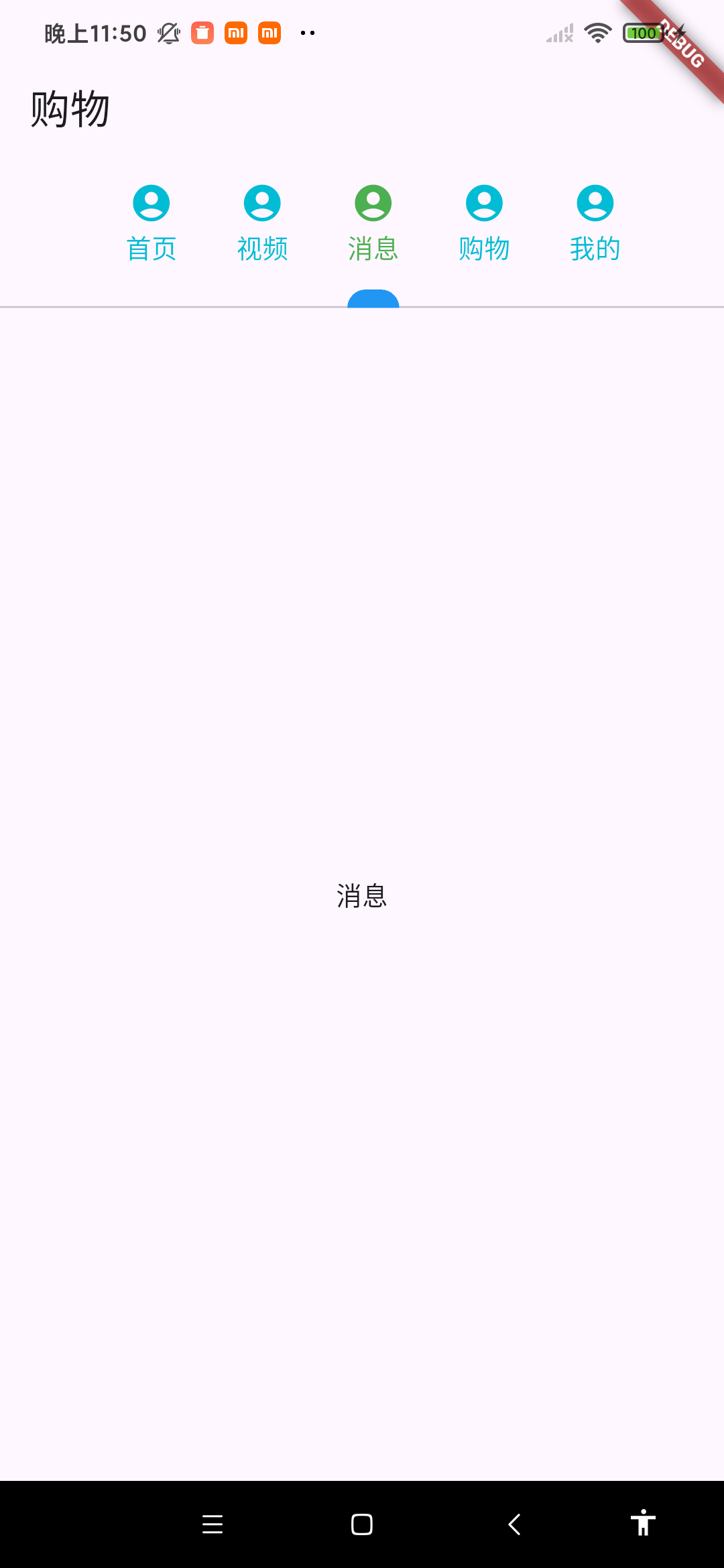
class MyState extends State {Widget build(BuildContext context) {TabBar tabBar = TabBar(unselectedLabelColor: Colors.cyan,labelColor: Colors.green ,indicatorColor: Colors.blue,indicatorWeight: 10,isScrollable: true,tabs: [Tab(icon: Icon(Icons.account_circle), text: "首页"),Tab(icon: Icon(Icons.account_circle), text: "视频"),Tab(icon: Icon(Icons.account_circle), text: "消息"),Tab(icon: Icon(Icons.account_circle), text: "购物"),Tab(icon: Icon(Icons.account_circle), text: "我的"),],);TabBarView tabBarView = TabBarView(children: [Center(child: Text("首页")),Center(child: Text("视频")),Center(child: Text("消息")),Center(child: Text("购物")),Center(child: Text("我的")),],);return DefaultTabController(length: 5,child: Scaffold(appBar: AppBar(title: Text("购物"), bottom: tabBar),body: tabBarView,),);}
}