tmagic-editor本地实践(2)
1.组合组件
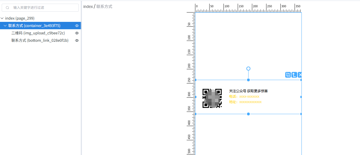
组合组件就是多个组件合成一个组件的形式,可以整体添加,但又支持对其中的单个组件进行配置和移除。添加组合组件后,图层如图所示。
在playground\src\configs下的组件配置文件里:
{title: '示例组件',items: [//单组件形式{icon: Tickets,text: '文本',type: 'text',},//组合组件{icon: ElementPlusIconsVue.Postcard,text: '组合组件',data: {name: '组合组件',type: 'container',style: {width: '100%',height: '120px',backgroundColor:'rgba(128, 128, 128, 0)'},items: [{type: '子组件1类型',style: {position: 'absolute',left: 15,top: 20,width: '80px',height: '80px',overflow: 'hidden',borderRadius: '8px',padding: '5px',background: 'white',},name: '子组件1名称',items: [//可以再嵌套子组件],src: '',file_max_number:1,file_size_limit:1,upload_type:[1],},{type: '子组件2类型',name: '子组件2名称',style: {position: 'absolute',left: 120,top: 30,},link1:'关注公众号 获取更多惊喜',link1_color:'#000000',link1_bottom:'',link2:'电话:xxxx-xxxxxxx',link2_color:'#FFD700',link2_bottom:'',link3:'地址:xxxxxxxxxxxxx',link3_color:'#FFD700',},]},},]
}
2.顶部菜单栏改造
修改playground\src\pages\Editor.vue中MenuBarData部分即可
3.左侧菜单栏改造

以新增左侧菜单为例,不新增只修改可直接看“3.5配置左侧菜单项”
3.1定义菜单项和菜单项所需要的数据类型
在packages\editor\src\type.ts中:
//定义新增的左侧菜单项枚举值
export enum SideItemKey {PAGE_COMPONENT='page-component-list',  //新增菜单项对应的枚举值COMPONENT_LIST = 'component-list',LAYER = 'layer',CODE_BLOCK = 'code-block',DATA_SOURCE = 'data-source',
} //定义菜单项所接受的数据类型
export interface ComponentGroupState {[key: string]: any; list: ComponentGroup[];page_list:ComponentGroup[];    //新增菜单项对应的数据类型;
}
packages\editor\src\services\componentList.ts
//定义新的数据项
private state = shallowReactive<ComponentGroupState>({list: [],page_list:[],    //新增项});
3.2定义菜单项配置
在playground\src\configs\路径下新建菜单项配置pageComponentGroupList.ts,内容可参考componentGroupList.ts
//pageComponentGroupList.ts
import * as ElementPlusIconsVue from '@element-plus/icons-vue'import type { ComponentGroup } from '@tmagic/editor';//菜单配置,可参考componentGroupList.ts
export default [{title: '菜单名称',    items: [{icon: ElementPlusIconsVue.Picture,    //图标text: '提示',                         //组件名称type: 'tip_box',                     //组件类型}],}
] as ComponentGroup[];
3.3读取菜单项配置
读取菜单项配置,在playground\src\pages\Editor.vue中:
//引入上一步的配置文件
import pageComponentGroupList from '../configs/pageComponentGroupList';//定义数据传递
<TMagicEditorv-model="value"ref="editor":menu="menu" //新增内容,注意命名格式,如pagecomponent-group-list,//数据项则为pagecomponentGroupList,小驼峰命名形式:pagecomponent-group-list="pageComponentGroupList"   略...
>
</TMagicEditor>
在packages\editor\src\editorProps.ts定义菜单项数据。
注意:与playground\src\pages\Editor.vue中的配置命名要对应,小驼峰命名形式
//定义左侧菜单项数据
export interface EditorProps {略...pagecomponentGroupList?: ComponentGroup[];   //新增项
}export const defaultEditorProps = {略...pagecomponentGroupList:()=>[],     //新增项
}
packages\editor\src\initService.ts
//监听数据配置
export const initServiceState = (props: EditorProps,{editorService,historyService,componentListService,propsService,eventsService,uiService,codeBlockService,keybindingService,dataSourceService,}: Services,
) => {略...//新增内容,与packages\editor\src\editorProps.ts中定义的命名要一致watch(() => props.pagecomponentGroupList,(pagecomponentGroupList) =>{if(pageComponentGroupList){componentListService.setListByType('page_list',pagecomponentGroupList);}},{immediate: true,},);
};
在packages\editor\src\Editor.vue接收配置数据
<template #sidebar><slot name="sidebar" :editorService="editorService"><Sidebar:data="sidebar":layer-content-menu="layerContentMenu":custom-content-menu="customContentMenu":indent="treeIndent":next-level-indent-increment="treeNextLevelIndentIncrement"> 略...//新增内容<template #page-component-list="{ pageComponentGroupList}"><slot name="component-list" :component-group-list="pageComponentGroupList"></slot></template></Sidebar></slot>
</template>
3.4新增对应的菜单项面板
在packages\editor\src\layouts\sidebar\下新建左侧菜单,如PageComponentListPanel.vue,内容参考ComponentListPanel.vue文件,仅变更里面的数据项名称
//这里的page_list是新增的数据项名称
const list = computed<ComponentGroup[]>(() =>(services?.componentListService.getListByType('page_list') || []).map((group: ComponentGroup) => ({...group,items: group.items.filter((item: ComponentItem) => item.text.includes(searchText.value)),})),
);
3.5配置左侧菜单项
修改packages\editor\src\layouts\sidebar\Sidebar.vue
//引入新增的左侧菜单
import PageComponentListPanel from './PageComponentListPanel.vue';//配置左侧菜单
const props = withDefaults(defineProps<{data?: SideBarData;layerContentMenu: (MenuButton | MenuComponent)[];indent?: number;nextLevelIndentIncrement?: number;customContentMenu: CustomContentMenuFunction;}>(),{data: () => ({type: 'tabs',status: '组件',//修改items,这里使用到之前新增的枚举值SideItemKey.PAGE_COMPONENTitems: [SideItemKey.COMPONENT_LIST, SideItemKey.LAYER, SideItemKey.CODE_BLOCK, SideItemKey.DATA_SOURCE,SideItemKey.PAGE_COMPONENT],}),},
);//配置菜单项的名称和图标等
const getItemConfig = (data: SideItem): SideComponent => {const map: Record<string, SideComponent> = { 略...,[SideItemKey.PAGE_COMPONENT]: {    //之前定义的枚举值SideItemKey.PAGE_COMPONENT$key: SideItemKey.PAGE_COMPONENT,type: 'component',icon: Tickets,text: '单页',component: PageComponentListPanel,    //引入的菜单文件PageComponentListPanel slots: {},},};
4.编辑区改造

4.1设备切换栏
playground\src\pages\Editor.vue
<!--设备切换栏  -->
<template #workspace-content><DeviceGroup ref="deviceGroup" v-model="stageRect"></DeviceGroup>
</template>
4.2编辑区底部操作栏
packages\editor\src\layouts\Framework.vue
<slot name="page-bar"><PageBar:disabled-page-fragment="disabledPageFragment":page-bar-sort-options="pageBarSortOptions":filter-function="pageFilterFunction"><template #page-bar-add-button><slot name="page-bar-add-button"></slot></template><template #page-bar-title="{ page }"><slot name="page-bar-title" :page="page"></slot></template><template #page-bar-popover="{ page }"><slot name="page-bar-popover" :page="page"></slot></template><template #page-list-popover="{ list }"><slot name="page-list-popover" :list="list"></slot></template></PageBar>
</slot>
5.右侧配置栏改造

5.1替换整个右侧配置栏
替换packages\editor\src\Editor.vue中PropsPanel的引用,即可用自定义组件实现右侧配置栏
<slot name="props-panel"><PropsPanel:extend-state="extendFormState":disabled-show-src="disabledShowSrc"@mounted="propsPanelMountedHandler"@form-error="propsPanelFormErrorHandler"@submit-error="propsPanelSubmitErrorHandler"@change-tab="changeSetTab"><template #props-panel-header><slot name="props-panel-header"></slot></template></PropsPanel>
</slot>
5.2修改默认配置栏中的“属性”配置面板中的内容
5.2.1通用配置
packages\editor\src\services\props.ts
/*** 获取指点类型的组件属性表单配置* @param type 组件类型* @returns 组件属性表单配置*/public async getPropsConfig(type: string): Promise<FormConfig> {if (type === 'area') {return await this.getPropsConfig('button');}let formConfig=cloneDeep(this.state.propsConfigMap[toLine(type)] || (await this.fillConfig([])));let config_arr=formConfig[0].items;//隐藏页面ID的显示formConfig[0].items[0].items[1].type='hidden';//去掉事件面板formConfig[0].items=config_arr.filter((item:any) => item.title !== '事件'); return formConfig;}5.2.2非通用配置介入
根据选中节点的属性做判断与业务处理,在packages\editor\src\layouts\props-panel\PropsPanel.vue中的init
const init = async () => {if (!node.value) {curFormConfig.value = [];return;}//这里可以根据业务流程判断,进行自定义处理const type = node.value.type || (node.value.items ? 'container' : 'text');curFormConfig.value = await propsService.getPropsConfig(type);values.value = node.value;
};
5.3增加右侧表单配置项类型
5.3.1新增配置内容组件
在packages\form\src\fields下新增vue文件,如OptionItems.vue,定义配置类型的展现内容
在packages\form\src\index.ts进行对应定义:
import MFormOptionItems from './fields/extend/OptionItems.vue';export { default as MFormOptionItems } from './fields/extend/OptionItems.vue';#m-fields-后面的字符串,就是配置时使用的type
app.component('m-fields-option-items', MFormOptionItems);
在组件使用该配置类型后,根据页面效果进行样式调整,配置内容使用计算属性接收props.model里的对应属性,改动方法直接变更props.model里的对应属性。
5.3.2直接在右侧配置栏显示的组件
在需要使用该配置类型的组件的formConfig.js中,配置项的type使用刚刚定义的类型即可,如app.component('m-fields-option-items', MFormOptionItems);则使用m-fields-后面的字符串,即option-items:
export default [{name: 'text',text: '标题内容',},{name: 'options',type: 'option-items',    //新增的配置类型text: '选项'},//略...
]
5.3.3弹窗配置
在需要使用该配置类型的组件的formConfig.js中,配置项的type使用刚刚定义的类型即可,如app.component('m-fields-option-items', MFormOptionItems);则使用m-fields-后面的字符串,即option-items:
export default [//略...{type: "link",    //使用该类型打开弹框name: "prize_data",text: "奖品配置",//弹框里需要进行配置的内容,可以多个form: [{name: 'prize_max_num',text: '配置项名称1',type:"option-items",    //配置项类型},{name: "prize_data_arr",text: "奖品配置项名称2",type:"配置项类型",}]},//略...
]
6.接口请求
导出或改造packages\data-source\src\data-sources\Http.ts中的webRequest,调用该方法进行接口调用
/*** 浏览器端请求* 如果未有自定义的request方法,则使用浏览器的fetch方法* @param options 请求参数*/
export const webRequest = async (options: HttpOptions) => {const { url, method = 'GET', headers = {}, params = {}, data = {}, ...config } = options;const query = urlencoded(params);let body: string = JSON.stringify(data);if (headers['Content-Type']?.includes('application/x-www-form-urlencoded')) {body = urlencoded(data);}const response = await globalThis.fetch(query ? `${url}?${query}` : url, {method,headers,body: method === 'GET' ? undefined : body,...config,});const response_json=await response.json();if(response.ok&&response_json.code===1001&&window.location.href.indexOf('/page/')==-1){loginFail();}return response_json;
};