197-200CSS3响应式布局,BFC
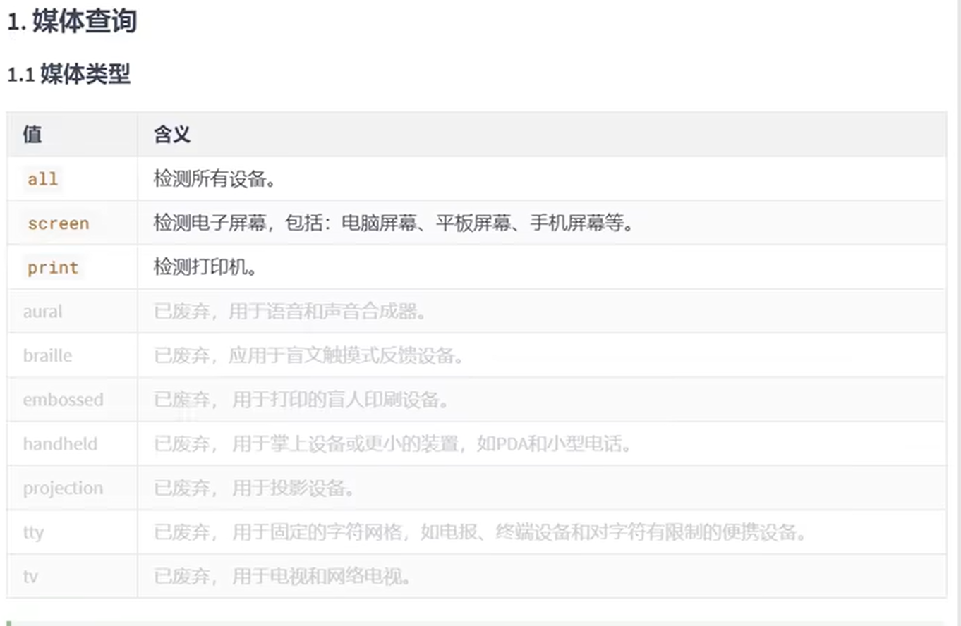
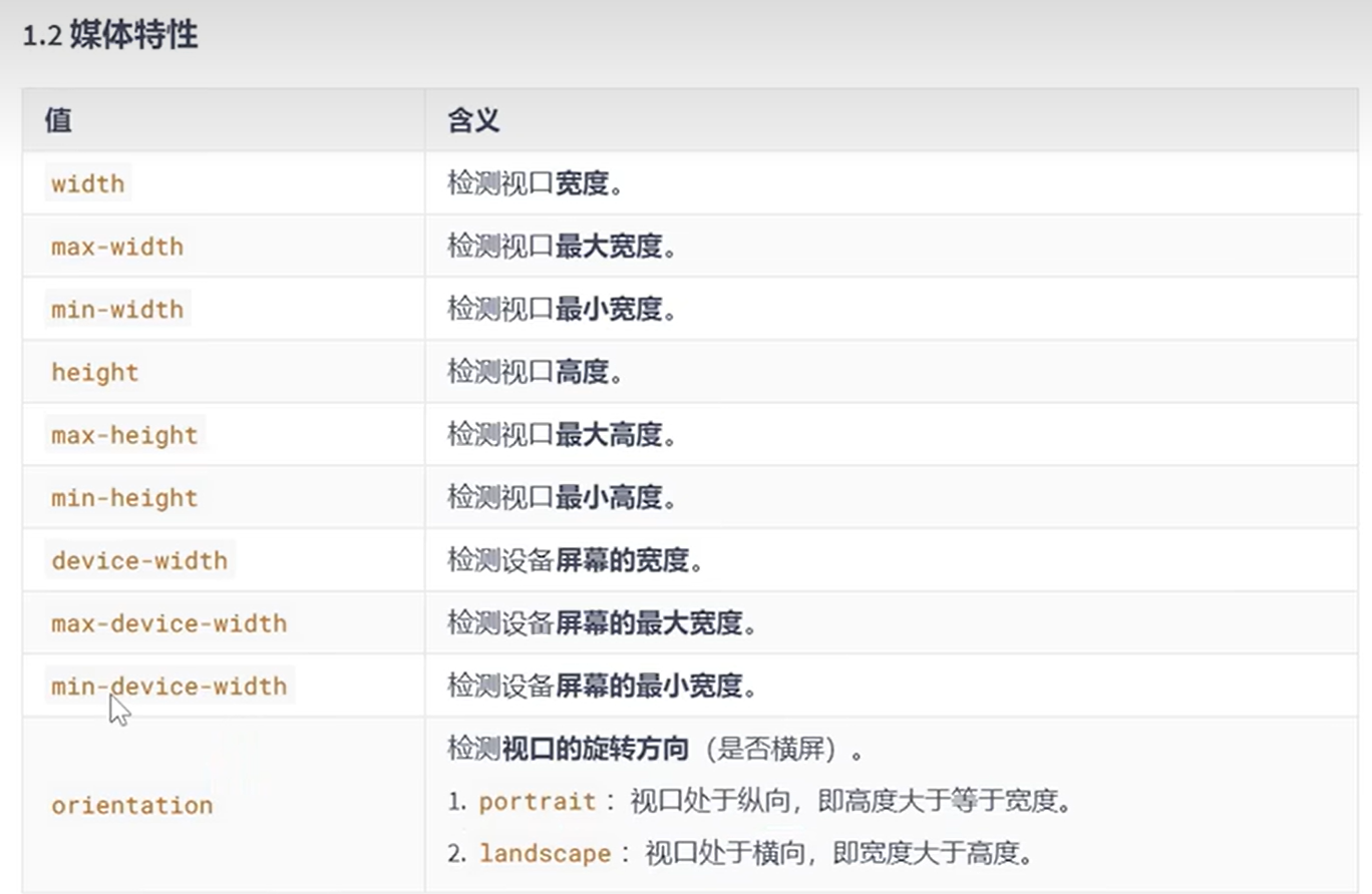
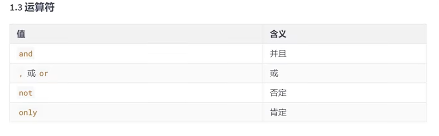
CSS3响应式布局-媒体查询
举例
<title>01.媒体查询_媒体类型</title><style>h1 {width: 600px;height: 400px;background-image: linear-gradient(60deg,red,yellow,green);font-size: 40px;color: white;text-shadow: 0 0 20px black;text-align: center;line-height: 400px;margin: 0 auto;}/* 打印机设备 */@media print {h1 {background-color: transparent;}}/* 在屏幕上面应用的样式  */@media screen {h1 {font-family:'Trebuchet MS';}}/* 一直应用的样式 */@media all {h1 {color: pink;}}</style>
</head>
<body><h1>媒体类型(print / screen)</h1>
</body>
<title>02.媒体查询_媒体特性</title><style>h1 {background-color: blue;font-size: 40px;color: white;text-align: center;height: 400px;line-height: 400px;}/* 当检测到视口为 800px 时候变为黄色  */@media (width:800px) {h1 {background-color: yellow;}}/* 最大宽度为700px,那么也就是小于 700px的时候所产生的效果   */@media (max-width:700px) {h1 {background-color: green;}}/* 最小宽度为900px   那么代表的意思就是屏幕超过 900px 产生的效果 */@media (min-width:900px) {h1 {background: chocolate;}}/* 视口高度 小于300px时候  */@media (max-height:300px) {h1 {background: goldenrod;}}/* device 设置前缀  *//* @media (device-width:1920px) {h1 {background-color: aquamarine;}} */</style>
</head>
<body><h1>(宽度  高度计算)</h1>
</body>
<title>03.媒体查询_运算符</title><style>h1 {background-color: rgba(236, 230, 219,.7);font-size: 40px;color: white;text-align: center;height: 300px;line-height: 300px;}/* and 运算  并且   大于 700px ~ 900px  *//* @media (min-width:700px) and (max-width:900px) {h1 {background-color: tomato;}  } *//* 方式2  兼容ie写法  and 运算 *//* @media screen and (min-width:700px) and (max-width:900px) {h1 {background-color: tomato;}  } *//* or 或 , *//* @media (max-width:700px) or (min-width:900px) {h1 {background-color: gold;}  } */@media screen and (max-width:700px) , (min-width:900px) {h1 {background-color: green;}  }/* not 否定 */@media not screen {h1 {background-color: yellow;} }/* only 肯定 当屏幕在800px时候生效 */@media only screen and (width:820px){h1 {background-color: purple;} }</style>
</head>
<body><h1>(媒体计算,运算符 )</h1>
</body>
CSS3响应式布局-常用阈值
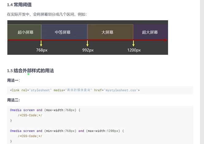
 <title>04.媒体查询_常用阀值</title><style>div {background-color: rgba(212, 159, 61, 0.7);font-size: 20px;color: white;text-align: center;height: 100px;line-height: 100px;display: none;}/* 超小屏幕 */@media screen and (max-width:768px) {.small_width {display:block;background-color: red;}}/* 中等屏幕 */@media screen and (min-width:768px) and (max-width:992px){.middle_width {display:block;background-color: pink;}}/* 大屏幕 */@media screen and (min-width:992px) and (max-width:1200px) {.large_width {display:block;background-color: green;}}/* 超大屏幕 */@media screen and (min-width:1200px) {.huge_width {display:block;background-color: skyblue;}}</style>
</head>
<body><div class="small_width">我是最小的宽度,宽度 768px</div><div class="middle_width">我是中等屏幕,宽度 768px ~ 992px </div><div class="large_width">我是大屏宽度,宽度 992px ~ 1200px</div><div class="huge_width">我是超大宽度,宽度 1200px 以上</div>
</body>
 <meta charset="UTF-8"><meta name="viewport" content="width=device-width, initial-scale=1.0"><title>05.媒体查询_常用阀值(外部引入方式1)</title><link rel="stylesheet" href="./css/index.css"><link rel="stylesheet" href="./css/small.css"><link rel="stylesheet" href="./css/middle.css"><link rel="stylesheet" href="./css/large.css"><link rel="stylesheet" href="./css/huge.css"></head>
<body><div class="small_width">我是最小的宽度,宽度 768px</div><div class="middle_width">我是中等屏幕,宽度 768px ~ 992px </div><div class="large_width">我是大屏宽度,宽度 992px ~ 1200px</div><div class="huge_width">我是超大宽度,宽度 1200px 以上</div>
</body>
  <meta charset="UTF-8"><meta name="viewport" content="width=device-width, initial-scale=1.0"><title>05.媒体查询_常用阀值(外部引入方式1)</title><link rel="stylesheet" href="./css/index.css"><link rel="stylesheet" media="screen and (max-width:768px)" href="./css/small.css"><link rel="stylesheet" media="screen and (min-width:768px) and (max-width:992px)" href="./css/middle.css"><link rel="stylesheet" media="screen and (min-width:992px) and (max-width:1200px)" href="./css/large.css"><link rel="stylesheet" media="screen and (min-width:1200px)" href="./css/huge.css"></head>
<body><div class="small_width">我是最小的宽度,宽度 768px</div><div class="middle_width">我是中等屏幕,宽度 768px ~ 992px </div><div class="large_width">我是大屏宽度,宽度 992px ~ 1200px</div><div class="huge_width">我是超大宽度,宽度 1200px 以上</div>
</body>
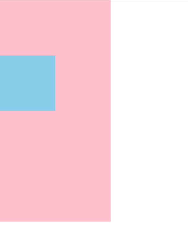
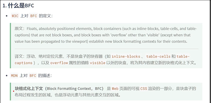
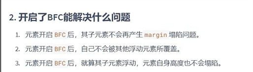
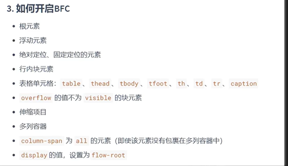
BFC
举例
<!DOCTYPE html>
<html lang="en">
<head><meta charset="UTF-8"><meta http-equiv="X-UA-Compatible" content="IE=edge"><meta name="viewport" content="width=device-width, initial-scale=1.0"><title>Document</title><style>body {margin: 0;padding: 0;}.continer{width: 100px;height: 200px;background: pink;overflow: hidden; //设置BFC}.box{margin-top: 50px;height: 50px;width: 50px;background: skyblue;}</style>
</head>
<body><div class="continer"><div class="box"></div></div>
</body>
</html>
结果