Uniapp + Vue3 + uView 年份显示前后一年,分钟动态设置间隔
主体显示 < view class = "uni-row selector" @click= "openPicker" > < uni- icons color= "#c0c4cc" type= "calendar" size= "22" > < / uni- icons> < textclass = "label" : style= "{ color: props.modelValue ? '#333' : '#999' }" > { { displayValue || placeholder } } < / text> < / view>
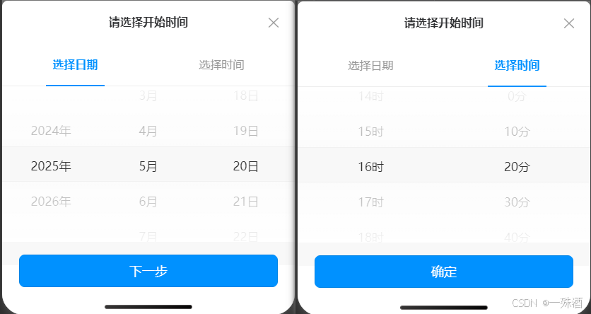
底部弹窗 < transition name= "fade" > < view v- if = "showPicker" class = "overlay" @click= "closePicker" > < / view> < view v- if = "showPicker" class = "picker-modal" > < view class = "title" > { { placeholder } } < / view> < view class = "uni-row tab-container" > < view: class = "['tab', activeTab === 'date' ? 'active' : '']" @click= "switchTab('date')" > 选择日期< / view> < view: class = "['tab', activeTab === 'time' ? 'active' : '']" @click= "switchTab('time')" : style= "{ pointerEvents: dateConfirmed ? 'auto' : 'none' , } "> 选择时间< / view> < / view> < picker- viewv- show= "activeTab === 'date'" class = "picker-view" : indicator- style= "'height: 50px;'" : value= "[yearIndex, monthIndex, dayIndex]" @change= "onDateChange" > < picker- view- column> < view v- for = "(y, i) in years" : key= "i" class = "picker-item" > { { y } } 年< / view> < / picker- view- column> < picker- view- column> < view v- for = "(m, i) in months" : key= "i" class = "picker-item" > { { m } } 月< / view> < / picker- view- column> < picker- view- column> < view v- for = "(d, i) in days" : key= "i" class = "picker-item" > { { d } } 日< / view> < / picker- view- column> < / picker- view> < picker- viewv- show= "activeTab === 'time'" class = "picker-view" : indicator- style= "'height: 50px;'" : value= "[hourIndex, minuteIndex]" @change= "onTimeChange" > < picker- view- column> < view v- for = "(h, i) in hours" : key= "i" class = "picker-item" > { { h } } 时< / view> < / picker- view- column> < picker- view- column> < view v- for = "(m, i) in minutes" : key= "i" class = "picker-item" > { { m } } 分< / view> < / picker- view- column> < / picker- view> < view class = "picker-footer" > < buttonv- if = "activeTab === 'date'" class = "btn-next" @click= "goToTime" > 下一步< / button> < button v- else class = "btn-confirm" @click= "confirm" > 确定< / button> < / view> < view class = "close-btn" @click= "closePicker" > ✕< / view> < / view> < / transition>
组件抛出 const props = defineProps ( { modelValue: { type: String, default : "" , } , placeholder: { type: String, default : "请选择时间" , } , minuteStep: { type: Number, default : 1 , } ,
} ) ;
const emit = defineEmits ( [ "update:modelValue" ] ) ;
年月列表项和默认值 const now = new Date ( ) ;
const currentYear = now. getFullYear ( ) ;
const currentMonth = now. getMonth ( ) + 1 ;
const years = [ currentYear - 1 , currentYear, currentYear + 1 ] ;
const months = Array. from ( { length: 12 } , ( _, i ) => i + 1 ) ;
const yearIndex = ref ( 1 ) ;
const monthIndex = ref ( currentMonth - 1 ) ;
时分列表项和默认值 const currentHour = now. getHours ( ) ;
const currentMinute = now. getMinutes ( ) ; const hours = Array. from ( { length: 24 } , ( _, i ) => i) ;
const minutes = computed ( ( ) => { const step = props. minuteStep; return Array. from ( { length: Math. floor ( 60 / step) } , ( _, i ) => i * step) ;
} ) ;
const hourIndex = ref ( currentHour) ;
const minuteIndex = ref ( Math. floor ( currentMinute / props. minuteStep) ) ;
监听年月变化,更新天数
const dayIndex = ref ( currentDay - 1 ) ;
const updateDays = ( ) => { const y = years[ yearIndex. value] ; const m = months[ monthIndex. value] ; const dayCount = new Date ( y, m, 0 ) . getDate ( ) ; days. value = Array. from ( { length: dayCount } , ( _, i ) => i + 1 ) ; if ( dayIndex. value >= dayCount) { dayIndex. value = dayCount - 1 ; }
} ;
watch ( [ yearIndex, monthIndex] , updateDays) ;
初始化当天日期时间 onMounted ( ( ) => { updateDays ( ) ; if ( props. modelValue) { const reg = / (\d{4})年(\d{1,2})月(\d{1,2})日 (\d{1,2})时(\d{1,2})分 / ; const matched = props. modelValue. match ( reg) ; if ( matched) { const [ _, y, mo, d, h, mi] = matched; const yNum = + y, moNum = + mo, dNum = + d, hNum = + h, miNum = + mi; const yi = years. indexOf ( yNum) ; yearIndex. value = yi !== - 1 ? yi : 1 ; monthIndex. value = moNum - 1 ; dayIndex. value = dNum - 1 ; hourIndex. value = hNum; minuteIndex. value = Math. floor ( miNum / props. minuteStep) ; updateDays ( ) ; } }
} ) ;
选项变化更新对应值 const onDateChange = ( e ) => { const [ y, m, d] = e. detail. value; yearIndex. value = y; monthIndex. value = m; dayIndex. value = d; updateDays ( ) ;
} ; const onTimeChange = ( e ) => { const [ h, mm] = e. detail. value; hourIndex. value = h; minuteIndex. value = mm;
} ;
确定事件,抛出最新值 const confirm = ( ) => { const y = years[ yearIndex. value] ; const m = String ( months[ monthIndex. value] ) . padStart ( 2 , "0" ) ; const d = String ( days. value[ dayIndex. value] ) . padStart ( 2 , "0" ) ; const h = String ( hours[ hourIndex. value] ) . padStart ( 2 , "0" ) ; const mm = String ( minutes. value[ minuteIndex. value] ) . padStart ( 2 , "0" ) ; const val = ` ${ y} - ${ m} - ${ d} ${ h} : ${ mm} ` ; emit ( "update:modelValue" , val) ; showPicker. value = false ;
} ;
组件样式 < style lang= "scss" scoped>
. time- box { width: 100 % ; . selector { width: 100 % ; border: 1 px solid #eee; border- radius: 10 rpx; padding: 0 24 rpx; height: 70 rpx; font- size: 0.32 rem; color: #999 ; justify- content: flex- start; . label { margin- left: 15 rpx; } } . overlay { position: fixed; top: 0 ; left: 0 ; right: 0 ; bottom: 0 ; background- color: rgba ( 0 , 0 , 0 , 0.5 ) ; z- index: 998 ; } . picker- modal { position: fixed; bottom: 0 ; left: 0 ; right: 0 ; background: #fff; border- top- left- radius: $border- radius; border- top- right- radius: $border- radius; box- shadow: 0 - 2 px 10 px rgba ( 0 , 0 , 0 , 0.15 ) ; z- index: 999 ; padding- bottom: 40 rpx; . title { font- weight: bold; text- align: center; font- size: 0.32 rem; line- height: 110 rpx; } . tab- container { border- bottom: 1 px solid #eee; . tab { flex: 1 ; text- align: center; font- size: 0.32 rem; padding: 20 rpx 0 ; color: #999 ; position: relative; & . active { color: $primary- color; font- weight: bold; & : : after { content: "" ; position: absolute; bottom: - 1 px; left: 30 % ; right: 30 % ; height: 2 px; background- color: $primary- color; } } } } . picker- view { background: $background- color; height: 400 rpx; . picker- item { height: 100 rpx; line- height: 100 rpx; text- align: center; font- size: 0.34 rem; color: #333 ; } } . picker- footer { padding: 32 rpx 24 px; border- top: 1 px solid #eee; . btn- next, . btn- confirm { width: 100 % ; background- color: $primary- color; border: none; border- radius: $border- radius; color: #fff; font- size: 0.36 rem; } } . close- btn { position: absolute; top: 20 rpx; right: 40 rpx; font- size: 0.4 rem; cursor: pointer; color: #999 ; } }
}
. fade- enter- active,
. fade- leave- active { transition: opacity 0.3 s ease;
}
. fade- enter- from ,
. fade- leave- to { opacity: 0 ;
}
. fade- enter- to,
. fade- leave- from { opacity: 1 ;
}
< / style>
注册组件进行调用 import DateTimePicker from "@/components/date-time-picker" ;
app. component ( "DateTimePicker" , DateTimePicker) ; < DateTimePickerstyle= "width: 100%" : modelValue= "data.applyForm.DateTime" : minute- step= "10" @update: modelValue= "getChangeItemValue" / >