Element plus参考vben逻辑实现的描述列表组件封装实践
组件介绍
在日常开发中,我们经常需要展示对象的详细信息,例如用户资料、订单详情等。Element Plus提供的Descriptions组件虽然功能强大,但在实际项目中我们往往需要更灵活的配置方式。本文将介绍如何基于Element Plus封装一个可配置化的描述列表组件。
组件结构
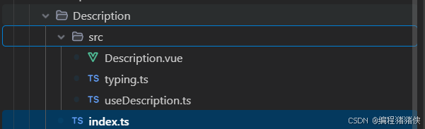
本次封装的Description组件位于 src/components/Description 目录下,包含以下文件:
index.ts : 组件导出入口
Description.vue : 组件核心实现
typing.ts : TypeScript类型定义
useDescription.ts : hook函数
类型定义设计
首先在 typing.ts 中定义组件所需的类型:
import type { VNode, CSSProperties } from "vue";
import type { DescriptionProps as ElDescriptionProps } from "element-plus";export interface DescItem {labelMinWidth?: number;contentMinWidth?: number;labelStyle?: CSSProperties;field: string;label: string | VNode | JSX.Element;span?: number;show?: (...arg: any) => boolean;render?: (val: any,data: Recordable) => VNode | undefined | JSX.Element | Element | string | number;
}export interface DescriptionProps extends ElDescriptionProps {useCollapse?: boolean;schema: DescItem[];data: Recordable;
}export interface DescInstance {setDescProps(descProps: Partial<DescriptionProps>): void;
}
组件核心实现
在 Description.vue 中,我们通过 schema 和 data 属性实现了描述项的动态渲染:
<script lang="tsx">
import type { DescriptionProps, DescInstance, DescItem } from "./typing";
import { defineComponent, computed, ref, unref, useAttrs } from "vue";
import { get } from "lodash-es";
import { ElDescriptions, ElDescriptionsItem } from "element-plus";
import { isFunction } from "@/utils/is";export default defineComponent({name: "Description",props: {title: { type: String, default: "" },size: { type: String, default: "default" },schema: { type: Array as PropType<DescItem[]>, default: () => [] },data: { type: Object },border: { type: Boolean, default: true },},emits: ["register"],setup(props, { emit }) {const propsRef = ref<Partial<DescriptionProps> | null>(null);const attrs = useAttrs();// 合并静态props和动态propsconst getMergeProps = computed((): DescriptionProps => ({...props,...unref(propsRef),}));// 设置描述项属性function setDescProps(descProps: Partial<DescriptionProps>): void {propsRef.value = { ...unref(propsRef), ...descProps };}// 渲染标签function renderLabel({ label, labelMinWidth, labelStyle }: DescItem) {if (!labelStyle && !labelMinWidth) return label;return (<div style={{ ...labelStyle, minWidth: `${labelMinWidth}px` }}>{label}</div>);}// 渲染描述项function renderItem() {const { schema, data } = unref(getMergeProps);return unref(schema).map((item) => {const { render, field, span, show, contentMinWidth } = item;if (show && isFunction(show) && !show(data)) return null;const getContent = () => {const _data = unref(getMergeProps)?.data;const getField = get(_data, field);return isFunction(render) ? render(getField, _data) : getField ?? "";};return (<ElDescriptionsItem label={renderLabel(item)} key={field} span={span}>{() => contentMinWidth ? (<div style={{ minWidth: `${contentMinWidth}px` }}>{getContent()}</div>) : getContent()}</ElDescriptionsItem>);}).filter((item) => !!item);}emit("register", { setDescProps });return () => (<ElDescriptions {...unref(getMergeProps)}>{renderItem()}</ElDescriptions>);},
});
</script>
hook函数
为了方便在组件外部控制描述列表,我们在 useDescription.ts 中实现了一个hook函数:
export function useDescription(props?: Partial<DescriptionProps>
): UseDescReturnType {const desc = ref<Nullable<DescInstance>>(null);const loaded = ref(false);function register(instance: DescInstance) {desc.value = instance;props && instance.setDescProps(props);loaded.value = true;}const methods: DescInstance = {setDescProps: (descProps: Partial<DescriptionProps>): void => {unref(desc)?.setDescProps(descProps);},};return [register, methods];
}
index.ts全局注册
import type { App, Plugin } from "vue";export const withInstall = <T>(component: T, alias?: string) => {const comp = component as any;comp.install = (app: App) => {// @ts-ignoreapp.component(comp.name || comp.displayName, component);if (alias) {app.config.globalProperties[alias] = component;}};return component as T & Plugin;
};
使用到的引入的封装的方法
export function isFunction(val: unknown): val is Function {return typeof val === 'function';
}import type { App, Plugin } from "vue";export const withInstall = <T>(component: T, alias?: string) => {const comp = component as any;comp.install = (app: App) => {// @ts-ignoreapp.component(comp.name || comp.displayName, component);if (alias) {app.config.globalProperties[alias] = component;}};return component as T & Plugin;
};
组件使用方法
基本用法
<template><div class="w-2/4 h-auto mt-4"><Description title="基本信息" @register="registerDesc" /></div>
</template><script setup lang="ts">
import { ref, nextTick, onMounted } from "vue";
import { Description, useDescription } from "@/components/Description";
import type { DescItem } from "@/components/Description";const info = ref();onMounted(() => {info.value = {orgName: "测试机构",checkOrgName: "测试检查机构",address: "测试详细地址",checkDate: "2022-01-01",name: "测试预约人",cardId: "测试身份证号",mobile: "1999999999999",};
});//描述组件配置项
const detailSchema: DescItem[] = [{label: "医疗机构",field: "orgName",span: 1,show: (data) => true,},{label: "检查机构",field: "checkOrgName",span: 1,},{label: "详细地址",field: "address",span: 2,},{label: "预约日期",field: "checkDate",span: 1,},{label: "预约人",field: "name",span: 1,},{label: "身份证号",field: "cardId",span: 1,contentMinWidth:300},{label: "联系电话",field: "mobile",span: 1,render(val, data) {return "自定义数据";},},
];const [registerDesc] = useDescription({data: info,schema: detailSchema,column: 2,size: "default",
});</script><style lang="less" scoped></style>
组件特点
灵活配置 :通过schema配置描述项,支持自定义标签宽度、内容宽度
动态渲染 :支持自定义渲染函数,可根据数据动态展示内容
条件显示 :通过show属性控制描述项是否显示
响应式更新 :提供setDescProps方法,支持动态更新组件属性
类型安全 :完整的TypeScript类型定义,提供良好的开发体验
总结
通过对Element Plus的Descriptions组件进行二次封装,我们得到了一个更加灵活和易用的描述列表组件。该组件通过配置化的方式,大大减少了重复代码,提高了开发效率。在实际项目中,你可以根据需求进一步扩展组件功能,例如添加折叠功能、支持更多自定义样式等。