CSS 盒子模型与元素定位
CSS 盒子模型与元素定位
一、元素类型与转换
1. 基本元素类型
块级元素 (block)
- 特点:独占一行,可设置宽高,默认宽度100%
- 示例:
<div>,<p>,<h1>-<h6>,<ul>,<li>
行内元素 (inline)
- 特点:不独占一行,不可设置宽高,大小由内容决定
- 示例:
<span>,<a>,<strong>,<em>
行内块元素 (inline-block)
- 特点:不独占一行但可设置宽高
- 示例:
<img>,<input>,<button>
2. 元素类型转换
/* 行内元素转块元素 */
span {display: block;width: 200px;height: 100px;
}/* 块元素转行内元素 */
div {display: inline;/* 此时设置宽高无效 */
}/* 转换为行内块元素 */
a {display: inline-block;width: 120px;height: 40px;
}
二、盒子模型详解(图示版)
1. 标准盒子模型 (W3C Box Model)
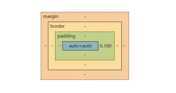
假设盒子为下列所述
.box {width: 300px;height: 200px;padding: 20px;border: 10px solid #333;margin: 30px;
}
计算公式:
- 元素总宽度 =
width+padding-left+padding-right+border-left+border-right+margin-left+margin-right
= 300 + 202 + 102 + 30*2 = 420px - 元素总高度 =
width+padding-left+padding-right+border-left+border-right+margin-left+margin-right
= 200 + 202 + 102 + 30*2 = 320px
2. 怪异盒子模型 (border-box)
.box {box-sizing: border-box; /* 关键声明 */width: 300px; /* 现在包含padding和border */height: 200px;padding: 20px;border: 10px solid #333;margin: 30px;
}
这种条件下width的宽度就相当于内容加上左右内边距和左右边框,内容的宽度会根据你设置的左右边框和左右内边距而调整.
计算公式:
- 内容区宽度 =
width-padding-left-padding-right-border-left-border-right
= 300 - 202 - 102 = 240px - 元素总宽度 =
width+margin-left+margin-right= 300 + 30*2 = 360px
3. 两种模型对比图示
标准模型: |---margin---||-border-||--padding--|| content |||--------------------总宽度---------------------|border-box模型: |---margin---||-border/padding-|| content |||--------width (包含padding+border)---------|
关键区别总结表
| 特性 | 标准模型 (content-box) | 怪异模型 (border-box) |
|---|---|---|
width定义范围 | 仅内容区域 | 内容+padding+border |
| 实际内容宽度 | width值 | width-padding-border |
| 新增元素是否影响布局 | 是 | 否 |
| 默认值 | 所有现代浏览器 | 传统IE浏览器 |
如果在CSS开头加上这段声明:
* {box-sizing: border-box;
}
这样我们的盒子会始终统一按照这样的模式来布局,不必设置内边距和边框之后再手动减少盒子宽度.
三、定位(position)系统
1. position属性值
static (默认)
- 特点:元素正常流排列,top/right/bottom/left无效
relative (相对定位)
- 特点:相对于自身原始位置偏移,保留原空间
.box {position: relative;top: 20px;left: 30px;
}
absolute (绝对定位)
- 特点:相对于最近的非static定位祖先元素,脱离文档流
.parent {position: relative;
}
.child {position: absolute;top: 0;right: 0;
}
fixed (固定定位)
- 特点:相对于视口定位,不随滚动条滚动
.header {position: fixed;top: 0;left: 0;width: 100%;
}
sticky (粘性定位)
- 特点:在阈值范围内表现为relative,超过后表现为fixed
.nav {position: sticky;top: 0;/* top要设为0 */
}
固定定位和粘性定位便可以和之前学习的页面中的返回顶部联系.
<!DOCTYPE html>
<html lang="en"><head><meta charset="UTF-8"><meta name="viewport" content="width=device-width, initial-scale=1.0"><title>返回顶部</title><style>/*粘性定位*/* {padding: 0px;margin: 0px;}a {text-decoration: none;color: rgb(207, 154, 154);}a:hover {text-decoration: underline;color: pink;}.sticky {position: sticky;top: 0;padding: 10px;background-color: pink;/* border: 5px solid red; */}.contain {padding-bottom: 3000px;/*设置一个大盒子,让我们实践返回顶部的功能*/}</style>
</head><body><a href="https://www.w3school.com.cn/css/css_positioning.asp" target="_blank">position : absolute sticky</a><!-- sticky粘性定位 --><a href="https://www.w3school.com.cn/tiy/t.asp?f=css_position_sticky" target="_blank" style="padding-left: 30px;">粘性定位实践 </a><!--返回顶部按钮 ---><div class="sticky"><a href="#top">返回顶部</a></div><div class="contain">我是内容</div>
</body></html>
2. z-index 堆叠顺序
- 仅对定位元素(position非static)有效
- 数值越大越靠前,可负值
示例练习
<!DOCTYPE html>
<html>
<head>
<style>
.container {position: relative;background: pink;height: 104px;margin: 0px;
}.black-box {position: relative;z-index: 1;border: 2px solid black;height: 100px;margin: 20px;
}
.gray-box {position: absolute;z-index: 2; /* 灰色框将位于绿色框和黑色框之上 */background: lightgray;height: 60px; width: 70%;top: 0px;left: 0px;
}
.green-box {position: absolute;z-index: 2; /* 绿色框将位于黑色框之上 */background: lightgreen;width: 35%;height: 100px;top: 0px;left: 270px;
}
</style>
</head>
<body>
<h1>Z-index 实例</h1>
<p>堆叠顺序较高的元素始终位于堆叠顺序较低的元素之上。</p>
<div class="container"><div class="black-box">黑色框 (z-index: 1)</div><div class="green-box">绿色框 (z-index: 2)</div><div class="gray-box">灰色框 (z-index: 3)</div>
</div>
</body>
</html>
加载的页面如下:
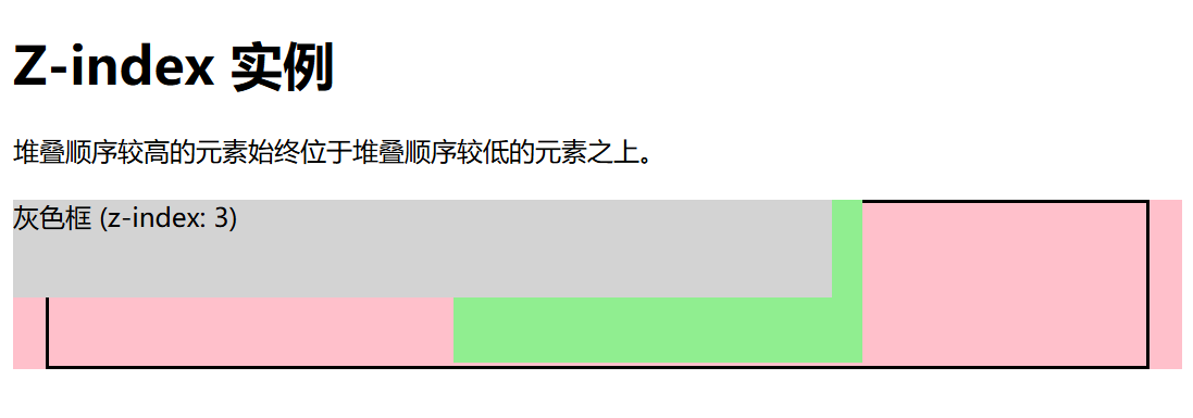
练习总结
- 这里的z-index控制盒子的堆叠次序数值越大的盒子就在上面.
- 在外部div元素中,先前并没有给出相应的高度,而通过调整灰色的框的绝对定位(它的父级元素定位就是粉色背景)和通过设置相应的背景颜色,说明没有设定高度的外部盒子会从它的内部盒子相应的水平位置开始绘制(不包括这个内部盒子的外边距).
- 这里要注意的是设置了position:absolute属性后,比如这里的灰色盒子,如果不设定它的top等等的值,例如top=0,那么他开始绘制的位置将是黑色框的下面20px(黑色框设定了margin值),它的绝对定位没起作用.
四、元素嵌套与定位处理
1. 常见嵌套场景
块元素包含块元素
<div class="parent"><div class="child"></div>
</div>
- 子元素默认从上到下排列
行内元素包含行内元素
<p>这是一段<span>特殊</span>文本</p>
- 保持在同一行显示
- 注意行内元素不能直接包含块元素
混合嵌套
<div class="card"><img src="..." alt=""><h3>标题</h3><p>描述文本<span>更多</span></p><a href="#">链接</a>
</div>
2. 嵌套中的定位处理
相对定位父元素 + 绝对定位子元素
.parent {position: relative;width: 300px;height: 200px;
}
.child {position: absolute;bottom: 10px;right: 10px;
}
多层绝对定位
.grandparent {position: relative;
}
.parent {position: absolute;top: 50px;left: 50px;
}
.child {position: absolute;top: 20px;left: 20px;
}
/* child相对于parent定位 */
3. 定位与文档流的影响
absolute/fixed完全脱离文档流relative不脱离文档流,原位置保留
五、实用技巧
居中技巧
/* 绝对定位元素水平垂直居中 */
.center {position: absolute;top: 50%;left: 50%;transform: translate(-50%, -50%);
}
MDN Web Docs实践链接
- 通过绝对定位将子盒子的左上角对其父盒子的中心点.
- 然后通过translate值(translate的百分比是相对于元素自身尺寸)将子盒子移动自身高宽的一半实现中心对齐.