VSCode插件Python Image Preview使用笔记
1. 介绍
Python Image Preview支持numpy pillow opencv-python matplotlib seaborn plotly imageio skimage tensorflow pytorch等library的可显示为图像的变量。这里以matplotlib官方的一个热力图例程为例,来展示如何使用Python Image Preview插件在远程调试时查看绘制的实验图像。
2. 安装
3. 使用
3.1. 示例代码
import numpy as np
import matplotlib
import matplotlib.pyplot as plt
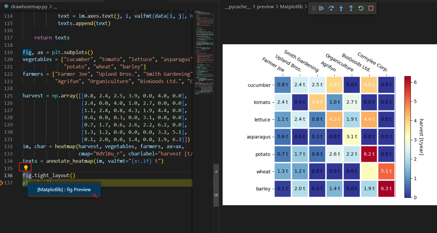
def heatmap(data, row_labels, col_labels, ax=None,cbar_kw={}, cbarlabel="", **kwargs):"""Create a heatmap from a numpy array and two lists of labels.Parameters----------dataA 2D numpy array of shape (M, N).row_labelsA list or array of length M with the labels for the rows.col_labelsA list or array of length N with the labels for the columns.axA `matplotlib.axes.Axes` instance to which the heatmap is plotted. Ifnot provided, use current axes or create a new one. Optional.cbar_kwA dictionary with arguments to `matplotlib.Figure.colorbar`. Optional.cbarlabelThe label for the colorbar. Optional.**kwargsAll other arguments are forwarded to `imshow`."""if not ax:ax = plt.gca()# Plot the heatmapim = ax.imshow(data, **kwargs)# Create colorbarcbar = ax.figure.colorbar(im, ax=ax, **cbar_kw)cbar.ax.set_ylabel(cbarlabel, rotation=-90, va="bottom")# Show all ticks and label them with the respective list entries.ax.set_xticks(np.arange(data.shape[1]), labels=col_labels)ax.set_yticks(np.arange(data.shape[0]), labels=row_labels)# Let the horizontal axes labeling appear on top.ax.tick_params(top=True, bottom=False,labeltop=True, labelbottom=False)# Rotate the tick labels and set their alignment.plt.setp(ax.get_xticklabels(), rotation=-30, ha="right",rotation_mode="anchor")# Turn spines off and create white grid.ax.spines[:].set_visible(False)ax.set_xticks(np.arange(data.shape[1]+1)-.5, minor=True)ax.set_yticks(np.arange(data.shape[0]+1)-.5, minor=True)ax.grid(which="minor", color="w", linestyle='-', linewidth=3)ax.tick_params(which="minor", bottom=False, left=False)return im, cbardef annotate_heatmap(im, data=None, valfmt="{x:.2f}",textcolors=("black", "white"),threshold=None, **textkw):"""A function to annotate a heatmap.Parameters----------imThe AxesImage to be labeled.dataData used to annotate. If None, the image's data is used. Optional.valfmtThe format of the annotations inside the heatmap. This should eitheruse the string format method, e.g. "$ {x:.2f}", or be a`matplotlib.ticker.Formatter`. Optional.textcolorsA pair of colors. The first is used for values below a threshold,the second for those above. Optional.thresholdValue in data units according to which the colors from textcolors areapplied. If None (the default) uses the middle of the colormap asseparation. Optional.**kwargsAll other arguments are forwarded to each call to `text` used to createthe text labels."""if not isinstance(data, (list, np.ndarray)):data = im.get_array()# Normalize the threshold to the images color range.if threshold is not None:threshold = im.norm(threshold)else:threshold = im.norm(data.max())/2.# Set default alignment to center, but allow it to be# overwritten by textkw.kw = dict(horizontalalignment="center",verticalalignment="center")kw.update(textkw)# Get the formatter in case a string is suppliedif isinstance(valfmt, str):valfmt = matplotlib.ticker.StrMethodFormatter(valfmt)# Loop over the data and create a `Text` for each "pixel".# Change the text's color depending on the data.texts = []for i in range(data.shape[0]):for j in range(data.shape[1]):kw.update(color=textcolors[int(im.norm(data[i, j]) > threshold)])text = im.axes.text(j, i, valfmt(data[i, j], None), **kw)texts.append(text)return textsfig, ax = plt.subplots()
vegetables = ["cucumber", "tomato", "lettuce", "asparagus","potato", "wheat", "barley"]
farmers = ["Farmer Joe", "Upland Bros.", "Smith Gardening","Agrifun", "Organiculture", "BioGoods Ltd.", "Cornylee Corp."]harvest = np.array([[0.8, 2.4, 2.5, 3.9, 0.0, 4.0, 0.0],[2.4, 0.0, 4.0, 1.0, 2.7, 0.0, 0.0],[1.1, 2.4, 0.8, 4.3, 1.9, 4.4, 0.0],[0.6, 0.0, 0.3, 0.0, 3.1, 0.0, 0.0],[0.7, 1.7, 0.6, 2.6, 2.2, 6.2, 0.0],[1.3, 1.2, 0.0, 0.0, 0.0, 3.2, 5.1],[0.1, 2.0, 0.0, 1.4, 0.0, 1.9, 6.3]])
im, cbar = heatmap(harvest, vegetables, farmers, ax=ax,cmap="RdYlBu_r", cbarlabel="harvest [t/year]")
texts = annotate_heatmap(im, valfmt="{x:.1f} t")fig.tight_layout()
plt.show()
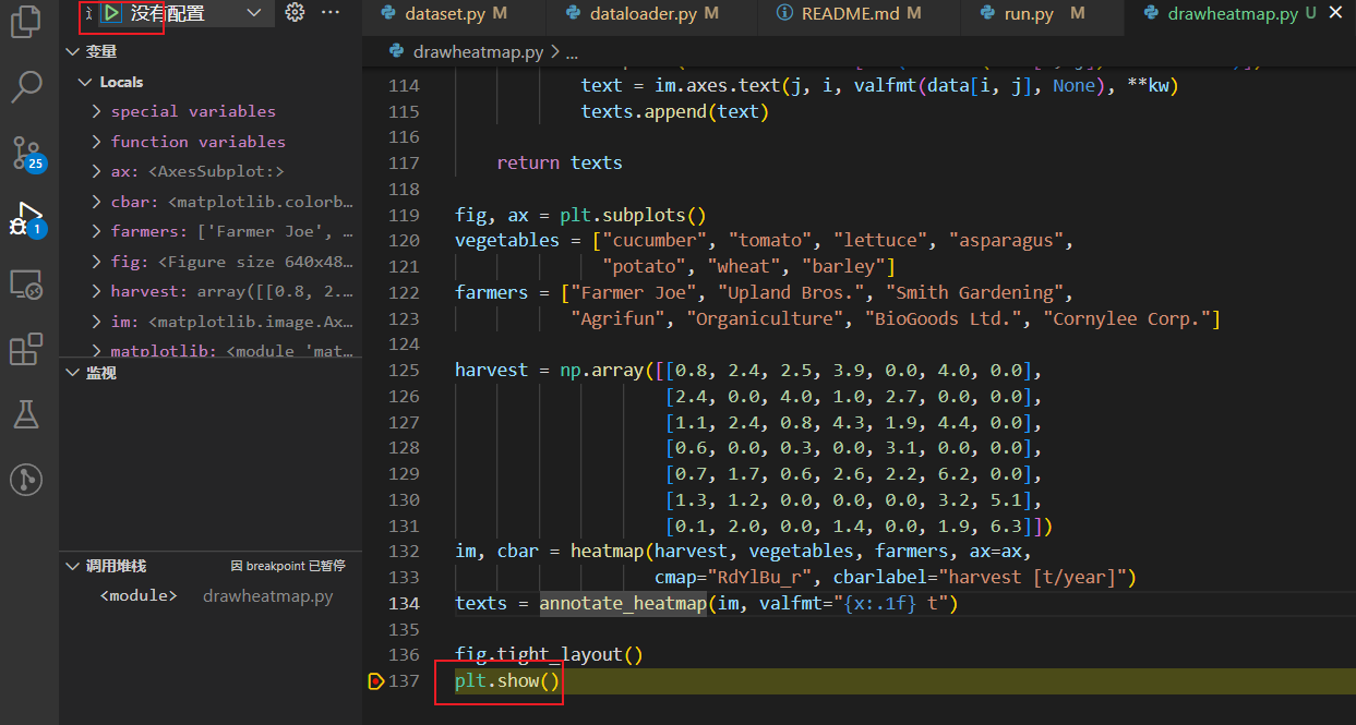
3.2. 打断点开始调试
将断点打到文件的最后一行,点击左侧debug的绿色箭头开始调试
 3.3. 激活插件并显示图像
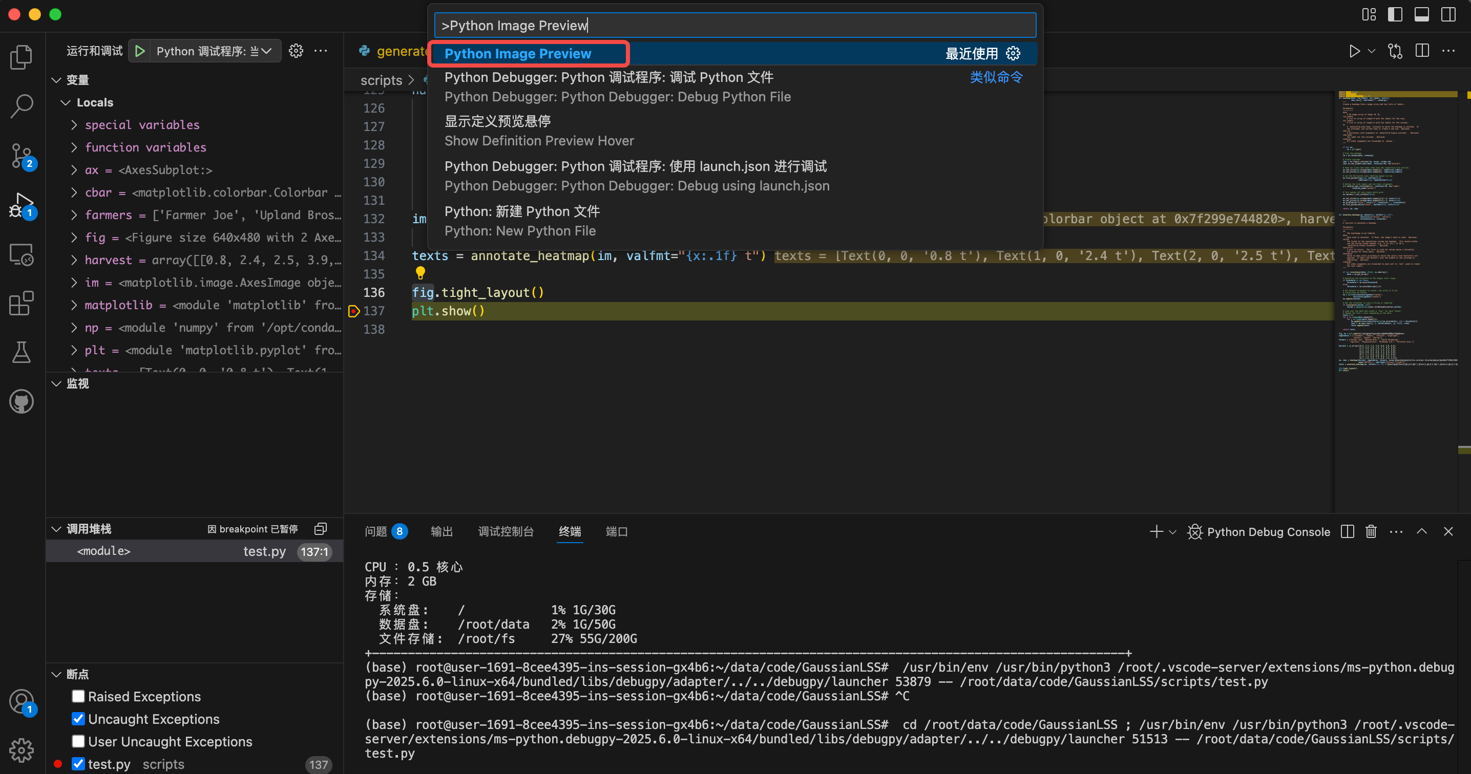
然后按下Ctrl+p,在命令框内输入>Python Image Preview激活插件
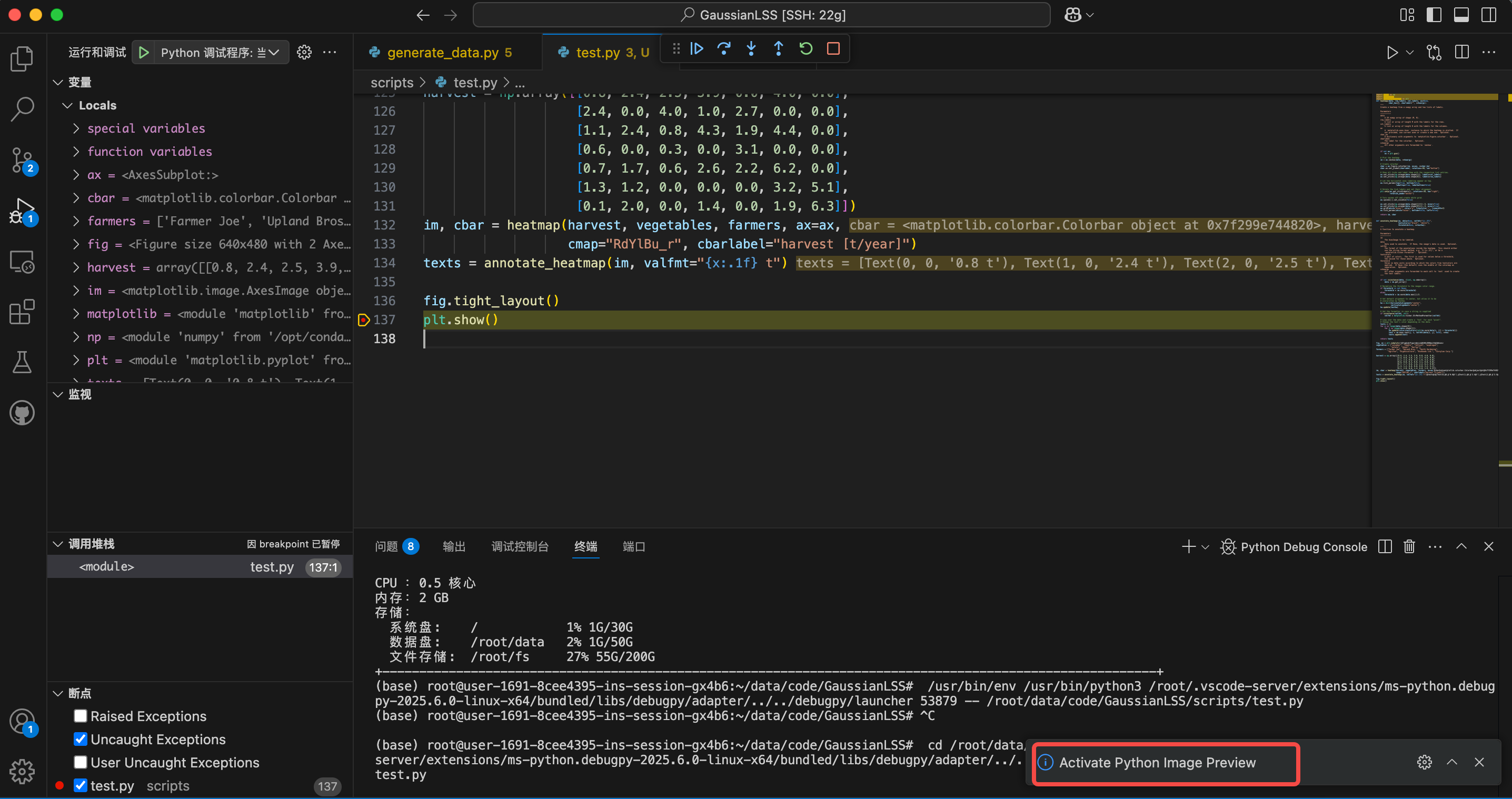
右下角显示插件已激活
接下来双击需要可视化的变量,稍等1~2秒,该变量上面会出现一个小灯泡。点击变量上的小灯泡,点击fig preview就可以显示图像。
参考文献
如何在Vscode连接远程服务器时做可视化——Vscode插件Python Image Preview介绍 - MapleTx - 博客园