vue3的 三种插槽 匿名插槽,具名插槽,作用域插槽
背景:
在vue3项目中,常用的三种插槽。
关于插槽的理论知识如下:
插槽是指可以在父组件内自定义模板片段,在子组件中可以将定义的模板片段插入到子组件的特定位置。常用:匿名插槽、具名插槽
作用域插槽:子组件向父组件传递数据,并在父组件定义的模板中渲染。常用:作用域插槽
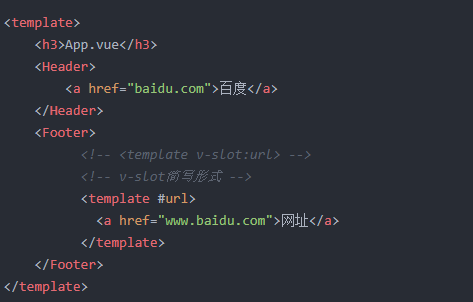
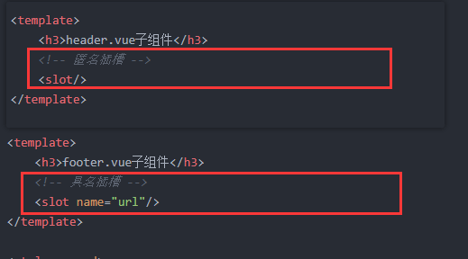
匿名插槽和具名插槽:
插槽是指可以在父组件内自定义模板片段,在子组件中可以将定义的模板片段插入到子组件的特定位置。常用:匿名插槽、具名插槽
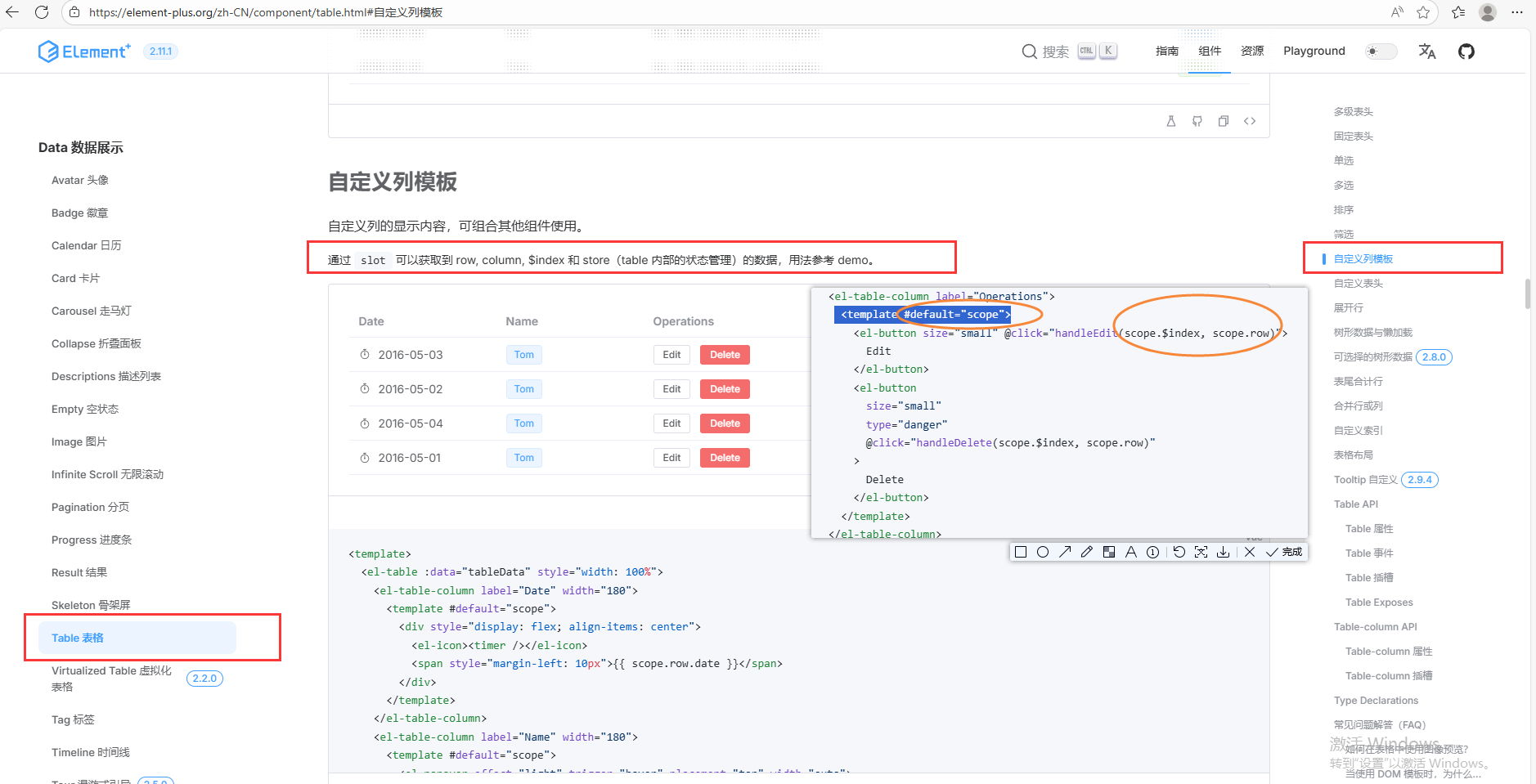
代码截图:
父组件:
子组件:
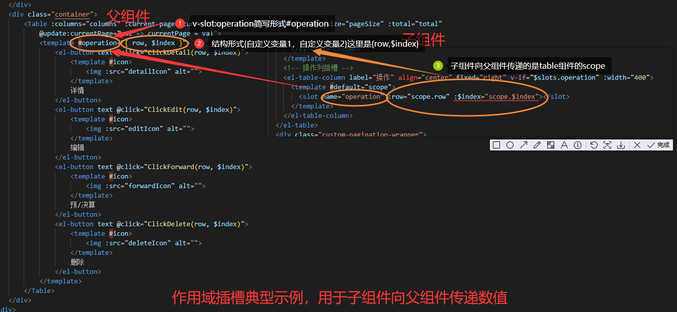
作用域插槽:
作用域插槽:子组件向父组件传递数据,并在父组件定义的模板中渲染。
代码截图:
实际代码如下:
父组件:
<div class="container"><Table :columns="columns" :current-page="currentPage" :data="tableData" :page-size="pageSize" :total="total"@update:currentPage="val => currentPage = val"><template #operation="{ row, $index }"><el-button text @click="ClickDetail(row, $index)"><template #icon><img :src="detailIcon" alt=""></template>详情</el-button><el-button text @click="ClickEdit(row, $index)"><template #icon><img :src="editIcon" alt=""></template>编辑</el-button><el-button text @click="ClickForward(row, $index)"><template #icon><img :src="forwardIcon" alt=""></template>预/决算</el-button><el-button text @click="ClickDelete(row, $index)"><template #icon><img :src="deleteIcon" alt=""></template>删除</el-button></template></Table>
</div>
子组件:
<template><div class="table-container"><el-table :data="data":style="`width: 100%; flex: 1 1 auto;opacity: ${!enableLoading || !isloading || isempty ? 1 : 0};`":height="tableBodyHeight" :header-cell-style="{ background: '#F5F9FF', color: '#333333', fontWeight: '550' }":cell-style="cellStyle" max-height="100%" :border="showBorder" empty-text=""><el-table-column type="index" label="序号" width="60" align="center" :index="indexMethod" fixed="left"v-if="showIndex" /><!-- 操作列插槽 --><el-table-column label="操作" align="center" fixed="right" v-if="$slots.operation" :width="400"><template #default="scope"><slot name="operation" :row="scope.row" :$index="scope.$index"></slot></template></el-table-column></el-table><div class="custom-pagination-wrapper"><span class="custom-pagination-total">共 {{ total }} 个</span><el-pagination background layout="prev, pager, next" :total="total" :page-size="pageSize":current-page="currentPage" @current-change="handlePageChange" class="custom-pagination" /></div></div>
</template><script setup>
import { defineProps, defineEmits, onMounted, ref, nextTick, reactive, watch, computed } from 'vue'const props = defineProps({columns: {type: Array,required: true},data: {type: Array,required: true},total: {type: Number,default: 0},pageSize: {type: Number,default: 10},currentPage: {type: Number,default: 1},// 是否默认显示序号列showIndex: {type: Boolean,default: true},// 是否默认显示表格边框showBorder: {type: Boolean,default: false},// 是否默认开启加载动画enableLoading: {type: Boolean,default: false}
});const isloading = ref(true), isempty = ref(false);
watch(() => props.data, (newValue, oldValue) => {nextTick(() => {// console.log('table');isempty.value = props.data.length == 0;isloading.value = false;})
});const emit = defineEmits(['update:currentPage', 'customCellStyle'])function handlePageChange(page) {// if (props.data && props.data.length !== 0) {//   state.tableData = props.data.slice((page - 1) * 10, 10 * page);//   emit('update:currentPage', page)// }emit('update:currentPage', page)
}// 自动序号方法,分页自增
const indexMethod = (index) => {return (props.currentPage - 1) * props.pageSize + index + 1
}// 计算表格可视区高度,减去分页区高度
const tableBodyHeight = ref('100%')// 自定义每个单元格的样式
const cellStyle = (target) => {let style = { color: '#363636' };// 子组件可自己实现自定义样式emit('customCellStyle', target, data => {style = data;});return style;
}onMounted(() => {nextTick(() => {const container = document.querySelector('.table-container')const pagination = document.querySelector('.custom-pagination-wrapper')if (container && pagination) {const containerHeight = container.clientHeightconst paginationHeight = pagination.clientHeighttableBodyHeight.value = `${containerHeight - paginationHeight}px`}// handlePageChange(props.currentPage)})
})
</script><style scoped>
.table-container {position: relative;display: flex;flex-direction: column;height: 100%;min-height: 0;.loading {position: absolute;top: 50%;left: 50%;transform: translate(-50%, -50%);display: flex;flex-direction: column;align-items: center;justify-content: center;z-index: 9;span {color: #3A5269;text-align: center;font-family: "Alibaba PuHuiTi";font-size: 18px;font-style: normal;line-height: 22px;/* 122.222% */font-weight: 400;/* margin-top: 10px; */margin-left: 20px;}}.isempty {position: absolute;top: 50%;left: 50%;transform: translate(-50%, -50%);display: flex;flex-direction: column;align-items: center;justify-content: center;z-index: 9;img {width: 140px;height: 140px;}span {color: #3A5269;text-align: center;font-family: "Alibaba PuHuiTi";font-size: 18px;font-style: normal;line-height: 22px;/* 122.222% *//* margin-top: 16px; */margin-left: 20px;}}
}.el-table {flex: 1 1 auto;min-height: 0;
}.el-table__body-wrapper {overflow-y: auto !important;
}:deep(.el-table__row) {height: 40px;
}.custom-pagination-wrapper {display: flex;align-items: center;justify-content: space-between;height: 30px;
}.custom-pagination-total {color: #86909C;font-size: 14px;margin-right: 16px;
}.custom-pagination {margin-left: auto;
}.custom-pagination .el-pager li {border-radius: 4px;min-width: 32px;height: 32px;line-height: 32px;margin: 0 2px;color: #4E5A6A;font-size: 14px;background: transparent;border: none;transition: background 0.2s, color 0.2s, border 0.2s;
}.custom-pagination .el-pager li.active {background: transparent;color: #28ABF5;border: 1px solid #28ABF5;border-radius: 4px;
}.custom-pagination .el-pager li:hover {background: #eaf4ff;color: #28ABF5;
}.custom-pagination .el-pagination__prev,
.custom-pagination .el-pagination__next {min-width: 32px;height: 32px;line-height: 32px;border-radius: 4px;color: #4E5A6A;background: transparent;border: none;margin: 0 2px;
}.custom-pagination .el-pagination__prev.is-active,
.custom-pagination .el-pagination__next.is-active {background: transparent;color: #28ABF5;border: 1px solid #28ABF5;border-radius: 4px;
}.custom-pagination .el-pagination__prev:hover,
.custom-pagination .el-pagination__next:hover {background: #eaf4ff;color: #28ABF5;
}:deep(.el-pagination.is-background .btn-next),
:deep(.el-pagination.is-background .el-pager li),
:deep(.el-pagination.is-background .btn-prev:disabled),
:deep(.el-pagination.is-background .btn-prev) {background: transparent;color: #606266;
}:deep(.el-pagination.is-background .el-pager li.is-active) {min-width: 25px;height: 25px;color: #28ABF5;border-radius: 4px;border: 1px solid #28ABF5;
}
</style>
为什么这么封装,需要了解el-table组件,点击跳转