Swiper、样式结构重用、GridGridItem
今日核心:
- 容器组件:Swiper、Grid\GridItem
- 样式&结构重用:@Builder、@Extend、@Styles
相关资源:
- 图片素材:📎day01.zip
1. Swiper
1.1. 适用场景
首先来看看 Swiper 在什么情况下会用到
链接
Swiper组件提供滑动轮播显示的能力。Swiper本身是一个容器组件,当设置了多个子组件后,可以对这些子组件进行轮播显示,比如:
1.2. 基本用法
首先来看看如何设置轮播内容,以及设置尺寸
- 轮播内容:内容作为Swiper的子组件即可
- 尺寸:
-
- 设置 Swiper 的尺寸:内容会拉伸为和 Swiper 一致(优先级高)
- 设置内容尺寸:会将Swiper撑开
Swiper() {// 轮播内容 // (设置尺寸,撑开swiper)
}
// 设置尺寸(内容拉伸、优先级高)
.width('100%')
.height(100)
实现一个数字轮播的效果:

参考代码:
@Entry
@Component
struct Page01_Swiper {// Swiper 基本使用build() {Column() {Text('Swiper基本使用').fontSize(20).fontWeight(900).padding(10)Swiper() {Text('0').textAlign(TextAlign.Center).backgroundColor(Color.Red).fontColor(Color.White).fontSize(30)Text('1').textAlign(TextAlign.Center).backgroundColor(Color.Green).fontColor(Color.White).fontSize(30)Text('2').textAlign(TextAlign.Center).backgroundColor(Color.Blue).fontColor(Color.White).fontSize(30)}.width('100%').height(100)}.width('100%').height('100%')}
}
1.3. 常用属性
设置了内容以及尺寸之后已经可以实现基础的轮播效果啦,接下来看看一些常见属性
| loop | boolean | 是否开启循环。 设置为true时表示开启循环,在LazyForEach懒循环加载模式下,加载的组件数量建议大于5个。 默认值:true |
| autoPlay | boolean | 子组件是否自动播放。 默认值:false 说明: loop为false时,自动轮播到最后一页时停止轮播。手势切换后不是最后一页时继续播放。 |
| interval | number | 使用自动播放时播放的时间间隔,单位为毫秒。 默认值:3000 |
| vertical | boolean | 是否为纵向滑动。 默认值:false |
| 更多属性参考文档。。。。。 | ||
使用上述属性,将轮播图调整为:
- 自动播放
- 播放间隔:4 秒钟
- 纵向滑动
基础模版
@Entry
@Component
struct Page02_SwiperAttribute {build() {Column() {Text('Swiper常用属性').fontSize(20).fontWeight(900).padding(10)Swiper() {Text('0').textAlign(TextAlign.Center).backgroundColor(Color.Red).fontColor(Color.White).fontSize(30)Text('1').textAlign(TextAlign.Center).backgroundColor(Color.Green).fontColor(Color.White).fontSize(30)Text('2').textAlign(TextAlign.Center).backgroundColor(Color.Blue).fontColor(Color.White).fontSize(30)}.width('100%').height(100)}.width('100%').height('100%')}
}
参考代码:
@Entry
@Component
struct Page02_SwiperAttribute {build() {Column() {Text('Swiper常用属性').fontSize(20).fontWeight(900).padding(10)Swiper() {Text('0').textAlign(TextAlign.Center).backgroundColor(Color.Red).fontColor(Color.White).fontSize(30)Text('1').textAlign(TextAlign.Center).backgroundColor(Color.Green).fontColor(Color.White).fontSize(30)Text('2').textAlign(TextAlign.Center).backgroundColor(Color.Blue).fontColor(Color.White).fontSize(30)}.width('100%').height(160).loop(false) // 是否开启循环 true/false.autoPlay(true) // 是否自动播放 true/false.interval(4000) // 自动播放时间间隔 单位毫秒.vertical(true) // 是否纵向滑动}.width('100%').height('100%')}
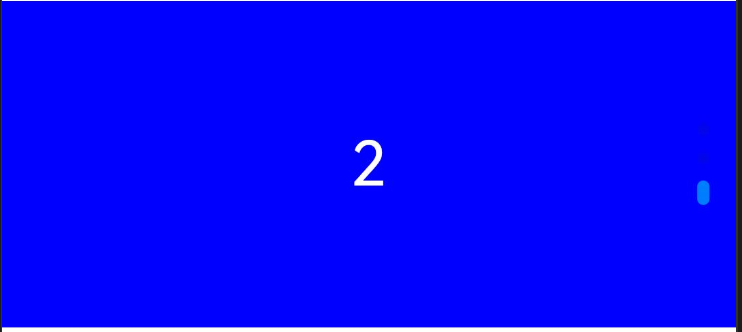
}1.4. 调整导航点
如果默认的导航点不满足效果,可以自行调整
导航点的调整可以分为 2 类:
- 显示 or 隐藏
- 导航点类型:
-
- 圆点(掌握)
- 数字(了解)
| indicator | DotIndicator | DigitIndicator | boolean | 设置可选导航点指示器样式。 - DotIndicator:圆点指示器样式。 - DigitIndicator:数字指示器样式。 - boolean:是否启用导航点指示器。 默认值:true 默认类型:DotIndicator |
Swiper(){// 略
}
// .indicator(false) // 关闭导航
// .indicator(Indicator.dot()) // 圆点指示器(默认)
// .indicator(Indicator.digit()) // 数字指示器
日常开发中 较为常见的是圆点指示器,咱们重点掌握如何调整他即可
Swiper(){// 略
}.indicator(Indicator.dot()// .xxx(设置圆点指示器的属性)) // 圆点指示器(默认)
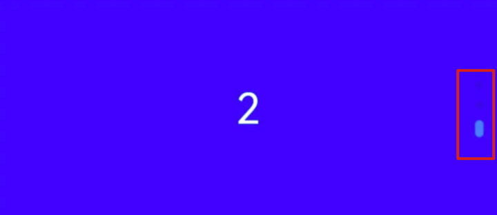
位置属性:
| 参数名 | 参数类型 | 必填项 | 参数描述 |
| left | Length | 否 | 设置导航点距离Swiper组件左边的距离。 默认值:0 单位:vp |
| top | Length | 否 | 设置导航点距离Swiper组件顶部的距离。 默认值:0 单位:vp |
| right | Length | 否 | 设置导航点距离Swiper组件右边的距离。 默认值:0 单位:vp |
| bottom | Length | 否 | 设置导航点距离Swiper组件底部的距离。 默认值:0 单位:vp |
样式属性:
| 参数名 | 参数类型 | 必填项 | 参数描述 |
| itemWidth | Length | 否 | 设置Swiper组件圆点导航指示器的宽,不支持设置百分比。 默认值:6 单位:vp |
| itemHeight | Length | 否 | 设置Swiper组件圆点导航指示器的高,不支持设置百分比。 默认值:6 单位:vp |
| selectedItemWidth | Length | 否 | 设置选中Swiper组件圆点导航指示器的宽,不支持设置百分比。 默认值:12 单位:vp |
| selectedItemHeight | Length | 否 | 设置选中Swiper组件圆点导航指示器的高,不支持设置百分比。 默认值:6 单位:vp |
| color | ResourceColor | 否 | 设置Swiper组件圆点导航指示器的颜色。 默认值:'#182431'(10%透明度) |
| selectedColor | ResourceColor | 否 | 设置选中Swiper组件圆点导航指示器的颜色。 默认值:'#007DFF' |
| 更多属性参考文档。。。。。 | |||
基础模版
@Entry
@Component
struct Page03_SwiperIndicator {build() {Column() {Text('Swiper导航点').fontSize(20).fontWeight(900).padding(10)Swiper() {Text('0').textAlign(TextAlign.Center).backgroundColor(Color.Red).fontColor(Color.White).fontSize(30)Text('1').textAlign(TextAlign.Center).backgroundColor(Color.Green).fontColor(Color.White).fontSize(30)Text('2').textAlign(TextAlign.Center).backgroundColor(Color.Blue).fontColor(Color.White).fontSize(30)}.width('100%').height(160)}.width('100%').height('100%')}
}
参考代码:
@Entry
@Component
struct Page03_SwiperIndicator {build() {Column() {Text('Swiper导航点').fontSize(20).fontWeight(900).padding(10)Swiper() {Text('0').textAlign(TextAlign.Center).backgroundColor(Color.Red).fontColor(Color.White).fontSize(30)Text('1').textAlign(TextAlign.Center).backgroundColor(Color.Green).fontColor(Color.White).fontSize(30)Text('2').textAlign(TextAlign.Center).backgroundColor(Color.Blue).fontColor(Color.White).fontSize(30)}.width('100%').height(160)// .indicator(false) // 关闭导航点// .indicator(Indicator.digit()) // 数字导航点.indicator(Indicator.dot().left(10)// 左侧距离.top(10)// 顶部距离.bottom(10)// 底部距离.right(10)// 右侧距离(距离属性组合使用,无需全部设置).itemWidth(20)// 指示器宽度.itemHeight(20)// 指示器高度.selectedItemWidth(30)// 选中指示器宽度.selectedItemHeight(30)// 选中指示器高度.selectedColor(Color.Yellow)// 选中指示器颜色.color(Color.Blue) // 默认指示器宽度) // 圆形导航点}.width('100%').height('100%')}
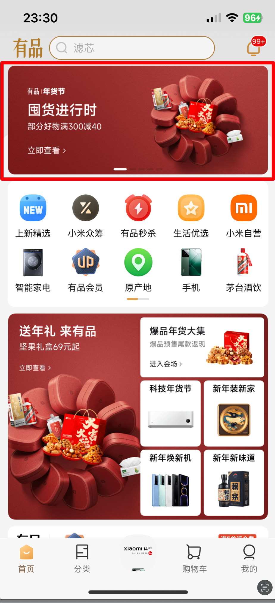
}1.5. 案例-小米有品
通过刚刚学习的内容,咱们来完成小米有品首页的轮播效果

关键信息:
- 宽高:100%、160
- 循环、自动轮播,间隔 4000
- 圆点指示器:
-
- 选中颜色:白色
- 选中宽高:30、4
- 默认宽高:10、4
基础模版:
@Entry
@Component
struct Page04_SwiperDemo_xiaomi {build() {Column() {Text('Swiper案例-小米').fontSize(20).fontWeight(900).padding(10)Swiper() {Image($r('app.media.ic_swiper_xmyp01'))Image($r('app.media.ic_swiper_xmyp02'))Image($r('app.media.ic_swiper_xmyp03'))Image($r('app.media.ic_swiper_xmyp04'))}}.width('100%').height('100%')}
}
参考代码:
@Entry
@Component
struct Page04_SwiperDemo_xiaomi {build() {Column() {Text('Swiper案例-小米').fontSize(20).fontWeight(900).padding(10)Swiper() {Image($r('app.media.ic_swiper_xmyp01'))Image($r('app.media.ic_swiper_xmyp02'))Image($r('app.media.ic_swiper_xmyp03'))Image($r('app.media.ic_swiper_xmyp04'))}.width('100%').height(160).indicator(Indicator.dot()// 圆形导航点.selectedColor(Color.White)// 选中颜色.selectedItemWidth(30)// 选中宽度.selectedItemHeight(4)// 选中高度.itemWidth(10)// 默认宽度.itemHeight(4) // 默认高度)}.width('100%').height('100%')}
}
2. 样式&结构重用
随着页面复杂程度提高,页面中会有很多的样式&结构代码,其中难免重复的部分,如果可以提取出来重复使用,就可以提升编码效率,减少重复代码,提升代码可读性。
咱们来来学习3 种样式&结构复用的语法:
- @Styles: 抽取公共样式、事件
- @Extends:扩展组件样式、事件
- @Builder:轻量级的元素复用机制(结构、样式、事件)- 重点掌握
2.1. @Styles
@Styles 可以抽取 通用的事件和属性,比如:
链接
Text(this.message).width(100).height(100).backgroundColor(this.bgColor).onClick(() => {this.bgColor = Color.Orange})Column() {
}
.width(100)
.height(100)
.backgroundColor(this.bgColor)
.onClick(() => {this.bgColor = Color.Orange
})Button('按钮').width(100).height(100).backgroundColor(this.bgColor).onClick(() => {this.bgColor = Color.Orange})
Text(this.message).sizeAndColorFancy()Column() {
}
.sizeAndColorFancy()Button('按钮').sizeAndColorFancy()