【Qt开发】常用控件(七)-> styleSheet
目录
1 -> 引言:为什么需要 Qt 样式表?
2 -> Qt 样式表基础
2.1 -> 什么是 Qt 样式表
2.2 -> 基本语法结构
3 -> 选择器类型
3.1 -> 通用选择器
3.2 -> 类型选择器
3.3 -> 类选择器
3.4 -> ID 选择器(通过 objectName)
3.5 -> 属性选择器
3.6 -> 子控件选择器
3.7 -> 状态选择器
4 -> 常用属性详解
4.1 -> 背景与边框
4.2 -> 文本与字体
4.3 -> 尺寸与边距
4.4 -> 渐变与图像
5 -> 复杂控件样式化
5.1 -> QComboBox 样式
5.2 -> QSlider 样式
5.3 -> QTabWidget
6 -> 代码示例
6.1 -> 设置文本样式
6.2 -> 实现切换夜间模式
1 -> 引言:为什么需要 Qt 样式表?
在 GUI 开发中,应用程序的外观和用户体验至关重要。Qt 提供了强大的样式表系统,允许开发者使用类似 CSS 的语法来美化应用程序界面,无需重写绘图代码或创建自定义控件。无论想实现现代化界面、保持跨平台一致性,还是创建品牌特定的视觉风格,Qt 样式表都能轻松实现。
2 -> Qt 样式表基础
2.1 -> 什么是 Qt 样式表
Qt 样式表(QSS)是一种基于 CSS 语法的机制,用于自定义 Qt 控件的外观。它允许你设置颜色、字体、边框、背景等属性,而无需子类化 Qt 控件。
CSS(Cascading Style Sheets 层叠样式表)本身属于网页前端技术。主要就是用来描述界面的样式。
所谓 “样式”,包括不限于大小,位置,颜色,间距,字体,背景,边框等。
平时所看到的丰富多彩的网页,就会用到大量的 CSS。
Qt 虽然是做 GUI 开发,但实际上和网页前端有很多异曲同工支持。因此 Qt 也引入了对于 CSS 的支持。
CSS 中可以设置的样式属性非常多。基于这些属性 Qt 只能支持其中一部分,称为 QSS(Qt Style Sheet)。
2.2 -> 基本语法结构
选择器 {属性: 值;属性: 值;
}
示例:
QPushButton {background-color: #3498db;color: white;border: 2px solid #2980b9;border-radius: 5px;padding: 5px 10px;
}
3 -> 选择器类型
3.1 -> 通用选择器
* {font-family: "Microsoft YaHei";font-size: 12px;
}
3.2 -> 类型选择器
QPushButton {/* 所有QPushButton的样式 */
}
3.3 -> 类选择器
.QPushButton {/* 与类型选择器类似 */
}
3.4 -> ID 选择器(通过 objectName)
QPushButton#loginButton {background-color: green;
}
3.5 -> 属性选择器
QPushButton[flat="true"] {border: none;
}
3.6 -> 子控件选择器
QComboBox::drop-down {/* QComboBox下拉箭头的样式 */
}
3.7 -> 状态选择器
QPushButton:hover {background-color: #2980b9;
}QPushButton:pressed {background-color: #21618c;
}QPushButton:disabled {color: gray;background-color: #dddddd;
}
4 -> 常用属性详解
4.1 -> 背景与边框
QWidget {background-color: #f0f0f0; /* 背景颜色 */border: 1px solid #cccccc; /* 边框:宽度 样式 颜色 */border-radius: 4px;       /* 圆角半径 */
}
4.2 -> 文本与字体
QLabel {color: #333333;           /* 文本颜色 */font-family: "Arial";     /* 字体家族 */font-size: 14px;          /* 字体大小 */font-weight: bold;        /* 字体粗细 */
}
4.3 -> 尺寸与边距
QPushButton {min-width: 80px;          /* 最小宽度 */max-width: 200px;         /* 最大宽度 */height: 30px;             /* 固定高度 */padding: 5px 10px;        /* 内边距 */margin: 2px;              /* 外边距 */
}
4.4 -> 渐变与图像
QPushButton {/* 线性渐变 */background: qlineargradient(x1:0, y1:0, x2:0, y2:1,stop:0 #3498db, stop:1 #2980b9);/* 径向渐变 */background: qradialgradient(cx:0.5, cy:0.5, radius: 0.5,fx:0.5, fy:0.5,stop:0 white, stop:1 green);/* 使用图像 */border-image: url(:/images/button.png) 3 3 3 3 stretch stretch;
}
5 -> 复杂控件样式化
5.1 -> QComboBox 样式
QComboBox {border: 1px solid #cccccc;border-radius: 3px;padding: 1px 18px 1px 3px;min-width: 6em;
}QComboBox::drop-down {subcontrol-origin: padding;subcontrol-position: top right;width: 15px;border-left-width: 1px;border-left-color: darkgray;border-left-style: solid;border-top-right-radius: 3px;border-bottom-right-radius: 3px;
}QComboBox::down-arrow {image: url(:/images/down_arrow.png);width: 10px;height: 10px;
}
5.2 -> QSlider 样式
QSlider::groove:horizontal {border: 1px solid #999999;height: 8px;background: #f0f0f0;border-radius: 4px;
}QSlider::handle:horizontal {background: #3498db;border: 1px solid #2980b9;width: 18px;margin: -5px 0;border-radius: 9px;
}QSlider::sub-page:horizontal {background: #3498db;border-radius: 4px;
}
5.3 -> QTabWidget
QTabWidget::pane {border: 1px solid #cccccc;background: white;
}QTabWidget::tab-bar {alignment: center;
}QTabBar::tab {background: #f0f0f0;border: 1px solid #cccccc;border-bottom: none;padding: 5px 15px;border-top-left-radius: 4px;border-top-right-radius: 4px;
}QTabBar::tab:selected {background: white;margin-bottom: -1px;
}
6 -> 代码示例
6.1 -> 设置文本样式
1. 在界面上创建 label
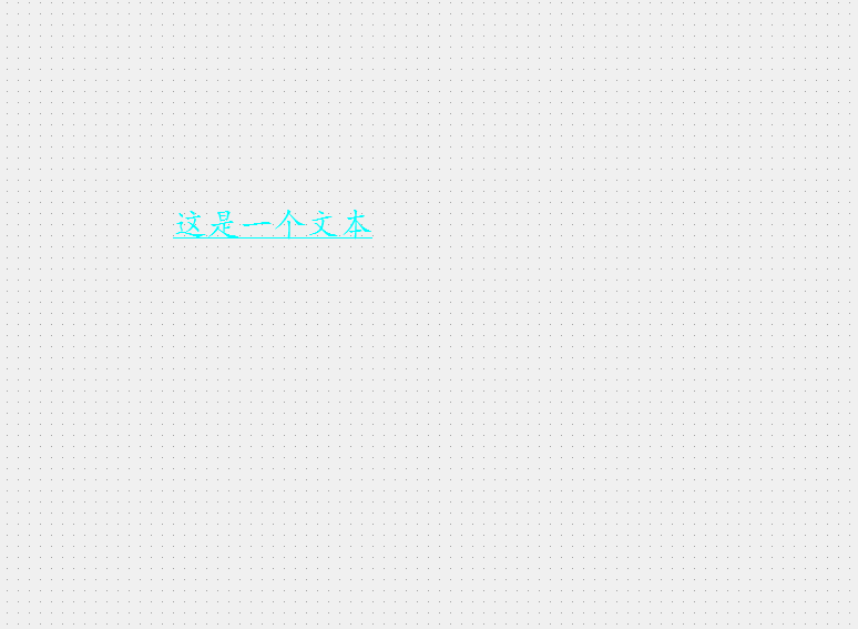
2. 编辑右侧的 styleSheet 属性,设置样式
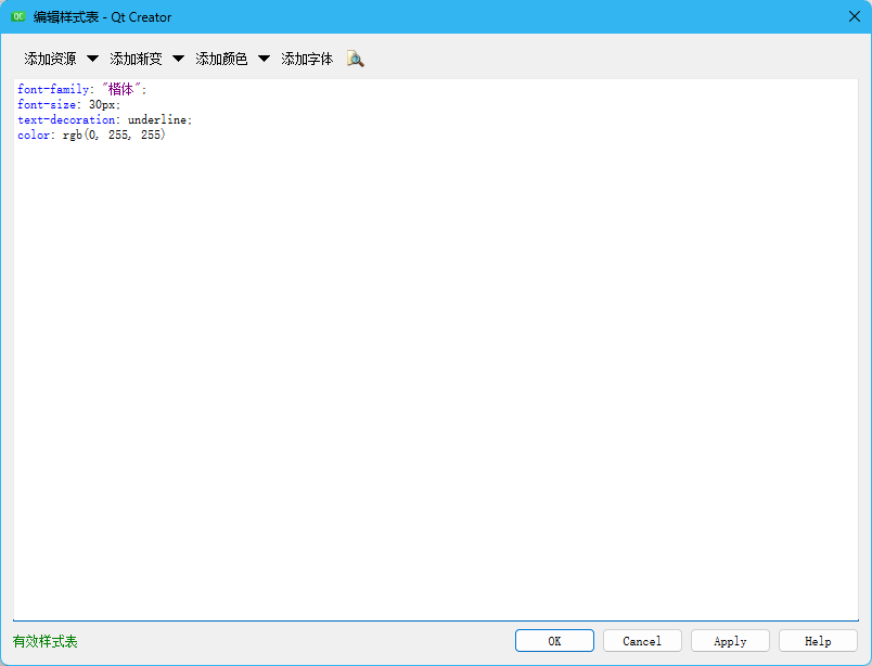
此处的语法格式同 CSS,使用键值对的方式设置样式。其中键和值之间使用 :分割。键值对之间使用 ;分割。
另外,Qt Designer 只能对样式的基本格式进行校验,不能检测出哪些样式不被 Qt 支持。比如 text-align: center 这样的文本居中操作,就无法支持。
编辑完成样式之后,可以看到在 Qt Designer 中能够实时预览出效果。
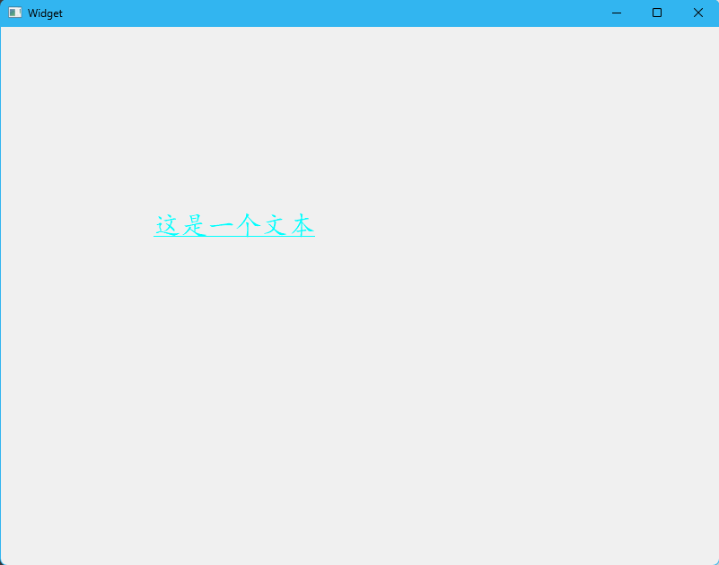
3. 运行程序,可以看到实际效果和预览效果基本一致。
6.2 -> 实现切换夜间模式
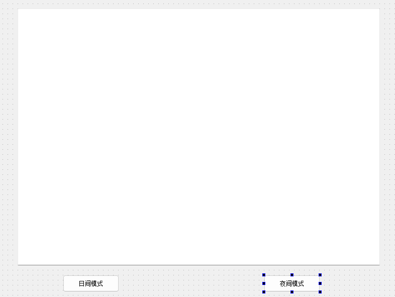
1. 在界面上创建一个多行输入框(Text Edit)和两个按钮
objectName 分别是 pushButton_light 和 pushButton_dark
2. 编写按钮的 slot 函数
#include "widget.h"
#include "ui_widget.h"Widget::Widget(QWidget *parent): QWidget(parent), ui(new Ui::Widget)
{ui->setupUi(this);
}Widget::~Widget()
{delete ui;
}void Widget::on_pushButton_light_clicked()
{// 设置窗口样式this->setStyleSheet("background-color: RGB(240, 240, 240);");// 设置输入框样式ui->plainTextEdit->setStyleSheet("background-color: white; color: black;");// 设置按钮样式ui->pushButton_light->setStyleSheet("color: black;");ui->pushButton_dark->setStyleSheet("color: black;");
}void Widget::on_pushButton_dark_clicked()
{// 设置窗口样式this->setStyleSheet("background-color: black;");// 设置输入框样式ui->plainTextEdit->setStyleSheet("background-color: black; color: white;");// 设置按钮样式ui->pushButton_light->setStyleSheet("color: white;");ui->pushButton_dark->setStyleSheet("color: white;");
}
关于计算机中的颜色表示
计算机中使用 “像素” 表示屏幕上的一个基本单位(也就是一个发亮的光点)。
每个光点都使用三个字节表示颜色,分别是 R(red),G(green),B(blue)一个字节表示(取值范围是 0-255,或者 0x00-0xFF)。
混合三种不同颜色的数值比例,就能搭配出千千万万的颜色出来。
- rgb(255, 0, 0) 或者 #FF0000 或者 #F00 表示纯红色。
- rgb(0, 255, 0) 或者 #00FF00 或者 #0F0 表示纯绿色。
- rgb(0, 0, 255) 或者 #0000FF 或者 #00F 表示纯蓝色。
- rgb(255, 255, 255) 或者 #FFFFFF 或者 #FFF 表示纯白色。
- rgb(0, 0, 0) 或者 #000000 或者 #000 表示纯黑色。
当然,上述规则只针对一般的程序而言是这么设定的。实际的显示器,可能是 8bit 色深或者 10bit 色深等,实际情况会更加复杂。
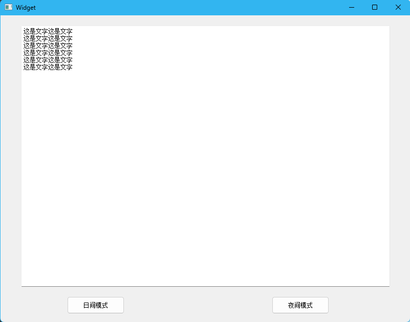
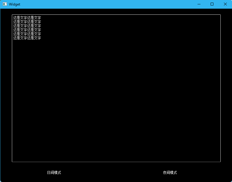
3. 运行程序,点击 “日间模式”,就是浅色背景,深色文字;点击 “夜间模式”,就是深色背景,浅色文字
感谢各位大佬支持!!!
互三啦!!!