CSS3动画
一、CSS3 动画
CSS3 动画是一种通过纯CSS实现动画效果的技术,它允许开发者在不使用JavaScript或Flash的情况下,为网页元素添加平滑的过渡和动画效果。CSS3 动画的引入,极大地增强了网页的表现力和用户体验。
二、 CSS3 动画的关键组成部分
1、设置关键帧
@keyframes animationname {
from {/*CSS样式写在这里*/}
percentage {/*CSS样式写在这里*/}
to {/*CSS样式写在这里*/}
}
2、调用关键帧
animation属性用于将@keyframes动画绑定到元素上,并控制动画的播放。它可以包含多个子属性,如animation-name、animation-duration、animation-timing-function、animation-delay、animation-iteration-count、animation-direction等
语法 :
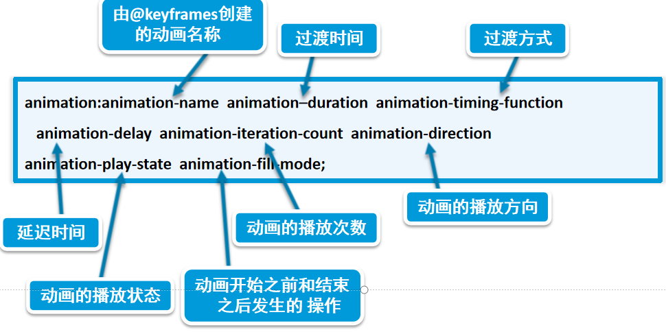
animation属性 :
| 性名称 | 作用描述 | 可选值 | 默认值 |
|---|---|---|---|
| animation-name | 指定关键帧动画名称 | keyframename | none | none |
| animation-duration | 单次动画持续时间 | 时间单位(s/ms) | 0s |
| animation-timing-function | 动画速度曲线 | ease | linear | ease-in | ease-out | ease-in-out | steps(n) | ease |
| animation-delay | 动画延迟时间 | 时间单位(允许负值) | 0s |
| animation-iteration-count | 动画播放次数 | number | infinite | 1 |
| animation-direction | 动画播放方向 | normal | reverse | alternate | alternate-reverse | normal |
| animation-fill-mode | 动画外样式应用 | none | forwards | backwards | both | none |
| animation-play-state | 动画播放状态控制 | running | paused | running |
说明:
animation-direction
- 作用:控制播放方向
- 参数:
normal:正向播放
reverse:反向播放
alternate:奇数次正向,偶数次反向
alternate-reverse:奇数次反向,偶数次正向animation-fill-mode
- 作用:设置动画执行前后样式状态
- 参数:
none:默认状态
forwards:保留最后一帧样式
backwards:应用第一帧样式
both:同时应用前后状态animation-play-state
- 作用:控制动画播放状态
- 参数:
running:将暂停的动画重新播放
paused:将正在播放的元素动画停下来
三、CSS3 动画的优势
纯CSS实现:无需依赖JavaScript或第三方库,减少了代码的复杂性和加载时间。
性能优化:浏览器对CSS动画进行了优化,通常比JavaScript动画更加流畅和高效。
易于维护:CSS动画与页面样式分离,使得样式和动画的维护更加容易。
兼容性:现代浏览器普遍支持CSS3动画,具有良好的兼容性。
四、动画应用
1、背景动画(通过改变背景图片的位置来实现动画效果。)
<!DOCTYPE html>
<html>
<head><meta charset="utf-8"><title>背景动画</title><style>body {display: flex; /* 使用弹性布局 */justify-content: center; /* 水平居中 */align-items: center; /* 居中显示 */height: 100vh; /* 确保足够长,以便滚动 */font-size: 30px;color: #fff;background-image: -webkit-linear-gradient(125deg, #2c3e50, #27ae60, #2980b9, #e74c3c, #8e44ad); /* 渐变背景 */background-size: 400%;  /* 背景图大小 */animation: bgmove 10s infinite; /* 动画名称、持续时间、无限循环 */}/* 定义动画 */@keyframes bgmove {from {background-position: 0% 50%; /* 起始位置 */}50% {background-position: 100% 50%; /* 中间位置 */}to {background-position: 0% 50%; /* 结束位置,回到起始点形成循环效果 */}}</style>
</head>
<body><h1>Animate Background</h1>
</body>
</html> 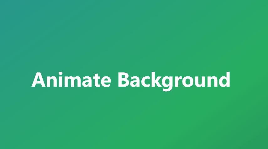
2、逼真的水滴动图(通过改变元素的边框半径和阴影来实现动画。)
<!DOCTYPE html>
<html>
<head><meta charset="utf-8"><title>水滴动图</title><style>* {margin: 0;padding: 0;box-sizing: border-box;}body {width: 100vw;height: 100vh;display: flex;background-color: #00a8ff;justify-content: center;}/* 水面 */.water {margin-top: 200px;width: 300px;height: 300px;border: 1px solid #000;border-radius: 72% 28% 64% 36% / 12% 17% 83% 88%;box-shadow: inset 10px 20px 30px rgba(0, 0, 0, 0.5),10px 10px 20px rgba(0, 0, 0, 0.3),15px 15px 30px rgba(0, 0, 0, 0.05),inset -10px -10px 15px rgba(255, 255, 255, 0.8);  /* 阴影效果 */animation: move 5s linear infinite alternate; /* 动画效果  */}/* 水滴 */.water::after, .water::before {content: '';position: absolute;background-color: rgba(255, 255, 255, 0.8);}/* 水滴后 */.water::after {width: 20px;height: 20px;top: 240px;left: 47%;border-radius: 9% 91% 35% 65% / 51% 17% 83% 49%;}/* 水滴前 */.water::before {width: 10px;height: 10px;top: 230px;left: 45%;border-radius: 53% 47% 46% 54% / 99% 0% 100% 1%;}/* 动画效果 */@keyframes move {25% {border-radius: 11% 89% 65% 35% / 64% 32% 68% 36%;  /* 改变形状 */}50% {border-radius: 60% 40% 65% 35% / 64% 32% 68% 36%;  /* 改变形状 */}to {border-radius: 73% 27% 65% 35% / 64% 67% 33% 36%;}}</style>
</head>
<body><div class="water"></div>
</body>
</html>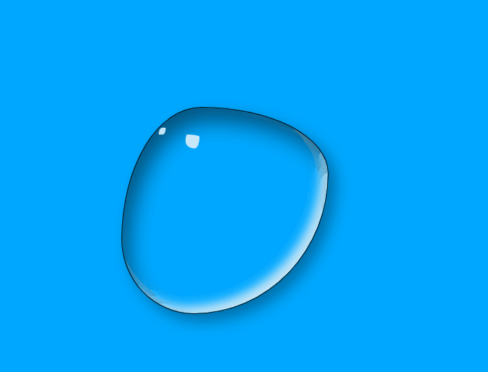
3、热点图动画(通过逐渐放大和降低透明度的圆圈来表示热点的动态变化。)
<!DOCTYPE html>
<html lang="en">
<head><meta charset="UTF-8"><meta name="viewport" content="width=device-width, initial-scale=1.0"><meta http-equiv="X-UA-Compatible" content="ie=edge"><title>热点图动画</title><style>body {position: relative;background-color: coral;}/* 热点的位置,大小 颜色 */.beijing, .shanghai, .guangzhou {position: absolute;width: 40px;height: 10px;font-size: 12px;color: white;}/* 热点位置 */.beijing { top: 100px; left: 500px; }.shanghai { top: 250px; left: 550px; }.guangzhou { top: 350px; left: 480px; }/* 动画圆点大小,颜色,阴影 */.dot {width: 8px;height: 8px;background-color: deepskyblue;border-radius: 50%;box-shadow: 0 0 12px deepskyblue;}/* 动画圆点位置 */.bjdot, .shdot, .gzdot {position: absolute;}/* 圆点位置 */.bjdot { top: 105px; left: 485px; }.shdot { top: 255px; left: 535px; }.gzdot { top: 355px; left: 465px; }/* 动画圆点 */.dot div[class^="circle"] {position: absolute;transform: translate(-50%, -50%);margin-top: 4px;margin-left: 4px;width: 8px;height: 8px;border: 1px solid deepskyblue;box-sizing: border-box;border-radius: 50%;box-shadow: 0 0 12px deepskyblue;}/* 动画延迟时间 */.circle1 { animation: movie 3s linear infinite; }.circle2 { animation: movie 3s linear 1s infinite; }.circle3 { animation: movie 3s linear 2s infinite; }/* 动画 */@keyframes movie {0% {}70% {width: 60px;height: 60px;opacity: 0.3;}100% {width: 60px;height: 60px;opacity: 0;}}</style>
</head>
<body><div class="beijing">北京</div><div class="shanghai">上海</div><div class="guangzhou">杭州</div><div class="dot bjdot"><div class="circle1"></div><div class="circle2"></div><div class="circle3"></div></div><div class="dot shdot"><div class="circle1"></div><div class="circle2"></div><div class="circle3"></div></div><div class="dot gzdot"><div class="circle1"></div><div class="circle2"></div><div class="circle3"></div></div>
</body>
</html>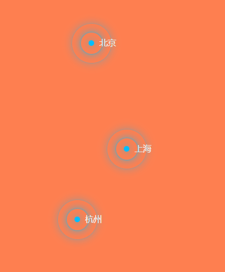
五、小结
CSS3 动画是一种强大的工具,它允许开发者以简单而高效的方式为网页添加动画效果。通过掌握
@keyframes规则和animation属性,您可以创建出丰富多样的动画效果,提升网页的用户体验。