零基础学习CSS3 - 3D转换: 手把手教您实现各种高级特效
基本使用
<style>div {width: 100px;height: 100px;background-color: pink;/* transform: translateX(100px) translateY(100px) translateZ(100px); *//* translateZ 单位一般是px translateZ(100px) 正值是外(向眼睛移动) 负值是里*//* 简写 x y z 不能省略 如果没有就写0*/transform: translate3d(0, 100px, 100px);}
</style><body><div></div>
</body>
3D透视
perspective(透视)
代码示例
<style>body {/* 透视要写到被观察盒子的父盒子里  数值越大我们看到的越小*/perspective: 200px;}div {width: 100px;height: 100px;background-color: pink;/* transform: translateX(100px) translateY(100px) translateZ(100px); *//* translateZ 单位一般是px translateZ(100px) 正值是外(向眼睛移动) 负值是里*//* 简写 x y z 不能省略 如果没有就写0*/transform: translate3d(400px, 100px, 100px);}
</style><body><div></div>
</body>
3D-Z轴
<style>body {/* 透视要写到被观察盒子的父盒子里  数值越大我们看到的越小*/perspective: 500px;}div {width: 200px;height: 200px;background-color: pink;margin: 100px auto;/* z轴数值越大我们看到的越大 */transform: translateZ(100px);}
</style><body><div></div>
</body>
3D旋转X轴
语法
- transform:rotateX(45deg); 沿着x轴正方向旋转45度
- transform:rotateY(45deg); 沿着y轴正方向旋转45度
- transform:rotateZ(45deg); 沿着y轴正方向旋转45度
- transform:rotate3d(x,y,z,deg); 沿着自定义方向旋转(了解即可)
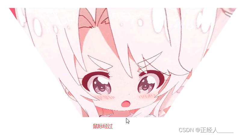
代码示例
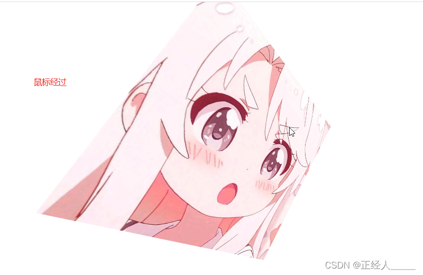
<style>body {/* 近大远小 */perspective: 300px;}img {display: block;width: 400px;margin: 100px auto;transition: all 1s;}img:hover {transform: rotateX(-45deg);}
</style><body><img src="img/doman.jpeg" alt="">
</body>
效果图
3D旋转Y轴
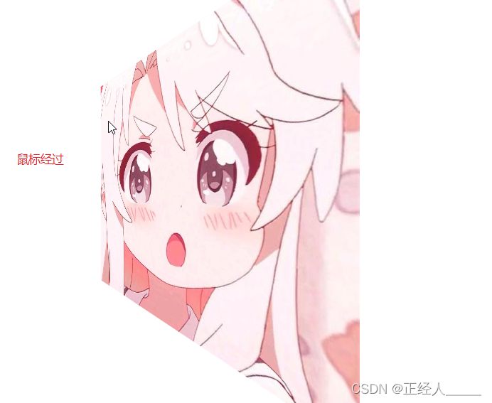
代码示例
<style>body {/* 近大远小 */perspective: 300px;}img {display: block;width: 400px;margin: 100px auto;transition: all 1s;}img:hover {transform: rotateY(-45deg);}
</style><body><img src="img/doman.jpeg" alt="">
</body>
效果图
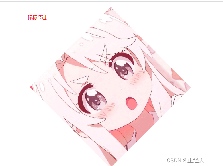
3D旋转Z轴
代码示例
<style>body {/* 近大远小 */perspective: 300px;}img {display: block;width: 400px;margin: 100px auto;transition: all 1s;}img:hover {transform: rotateZ(-45deg);}
</style><body><img src="img/doman.jpeg" alt="">
</body>
效果图
3D旋转复合写法
代码示例
<style>body {/* 近大远小 */perspective: 300px;}img {display: block;width: 400px;margin: 100px auto;transition: all 1s;}img:hover {/* transform: rotate3d(0, 1, 0, 45deg); *//* transform: rotate3d(1, 0, 0, 45deg); *//* transform: rotate3d(0, 0, 1, 45deg); */transform: rotate3d(0, 1, 1, 45deg);}
</style><body><img src="img/doman.jpeg" alt="">
</body>
效果图
3D呈现
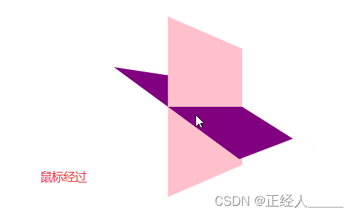
代码示例
<style>body {perspective: 400px;}.box {position: relative;width: 200px;height: 200px;margin: 100px auto;transition: all 1s;/* 让子元素保持3D立体空间环境 */transform-style: preserve-3d;}.box:hover {transform: rotateY(60deg);}.box div {position: absolute;top: 0;left: 0;width: 100%;height: 100%;background-color: pink;}.box div:last-child {background-color: purple;transform: rotateX(60deg);}
</style><body><div class="box"><div></div><div></div></div>
</body>
效果图
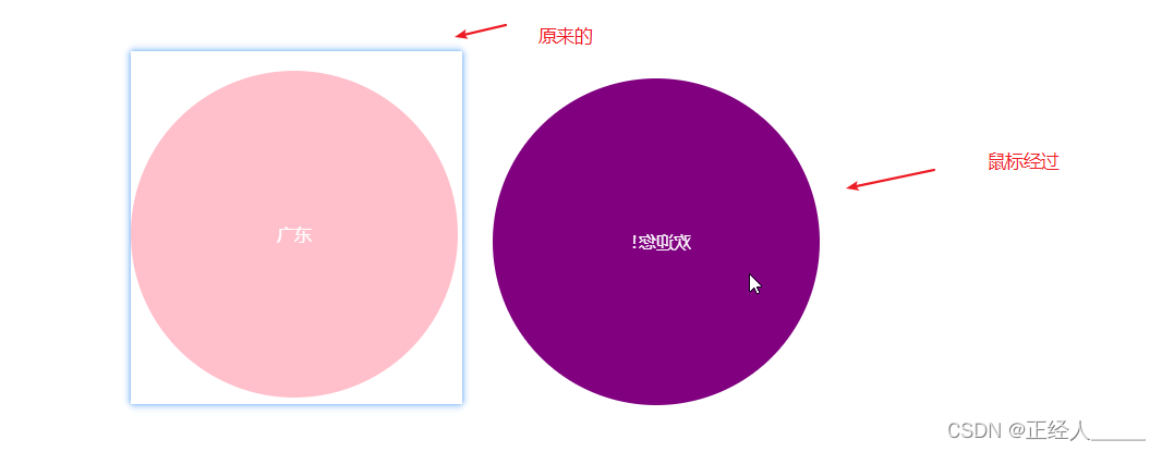
案例-两面翻转的盒子
代码示例
<style>body {perspective: 400px;}.box {position: relative;width: 300px;height: 300px;margin: 100px auto;transition: all .4s;/* 让背面紫色的盒子保留3D立体空间 */transform-style: preserve-3d;}.box:hover {transform: rotateY(90deg);}.front,.back {position: absolute;top: 0;left: 0;width: 100%;height: 100%;border-radius: 50%;color: #fff;text-align: center;line-height: 300px;}.front {background-color: pink;z-index: 1;}.back {background-color: purple;/*首先像手机一样背靠背  */transform: rotateY(90deg);}
</style><body><div class="box"><div class="front">广东</div><div class="back">欢迎您!</div></div>
</body>
效果示例
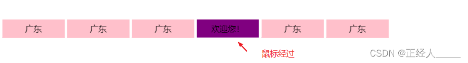
案例3D导航栏
代码示例
<style>* {margin: 0;padding: 0;}ul {margin: 100px;}li {float: left;width: 120px;height: 35px;margin: 0 5px;list-style: none;perspective: 500px;}.box {position: relative;width: 100%;height: 100%;/* 让紫色盒子保留3D立体空间环境 */transform-style: preserve-3d;transition: all 1s;}.box:hover {transform: rotateX(90deg);}.front,.back {position: absolute;top: 0;left: 0;width: 100%;height: 100%;line-height: 35px;text-align: center;}.front {background-color: pink;transform: translateZ(17.5px);}.back {background-color: purple;/* 有移动时要先移动后旋转 */transform: translateY(17.5px) rotateX(-90deg);}
</style><body><ul><li><div class="box"><div class="front">广东</div><div class="back">欢迎您!</div></div></li><li><div class="box"><div class="front">广东</div><div class="back">欢迎您!</div></div></li><li><div class="box"><div class="front">广东</div><div class="back">欢迎您!</div></div></li><li><div class="box"><div class="front">广东</div><div class="back">欢迎您!</div></div></li><li><div class="box"><div class="front">广东</div><div class="back">欢迎您!</div></div></li><li><div class="box"><div class="front">广东</div><div class="back">欢迎您!</div></div></li></ul></body>
效果图
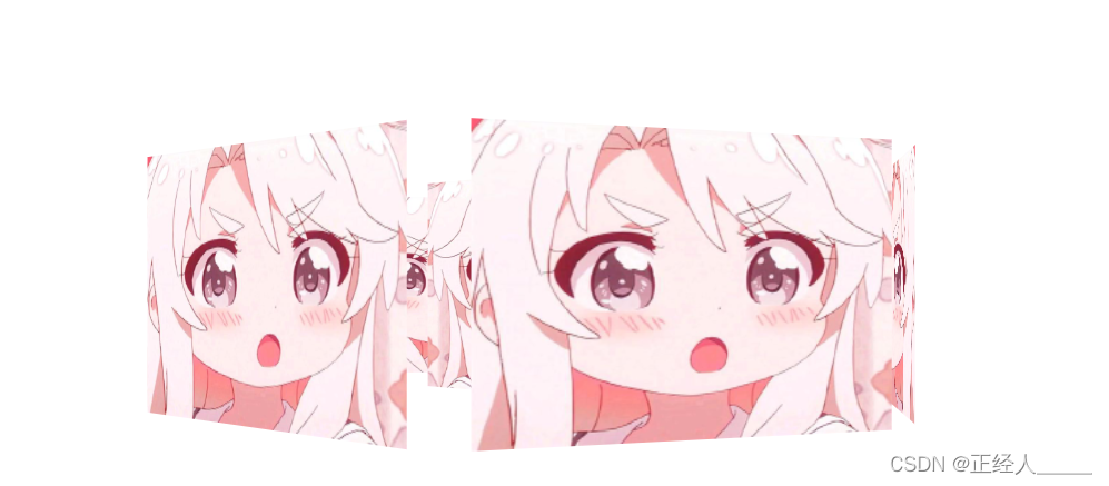
案例-旋转木马
代码示例
<style>body {perspective: 1000px;}section {position: relative;width: 300px;height: 200px;margin: 200px auto;transform-style: preserve-3d;/* 添加动画效果 */animation: rotate 10s linear 0s infinite;/* 木马中心的图片 */background: url(img/muma.png) no-repeat;}@keyframes rotate {0% {transform: rotateY(0);}100% {transform: rotateY(360deg);}}section:hover {/* 鼠标放到section 停止动画 */animation-play-state: paused;}section div {position: absolute;top: 0;left: 0;width: 100%;height: 100%;background: url(img/muma.png) no-repeat;}section div:nth-child(1) {transform: rotateY(0) translateZ(300px);/* z-index: 1; */}section div:nth-child(2) {/* 先旋转好了再 移动距离 */transform: rotateY(60deg) translateZ(300px);}section div:nth-child(3) {/* 先旋转好了再 移动距离 */transform: rotateY(120deg) translateZ(300px);}section div:nth-child(4) {/* 先旋转好了再 移动距离 */transform: rotateY(180deg) translateZ(300px);}section div:nth-child(5) {/* 先旋转好了再 移动距离 */transform: rotateY(240deg) translateZ(300px);}section div:nth-child(6) {/* 先旋转好了再 移动距离 */transform: rotateY(300deg) translateZ(300px);}
</style><body><section><div></div><div></div><div></div><div></div><div></div><div></div></section>
</body>
效果图