Vue3封装公共图片组件
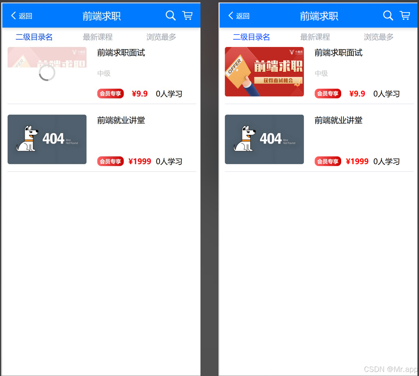
对图片加载做的处理:
1.图片加载状态响应式管理
2.图片访问错误的处理机制
3.图片懒加载
4.可通过slot支持自定义加载动画
5.其他监听事件的处理及向上传递
<!-- components/CustomImage.vue -->
<template><div class="custom-image-wrapper"><!-- 主图 --><img v-show="!showDefault" :src="effectiveSrc" class="img-style" :alt="altText" @error="handleError" @load="handleLoad" lazy-load="true" /><!-- 默认图 --><img v-show="showDefault" :src="effectiveDefaultSrc" class="img-style" :alt="altText" lazy-load="true" /><!-- 加载状态(可选) --><div v-if="showLoading" class="loading-overlay"><slot name="loading"><div class="loading-spinner"></div></slot></div></div>
</template><script setup>
const props = defineProps({src: {type: String,required: true},defaultSrc: {type: String,default: '../../static/404.jpg'},alt: {type: String,default: 'image'},lazy: {type: Boolean,default: true},imageClass: {type: String,default: ''},retryCount: {type: Number,default: 0},retryDelay: {type: Number,default: 2000}
});const emit = defineEmits(['error', 'loaded']);// 响应式状态
const hasError = ref(false);
const isLoading = ref(true);
const currentRetry = ref(0);
const localDefaultSrc = ref(props.defaultSrc);const altText = ref('');// 计算属性
const effectiveSrc = computed(() => {if (!props.src || hasError.value) return '';return props.src;
});const effectiveDefaultSrc = computed(() => {return localDefaultSrc.value || props.defaultSrc;
});const showDefault = computed(() => {return hasError.value || !props.src;
});const showLoading = computed(() => {return isLoading.value && !showDefault.value;
});// 处理方法
const handleError = (e) => {if (currentRetry.value < props.retryCount) {currentRetry.value++;setTimeout(() => {hasError.value = false;}, props.retryDelay);return;}hasError.value = true;isLoading.value = false;emit('error', e);
};const handleLoad = () => {isLoading.value = false;emit('loaded');
};// 监听props变化
watch(() => props.src,(newVal) => {if (newVal) {hasError.value = false;isLoading.value = true;currentRetry.value = 0;}}
);watch(() => props.defaultSrc,(newVal) => {localDefaultSrc.value = newVal;}
);
</script><style scoped>
.custom-image-wrapper {position: relative;/*  width: 100%;height: 100%; */
}img {width: 100%;height: 100%;object-fit: cover;transition: opacity 0.3s;border-radius: inherit;
}.img-style {width: var(--img-width);height: var(--img-height);border-radius: var(--img-border-radius);
}.loading-overlay {position: absolute;top: 0;left: 0;width: 100%;height: 100%;background: rgba(255, 255, 255, 0.8);display: flex;align-items: center;justify-content: center;
}.loading-spinner {width: 24px;height: 24px;border: 3px solid #ddd;border-top-color: #888;border-radius: 50%;animation: spin 1s linear infinite;
}@keyframes spin {to {transform: rotate(360deg);}
}
</style>
组件使用
<ImageView class="custom-style" :src="item.courseCover"
default-src="../../static/404.jpg"></ImageView>
.custom-style {--img-width: 298rpx;--img-height: 186rpx;--img-border-radius: 8rpx;}
说明:
1.图片样式直接在组件中通过给自定义组件上设置类名,在style中写CSS样式就行;
2.需要注意的是:在自定义组件中由于为了同时兼容H5、小程序,有这么一个变量穿透的类名 .img-style,如果只面向WEB端,可注释其CSS,在父组件中直接以普通形式设置图片的样式。
如果遇到样式不生效看这篇文章