web方向第一次考核内容
一.考核内容
Web组大一下考核之HTML、CSS
1.为什么要清除浮动(4),清除浮动的方法有哪些?(6)(至少两种)
2.怎么实现左边左边宽度固定右边宽度自适应的布局?(10)
3.讲讲flex:1;(10)
4.怎么实现移动端适配不同设备?(10)
5.制作页面
6.
7.
8.
二. 考核后的总结
1.
在网页的布局里,浮动常常使用,当父元素不直接设置高度,需要里面的子元素撑开时,子元素都设置了浮动脱离了标准流,会导致父元素没有高度,使得之后的标准流盒子影响整体的布局。
清除浮动的方法:
- 最常用的方法是使用伪元素清除浮动,思想就是设置一个正常流的盒子,让该正常流的盒子撑开父盒子,避免之后的正常流盒子影响布局。
clearfix清除浮动
.clearfix:after{content:"";display:“block";height: 0px;clear:both;visibility: hidden;
}
- 父元素触发 BFC:通过设置 overflow: hidden 或 overflow: auto 让父元素形成 BFC(块级格式化上下文),从而包裹浮动元素。有哪些属性可以激活bfc:浮动元素,定位元素(除了absolute,fixed),display:inline-block,overflow:hidden(只要不是visible)
2.
- 使用flex布局,假设左右两个盒子排在一行,左边固定,右边的盒子给他添加flex:1属性,实现自适应的效果。
- 使用overflow:hidden,给右边的盒子添加这一属性,让该盒子自己处于独立的渲染模式下(不设置宽度),左边的盒子设置了固定的宽度。
- 使用margin-left:左边的盒子宽度,给右盒子添加浮动属性,使他们一行排列,则可以实现右边宽度自适应的效果。
相应的dom结构
<div class="box1"></div>
<div class="box2"></div>
.box1 {float: left;width: 200px;height: 200px;background-color: pink;}.box2 {margin-left: 200px;height: 200px;background-color: purple;}
3.
flex:1是flex布局中的一个属性设置,如果大容器的每一个盒子都设置了这一个属性,则每一个盒子会平均分配大盒子的剩余宽度。
.container {
display: flex;
}
.item {
/* 所有子元素平分容器宽度 */
flex: 1;
}
4.
- REM 适配
通过媒体查询动态设置根字体大小(基于设计稿宽度,如 750px),引入flexible.js外部文件,动态处理rem的大小。
- Flexible 布局 + 媒体查询
使用 Flexbox 实现弹性布局。
针对不同屏幕尺寸设置媒体查询调整样式:
css
@media (max-width: 600px) {
body { font-size: 14px; }
}
- VW/VH 单位
直接使用视口单位(1vw = 1% 视口宽度,也可以用vmin以视口宽高较小的一个为准)
- 也可以使用bootstrap框架,栅栏式布局在四种屏幕宽度条件下搭配上媒体查询在屏幕缩放的过程中改变页面布局。
5.
- 页面分为头部,内容,尾部,头部和内容都可以使用flex布局,头部设置justify-content:space-between属性占据左右两部分。
- 内容可以给中间的盒子设置margin值,给每一个子盒子设置flex:1实现三栏布局。
6.
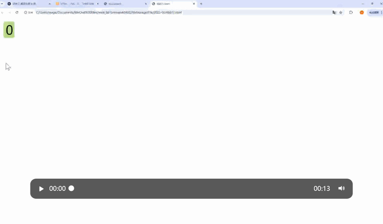
- 这个要注意的是设置一个只能显示一个数字大小的外部盒子,套一个大的子盒子,根据子绝父相定位子盒子,设置一个动画改变它的top值。
<div class="box"><div class="contain"><div>0</div><div>1</div><div>2</div><div>3</div><div>4</div><div>5</div><div>6</div><div>7</div><div>8</div><div>9</div></div></div>
* {box-sizing: border-box;}.box {position: relative;display: inline-block;width: 30px;height: 50px;background-color: green;border-radius: 5px;overflow: hidden;}@keyframes move {from {top: 0;}to {top: -460px;}}.contain {position: absolute;top: 0;left: 0;width: 30px;height: 500px;margin: 0 auto;border-radius: 5px;font-size: 16px;text-wrap: wrap;text-align: center;animation: move 4s ease-in-out infinite alternate backwards;}.contain div {width: 100%;height: 50px;line-height: 50px;}.contain div:last-child {width: 100%;height: 25px;}
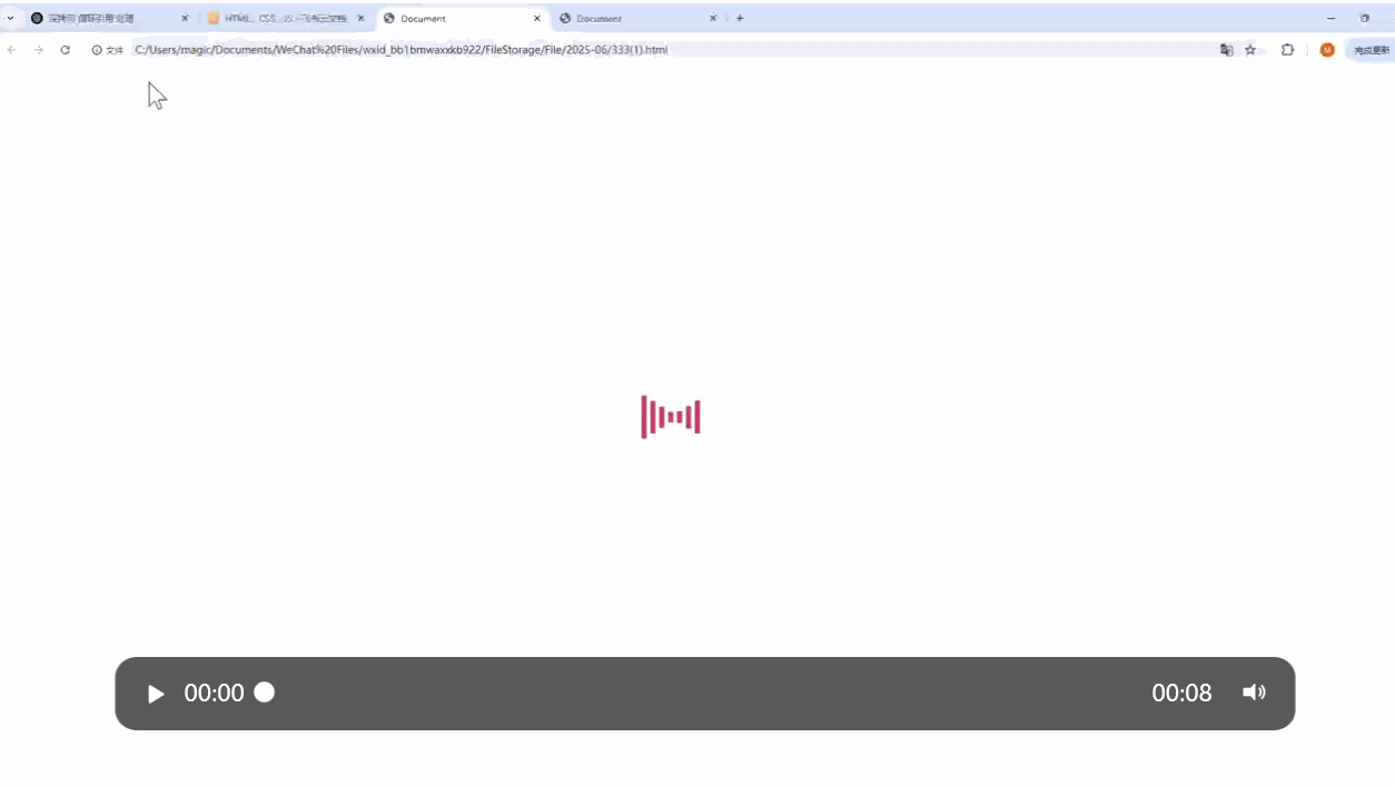
7.
这里的动画设置分为三部分,也就是三个关键帧,设置scaleY属性实现竖直方向的伸缩。
<div class="radio"><span></span><span></span><span></span><span></span><span></span><span></span><span></span> </div>
.radio {position: absolute;top: 0px;bottom: 0px;left: 0px;right: 0px;margin: auto;width: 175px;height: 100px;}.radio span {display: block;background: orange;width: 7px;height: 100%;border-radius: 14px;margin-right: 5px;float: left;}.radio span:nth-child(1) {animation: load 2.5s 1.4s infinite linear;}.radio span:nth-child(2) {animation: load 2.5s 1.2s infinite linear;}.radio span:nth-child(3) {animation: load 2.5s 1s infinite linear;}.radio span:nth-child(4) {animation: load 2.5s 0.8s infinite linear;}.radio span:nth-child(5) {animation: load 2.5s 0.6s infinite linear;}.radio span:nth-child(6) {animation: load 2.5s 0.4s infinite linear;}.radio span:nth-child(7) {animation: load 2.5s 0.2s infinite linear;}@keyframes load {0% {transform: scaleY(1);}50% {transform: scaleY(0.08);}100% {transform: scaleY(1);}}
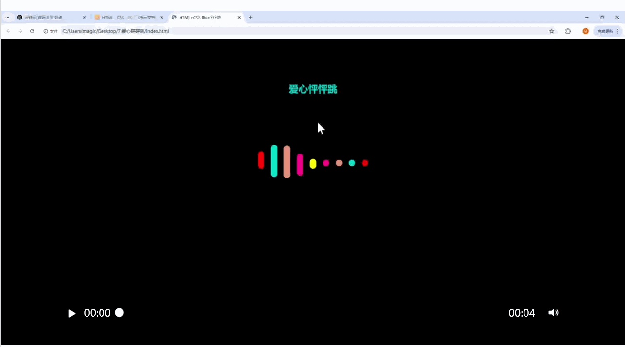
8.
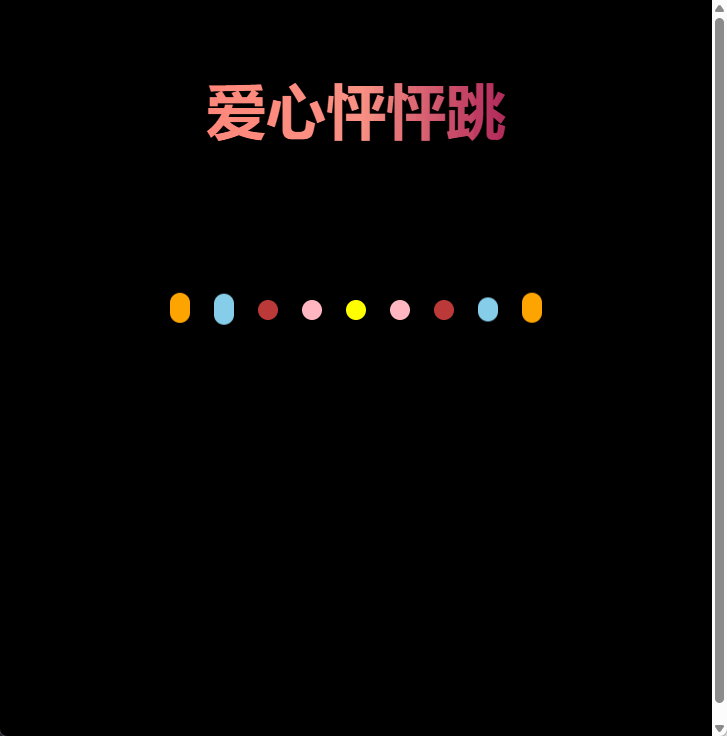
爱心怦怦跳
这个爱心的实现中每个线条是依次变长的,因此线条的开始的时间是不同的要设置延迟属性,这个爱心是对称形状的,因此对称线条的动画是相同的,只需要设置5个动画。
这里动画设置的点是关键帧可以简写,确保动画变完之后可以维持一段时间的状态等待之后的线条变化。
<div class="rad">爱心怦怦跳</div><div class="contain"><div class="space"></div><div class="space"></div><div class="space"></div><div class="space"></div><div class="space"></div><div class="space"></div><div class="space"></div><div class="space"></div><div class="space"></div></div>
body {height: 100vh;display: flex;justify-content: center;align-items: center;background-color: #000;}.rad {position: absolute;top: 60px;left: 50%;transform: translate(-50%, 0);text-align: center;line-height: 100px;font-weight: 600;font-size: 60px;color: transparent;background-clip: text;background-image: linear-gradient(to right, #ff8177 0%, #ff867a 0%, #ff8c7f 21%, #f99185 52%, #cf556c 78%, #b12a5b 100%);}.contain {position: absolute;top: 300px;display: flex;height: 200px;}.contain .space {flex: 1;margin: 0 12px;width: 20px;height: 20px;border-radius: 10px;}.contain .space:nth-child(1) {background-color: orange;animation: move1 5s infinite 0s linear;}.contain .space:nth-child(2) {background-color: skyblue;animation: move2 5s infinite .2s linear;}.contain .space:nth-child(3) {background-color: #bc3a3a;animation: move3 5s infinite .4s linear;}.contain .space:nth-child(4) {background-color: lightpink;animation: move4 5s infinite .6s linear;}.contain .space:nth-child(5) {background-color: yellow;animation: move5 5s infinite .8s linear;}.contain .space:nth-child(6) {background-color: lightpink;animation: move4 5s infinite 1.0s linear;}.contain .space:nth-child(7) {background-color: #bc3a3a;animation: move3 5s infinite 1.2s linear;}.contain .space:nth-child(8) {background-color: skyblue;animation: move2 5s infinite 1.4s linear;}.contain .space:nth-child(9) {background-color: orange;animation: move1 5s infinite 1.6s linear;}@keyframes move1 {30%,60% {height: 60px;transform: translateY(-30px);}80%,100% {height: 20px;transform: translateY(0);}}@keyframes move2 {30%,60% {height: 125px;transform: translateY(-60px);}80%,100% {height: 20px;transform: translateY(0);}}@keyframes move3 {30%,60% {height: 160px;transform: translateY(-75px);}80%,100% {height: 20px;transform: translateY(0);}}@keyframes move4 {30%,60% {height: 180px;transform: translateY(-60px);}80%,100% {height: 20px;transform: translateY(0);}}@keyframes move5 {30%,60% {height: 200px;transform: translateY(-45px);}80%,100% {height: 20px;transform: translateY(0);}}相应的渲染效果