大屏放大缩小自适应
目录
components
responsive.ts
页面代码
components
/*** 大屏响应式布局组件* 实现自动缩放以适应不同尺寸的屏幕*/
<script setup lang="ts">
import { ref, onMounted, onUnmounted, watch } from 'vue';
import { useWindowSize } from '@vueuse/core';
import { getScale, setScale } from '../../../utils/responsive';// 组件属性定义
const props = defineProps({// 设计稿宽度width: {type: Number,default: 1920},// 设计稿高度height: {type: Number,default: 1080},// 背景色background: {type: String,default: 'transparent'},// 背景图片backgroundImage: {type: String,default: ''}
});// 创建内容容器引用
const screenRef = ref<HTMLElement | null>(null);// 使用 vueuse 的窗口大小监听
const { width: windowWidth, height: windowHeight } = useWindowSize();/*** 应用缩放*/
const applyScale = () => {if (!screenRef.value) return;// 使用新的 APIsetScale(screenRef.value, {designWidth: props.width,designHeight: props.height});
};// 组件挂载时设置初始缩放
onMounted(() => {applyScale();
});// 监听窗口大小变化
watch([windowWidth, windowHeight], () => {applyScale();
});// 组件卸载时不需要手动移除监听,vueuse 会自动处理
onUnmounted(() => {});
</script><template><div class="screen-container" :style="{background: props.background,backgroundImage: props.backgroundImage ? `url(${props.backgroundImage})` : 'none'}"><div ref="screenRef" class="screen-content" :style="{width: `${props.width}px`,height: `${props.height}px`}"><!-- 内容插槽 --><slot></slot></div></div>
</template><style lang="scss" scoped>
.screen-container {position: relative;width: 100vw;height: 100vh;overflow: hidden;background-size: cover;background-position: center center;
}.screen-content {position: fixed;left: 50%;top: 50%;transform-origin: left top;
}
</style>
responsive.ts
/*** 大屏自适应工具* 根据当前屏幕大小计算缩放比例并应用transform*/// 设计稿尺寸,默认为1920x1080
export const DESIGN_WIDTH = 1920;
export const DESIGN_HEIGHT = 1080; /*** 缩放策略枚举*/
export enum ScalingStrategy {// 取最小缩放比例,确保内容完全显示(可能有空白)FIT = 'fit',// 取最大缩放比例,确保充满屏幕(可能有裁剪)FILL = 'fill',// 只按宽度缩放WIDTH = 'width',// 只按高度缩放HEIGHT = 'height'
}/*** 计算缩放比例* @param designWidth 设计稿宽度* @param designHeight 设计稿高度* @param strategy 缩放策略* @returns 当前屏幕的最佳缩放比例*/
export function getScale(designWidth = DESIGN_WIDTH, designHeight = DESIGN_HEIGHT,strategy = ScalingStrategy.FIT
): number {// 获取当前窗口宽高const width = window.innerWidth;const height = window.innerHeight;// 计算宽高比例const widthScale = width / designWidth;const heightScale = height / designHeight;// 根据策略返回不同的缩放比例switch (strategy) {case ScalingStrategy.FILL:return Math.max(widthScale, heightScale);case ScalingStrategy.WIDTH:return widthScale;case ScalingStrategy.HEIGHT:return heightScale;case ScalingStrategy.FIT:default:return Math.min(widthScale, heightScale);}
}/*** 缩放选项接口*/
export interface ScalingOptions {designWidth?: number;designHeight?: number;strategy?: ScalingStrategy;offsetX?: number;   // X轴偏移量调整(百分比)offsetY?: number;   // Y轴偏移量调整(百分比)
}/*** 设置元素的缩放* @param element 需要缩放的DOM元素* @param options 缩放选项*/
export function setScale(element: HTMLElement | null, options: ScalingOptions = {}
): void {if (!element) return;const {designWidth = DESIGN_WIDTH,designHeight = DESIGN_HEIGHT,strategy = ScalingStrategy.FIT,offsetX = -50,offsetY = -50} = options;// 计算并应用缩放const scale = getScale(designWidth, designHeight, strategy);element.style.transform = `scale(${scale}) translate(${offsetX}%, ${offsetY}%)`;// 添加当前缩放比例作为data属性,方便调试element.dataset.scale = scale.toFixed(3);
}/*** 初始化响应式大屏* @param elementRef 需要缩放的元素引用* @param options 缩放选项*/
export function initResponsive(elementRef: HTMLElement | null,options: ScalingOptions = {}
): { cleanup: () => void } {if (!elementRef) return { cleanup: () => {} };// 初始化缩放setScale(elementRef, options);// 创建调整函数const handleResize = () => {setScale(elementRef, options);};// 监听窗口大小变化,自动调整缩放window.addEventListener('resize', handleResize);// 返回清理函数return {cleanup: () => {window.removeEventListener('resize', handleResize);}};
}/*** 获取视口信息* 返回当前视口尺寸和缩放信息*/
export function getViewportInfo(designWidth = DESIGN_WIDTH, designHeight = DESIGN_HEIGHT) {const width = window.innerWidth;const height = window.innerHeight;const scale = getScale(designWidth, designHeight);const aspectRatio = width / height;const designAspectRatio = designWidth / designHeight;return {viewport: { width, height, aspectRatio },design: { width: designWidth, height: designHeight, aspectRatio: designAspectRatio },scale,isWider: aspectRatio > designAspectRatio,isNarrower: aspectRatio < designAspectRatio};
}
页面代码
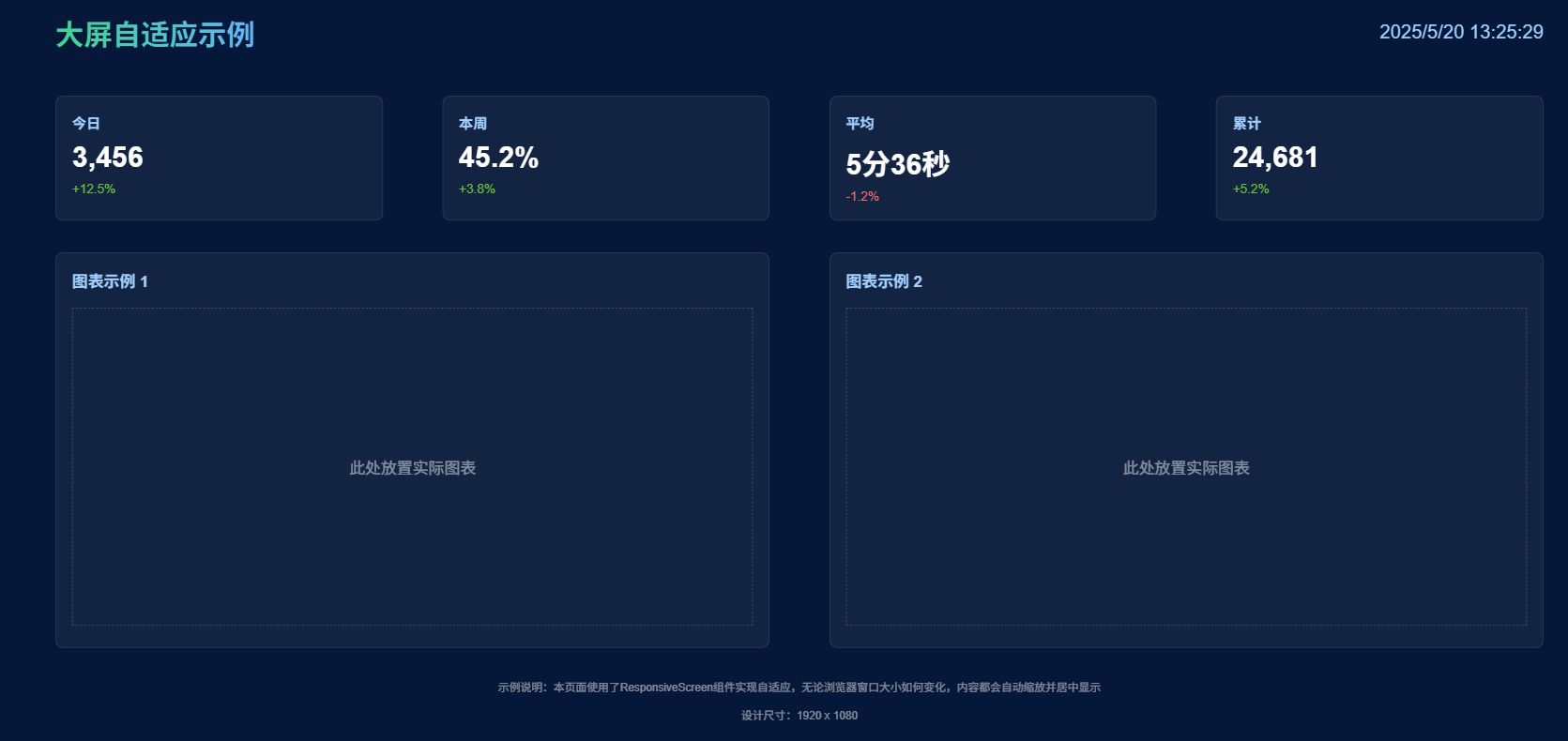
  <ResponsiveScreen :width="1920" :height="1080"><div>这里面放你的页面代码 宽高100%</div></ResponsiveScreen>
<script setup lang="ts">
import ResponsiveScreen from '@/components/ResponsiveScreen/index.vue';
</script>